Work with Stark in your favorite browser

Stark for Arc

Make every project accessible from the start. Stark for Arc keeps you focused on the parts of a project that need an accessibility audit. With powerful tools, automated checks, and smart suggestions you can supercharge your accessibility workflow at scale and in record time.

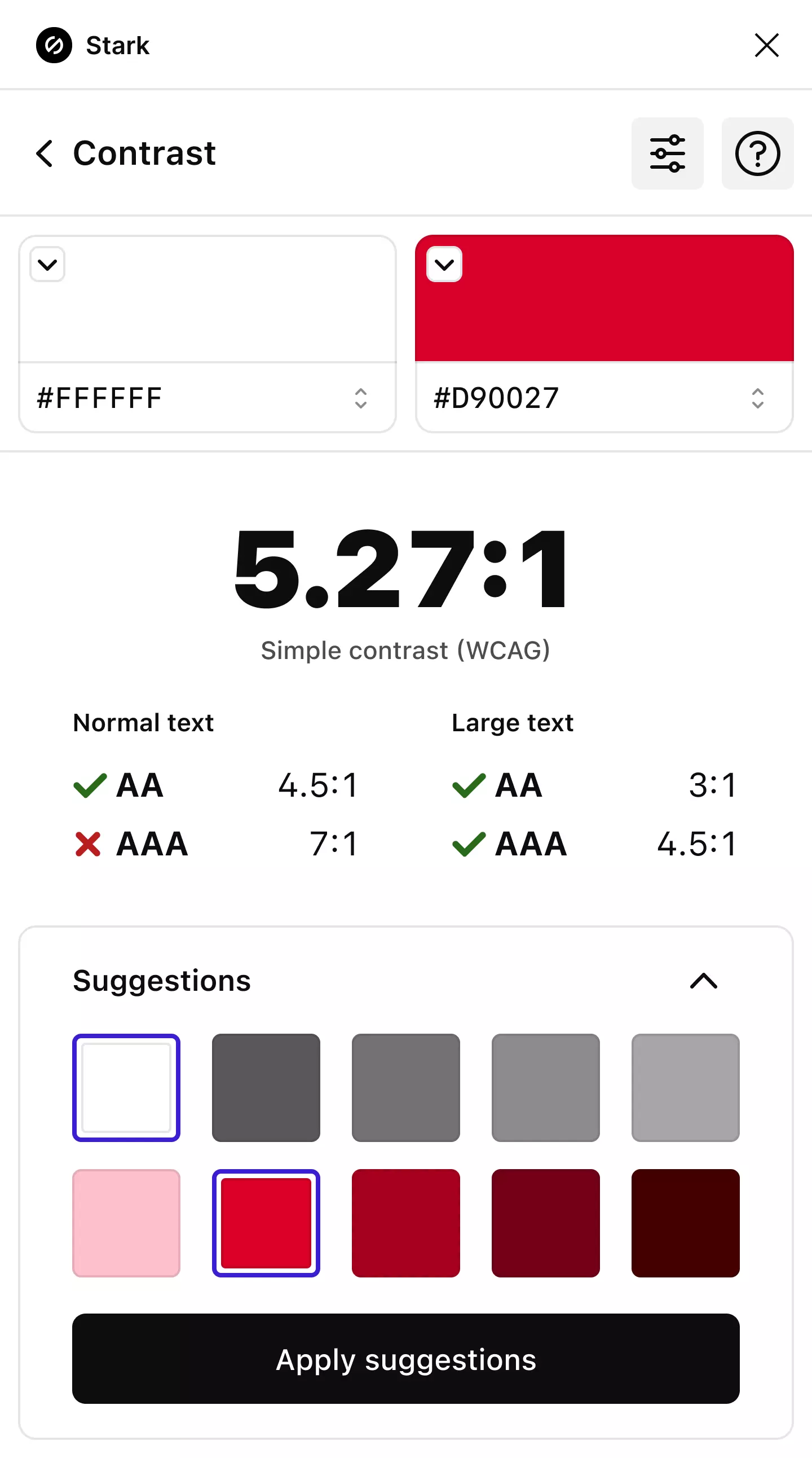
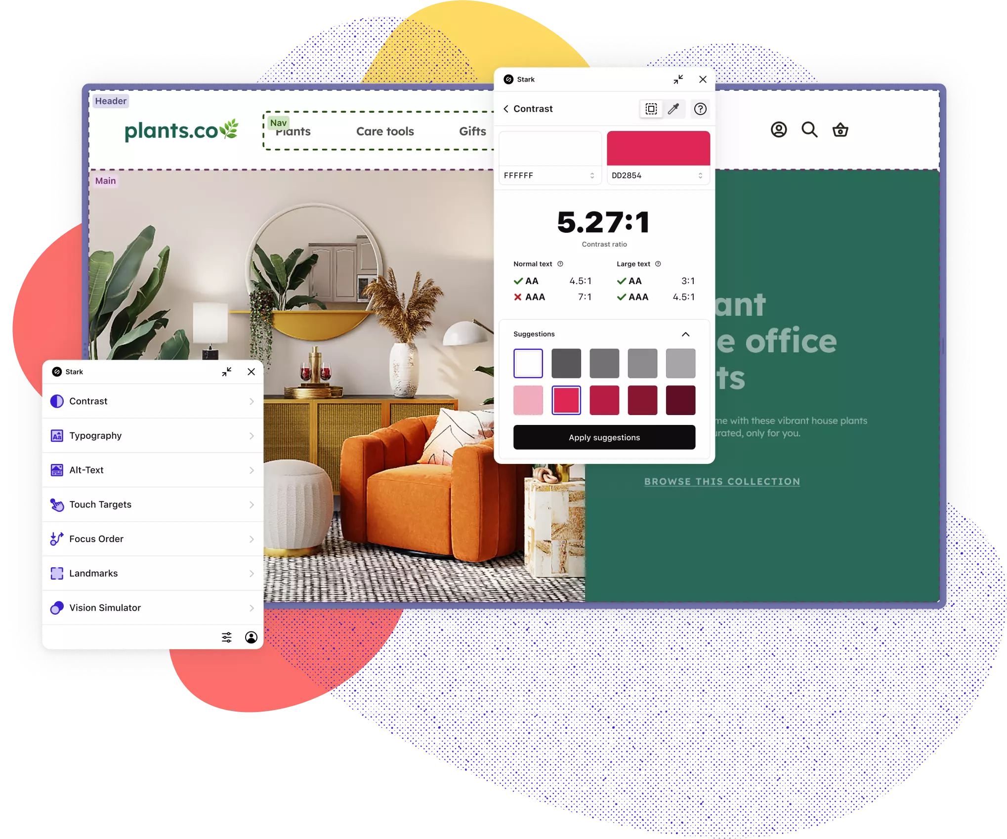
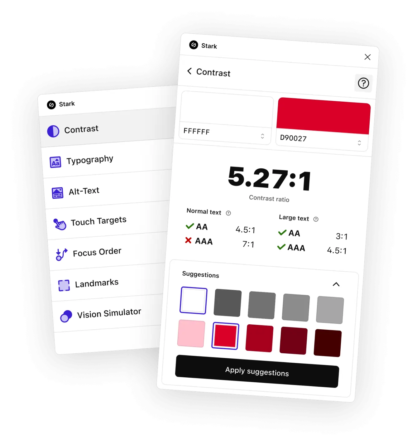
Stark for Arc shown with the main menu and contrast features popping out. The Contrast feature shows a red and white color pairining not passing AAA standards with 2 rows of suggested colors to remedy. The main menu shows the full suite of Stark tools including Contrast, Typography, Vision Simulator, Focus Order, Landmarks, and Touch Targets.

Speed up your accessibility
workflow from months to minutes

More than 40,000 designers, developers, product managers, and accessibility experts from over 28,000 companies use Stark’s suite of integrated accessibility tools in their daily product development cycle. Join them today!

Meet your new superpower

Create and test accessible designs in record time

Whether you’re building a website, online shop, mobile app, or SaaS product, Stark gives every designer, engineer, PM, and QA expert the manual and automated tools to make it accessible with ease.

Get started for free
A website about plants that is overlayed with Stark annotations showing Accessibility issues to address.
The Stark main menu listing Contrast, Typography, Alt-Text, Touch Targets, Focus Order, landmarks, and Vision Simulator as available tools.

Your ACcessibility ToolBOX

Everything you need, right where you need it

From Contrast Checker with Color Suggestions over Alt-Text Annotations to Focus Order and more, Stark offers the fully integrated and automated tools to help you and your team design, build and test software that meets the latest accessibility standards right in your design app and browser of choice.

Get started for free

Train on the job

Learn as you go

Stark is your accessibility sidekick. Learn best practices on the fly and get tips on how to fix any issues we find. We’ll take you from novice to expert while doing the heavy lifting in the background.

Get started for free
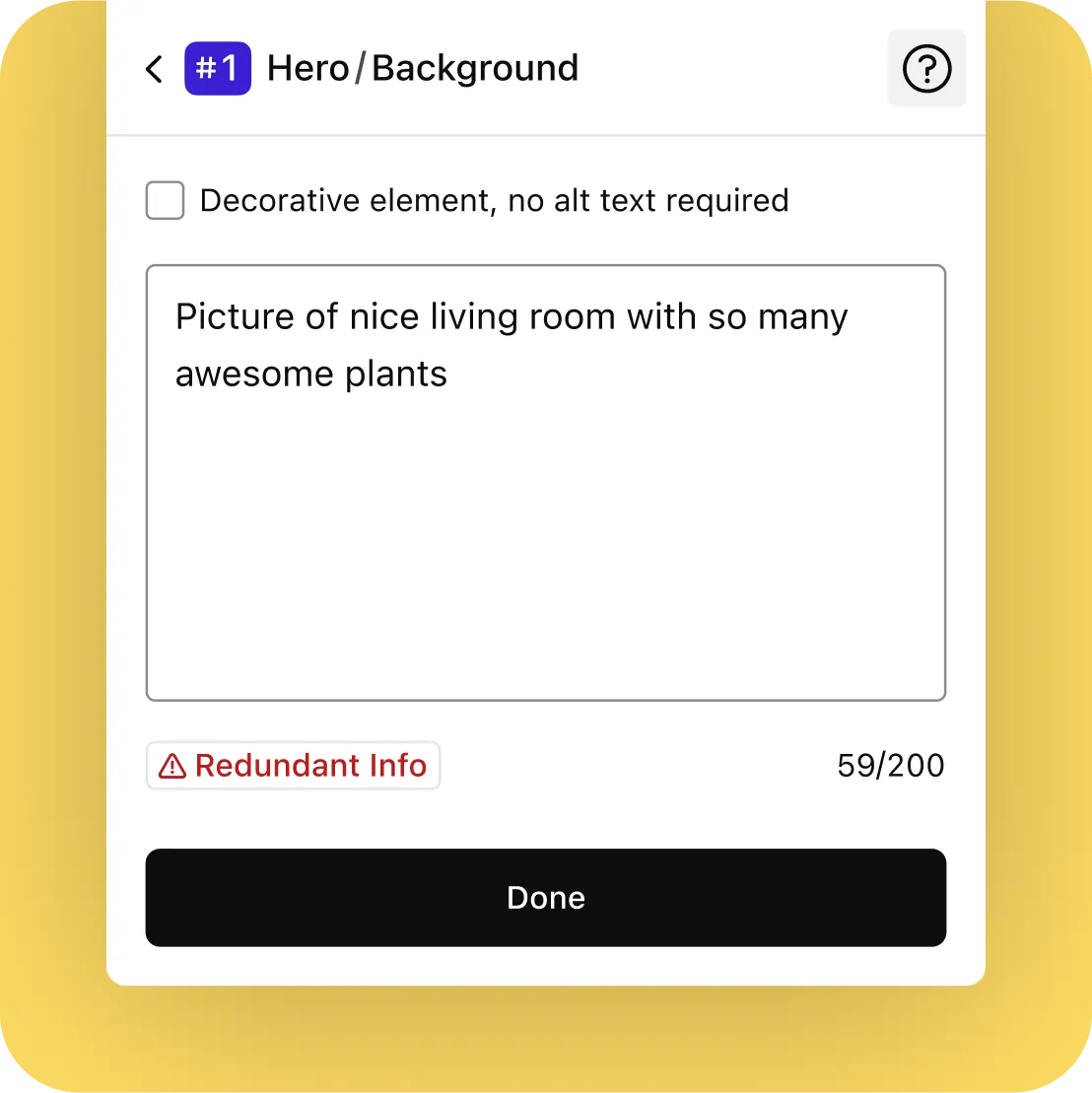
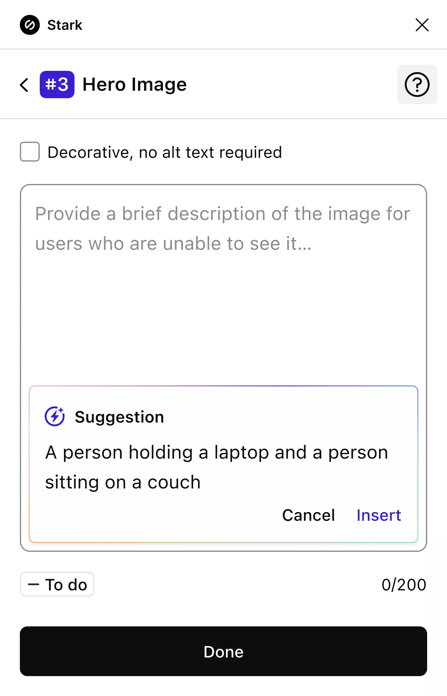
The Stark Alt-Text creator showing instructions for when to add Alt-Text as well as two created annotations: one with the text written and another showing as decorative.
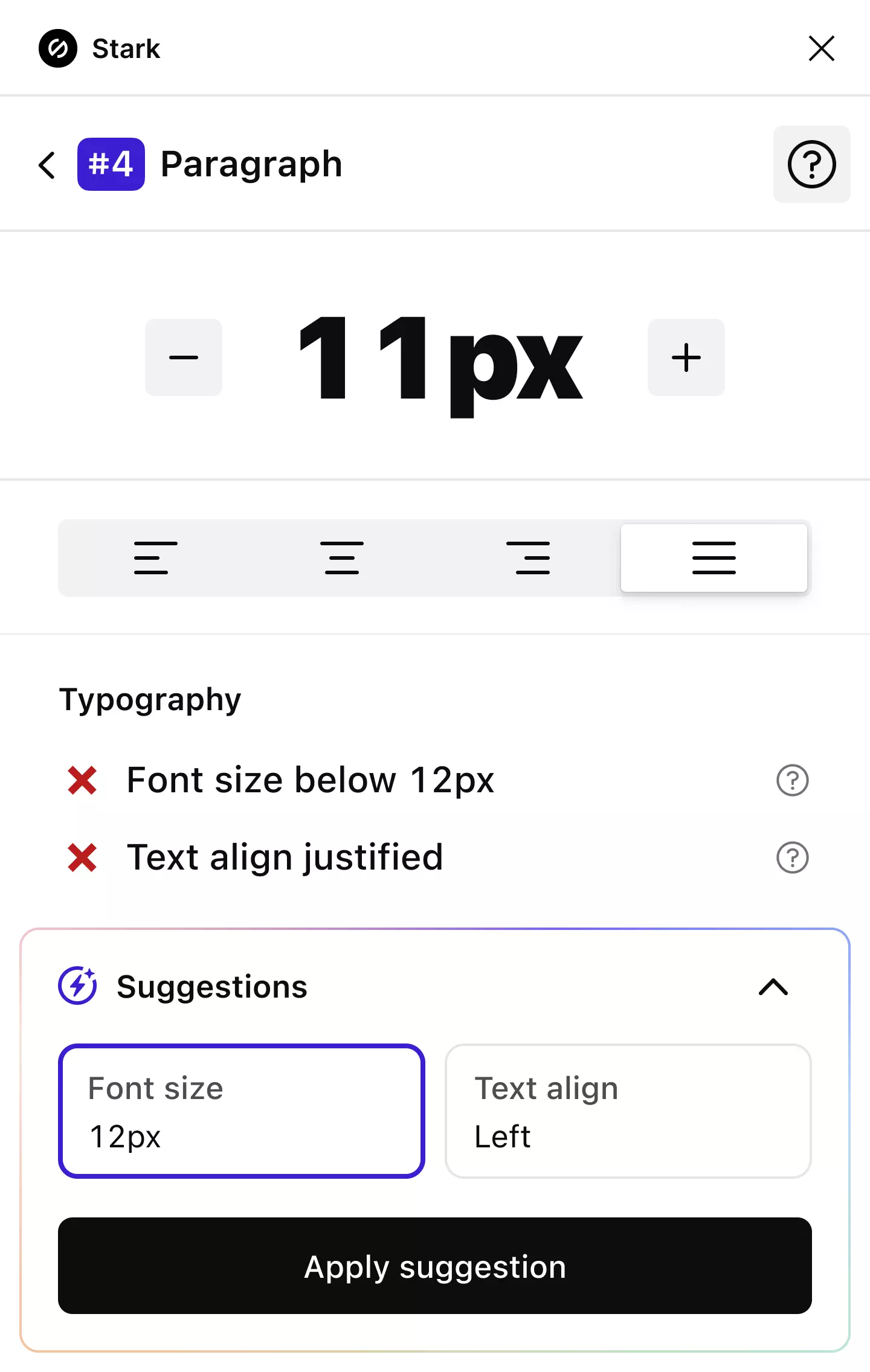
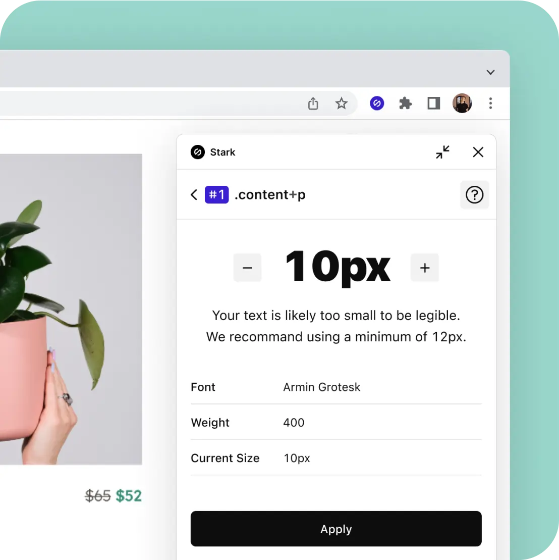
The Stark Typography analyzer showing font details for a design component with options to remedy it by increasing the size.

Retrofitting at scale with a click

Accessibility easy as one, two, three

Stark simplifies and accelerates collaboration on accessibility issues between designers and developers. With Stark's browser extension, you can scan for issues and get a Live Preview of our color and typography suggestions.

Get started for free

It takes a village

Join the Stark community

Connect with a global community of experts from all industries and stay up to date with the largest collection of accessibility resources on the internet.

Join our community
Group of Stark users clustered in a circle with teal, yellow, and coral colored circles surrounding them.

So, you’re ready to get started and supercharge accessiblity?

Step 1

Start with a free account

Wherever you are in your accessibility journey, we believe you should have access to the best tools.

Step 2

Download and install Stark

Download and install Stark for Arc and begin your accessibility journey with a Contrast Checker and Vision Simulator.

Step 3

Join a Team when you’re ready

From Reports & Insights to access to our Beta program, there’s much more you can do with a Team plan.

Come for the features,
stay for the magic

The Stark Contrast Checker showing white and red colors failing AAA WCAG standards and showing two rows of passing suggested colors at the bottom.

Contrast Checker + Color Suggestions

Two bounding boxes connected with a line and annotated with the numbers 1 and 2 showing the intended order of focus.

Focus Order

Landmarks

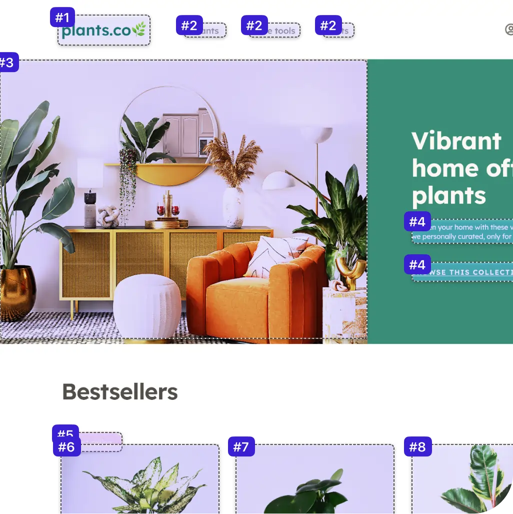
A website about plants annotated with the Stark Landmarks feature highlighting the header navigation, main content of the site, and a section of bestsellers.

Vision Simulator + Generator

The same photo of a living room covered in plants with a mirror on the wall and an orange chair to the right is shown in the various colorblind simulations that Stark offers including Protanopia, Tritanopia, Achromatopsia and more.
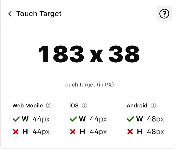
Stark's Touch Target tool showing a layer not meeting Web Mobile, iOS, or Android standards for touch target height.

Touch Targets

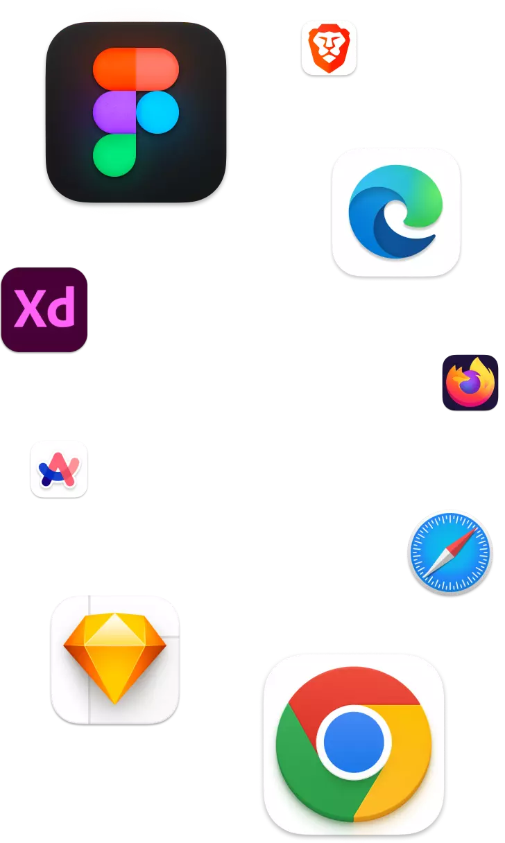
Stark's logo surrounded by design tools (Figma, Adobe XD, Sketch) and web browsers (Chrome, Edge, and Brave).
Stark logo

Works in your design Tool and browser

In-App Education
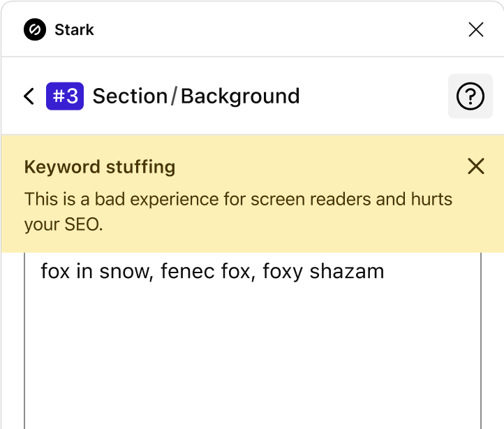
Stark's Alt-Text feature highlighting that the supplied alt text is an example of keyword stuffing which actually hurts your SEO and is a bad experience for screen readers.
Stark's Alt-Text feature with numerous layers annotated showing examples of written, decorative and incorrect alt text.

Alt-Text Annotations

Live preview in browser
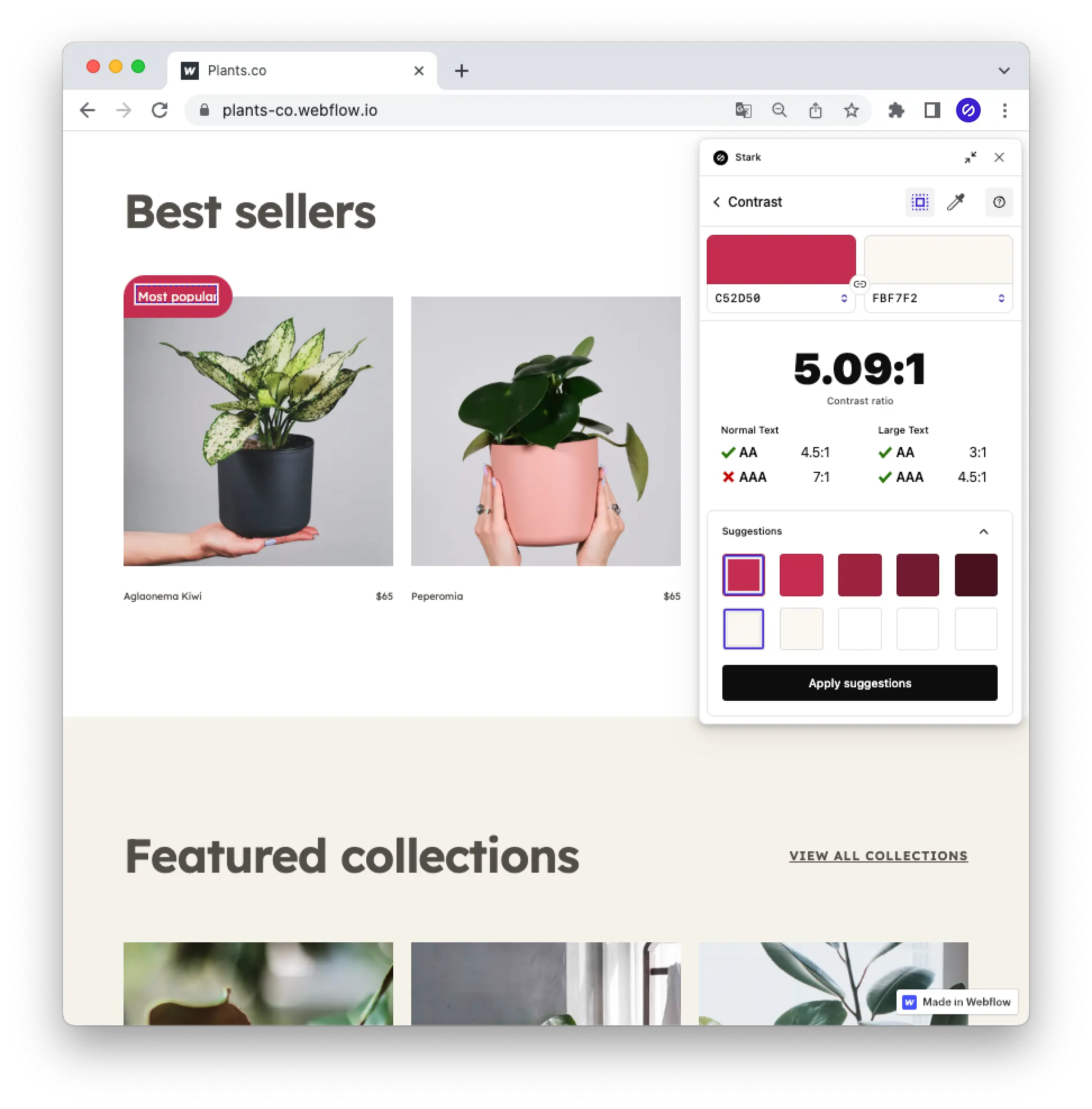
A plants website is shown with Stark's live preview feature allowing a user to directly change a color right in the browser.
Stark's Typography feature showing a layer with text size that is too small at 10px with the option to increase it.

Typography

Three illustrated faces (a bald man with a moustache, a person with blond hair, and a woman with curly hair) are shown connected with lines in front of a cloud with the word SSO above them.

SSO + Team Account Management

Beautifully simple, lightning fast
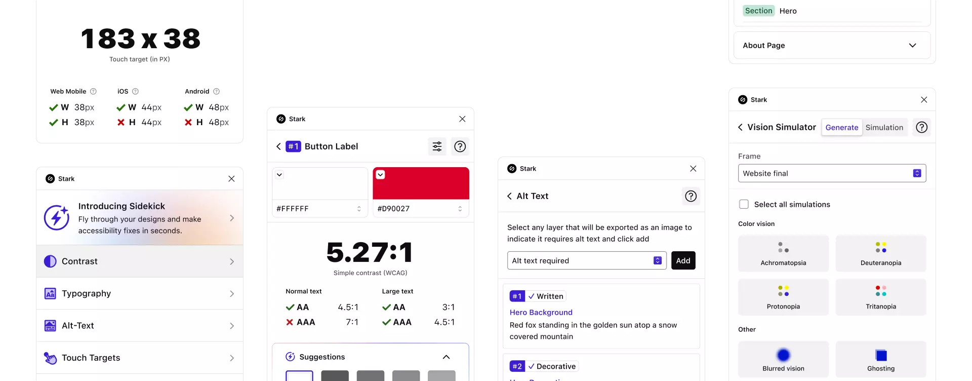
A grid of all the different features offered within Stark, including Contrast, Alt-Text, Vision Simulator, and more.