Keep your team on track with Accessibility Checklists for Figma and FigJam
Today, we’re bringing our beloved accessibility checklist widget in FigJam to Figma, streamlining your team’s workflow from ideation to production.

Team Stark
Aug 23, 2022

When setting out to bake accessibility into a product or retrofitting one that shipped years ago, we know there’s a lot to consider. Last year, we partnered with our friends at Figma to introduce a cross-functional accessibility widget for FigJam, giving designers, developers, and product managers role-specific accessibility task lists.
With the FigJam widget, we brought checklists into your team’s whiteboarding sessions, where accessibility conversations around your product should start.
And today…we’re bringing it to Figma!
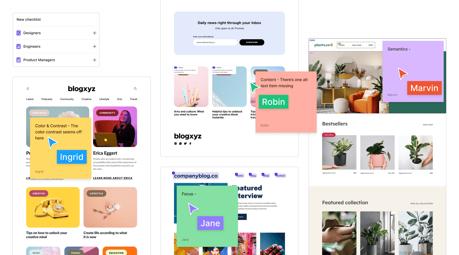
You can now use Stark’s Accessibility Checklists to track individual and team progress on a project, get education about different tasks, and collaborate on solutions in Figma and FigJam.
Whether you’re divvying up tasks at the start of a project or leaving notes on a design file to get everyone on the same page, you can create checklists to guide you through every stage of the product development cycle. And to make a simpler, more streamlined experience, we’ve updated the checklist UI to match all our redesigned plugins and extensions.
With Accessibility Checklists, we want to make it easier than ever to design, code, and build with accessibility in mind from the start. You can collaborate with your team in Figma and FigJam just as you usually do and learn about the requirements every product should meet for typography, color and contrast, modals and popups, and more.
Here’s an overview of how to use Stark Accessibility Checklists to keep your team on track throughout a project.
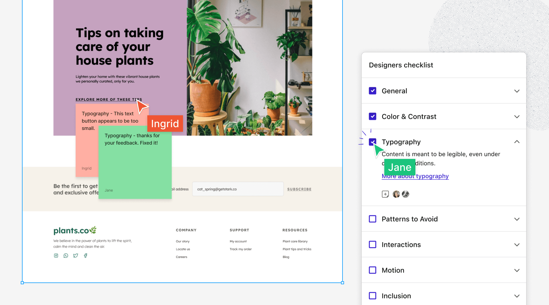
Check off your tasks, track your team’s progress
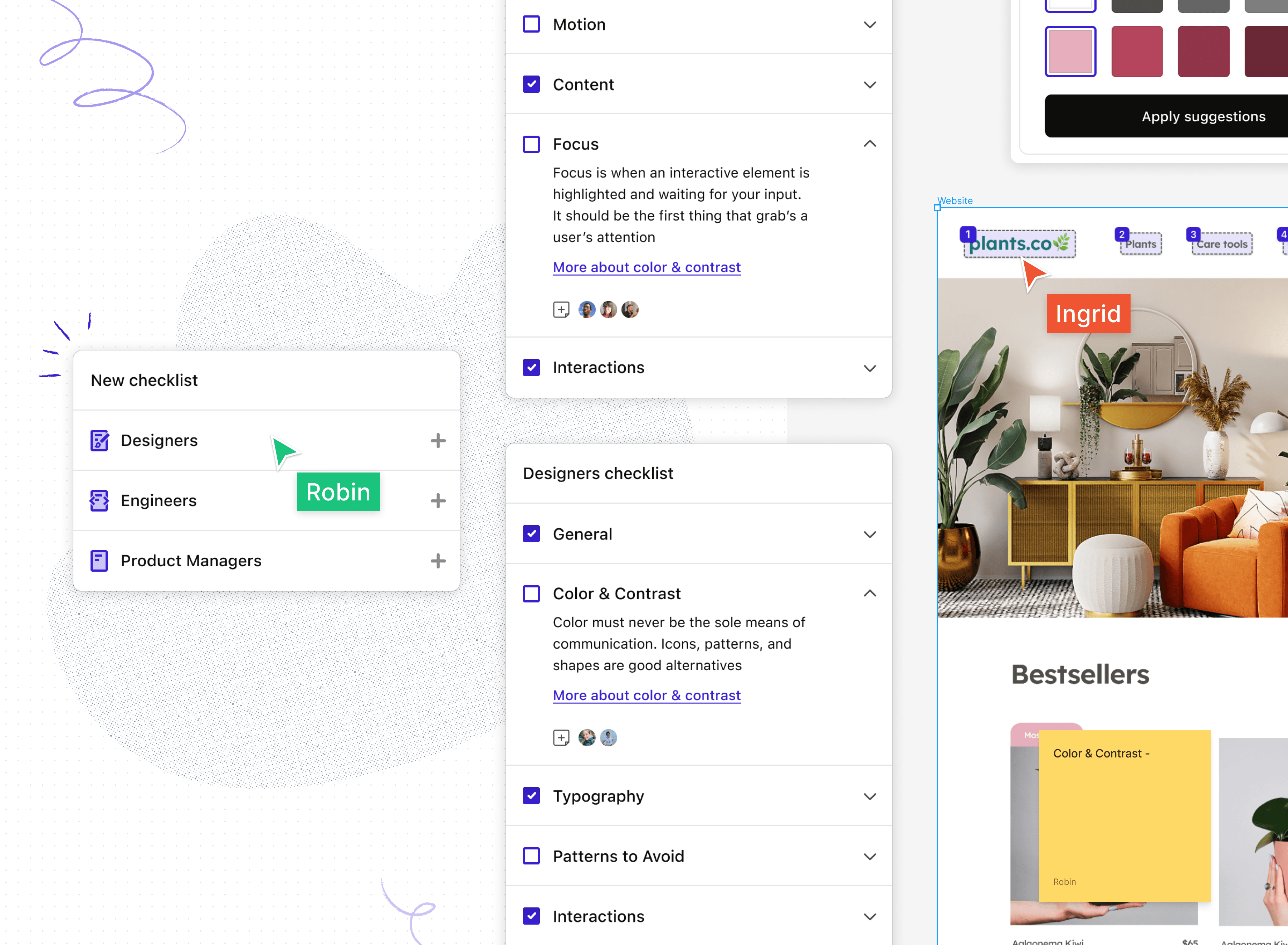
We’ve tailored each checklist to a designer’s, engineer’s, and product manager’s expertise.
As a designer, you probably consider whether your design has landscape and portrait orientation. If you’re a developer, your focus might be on whether a layout is responsive beyond a browser’s width. And as a product manager, you can oversee the production and ensure that anyone would be able to access your product.

Check off your tasks so everyone on your team can stay updated on your progress. It’s a clear and straightforward way to ensure you’re solving each of these accessibility tasks from different angles.
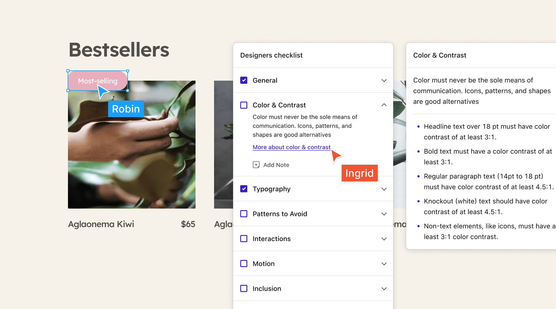
Get a list of requirements for each task
Stark’s Accessibility Checklists tell you exactly what requirements you should meet before marking a task as complete. Each task includes a link you can click to learn more information like contrast ratios for text and colors if you’re a designer.

Share feedback from start to finish
Figma and FigJam make it easy for teams to leave comments during whiteboarding sessions and on design files. Our Accessibility Checklists let you add sticky notes to tasks so everyone on your team can see the thoughts, questions, and comments left about the UI.

Ready to check off your accessibility tasks? Install the widget to use in your next brainstorming session or design review.
Want to be part of a community of accessibility superheroes? Join our Slack community, and follow us on Twitter and Instagram.