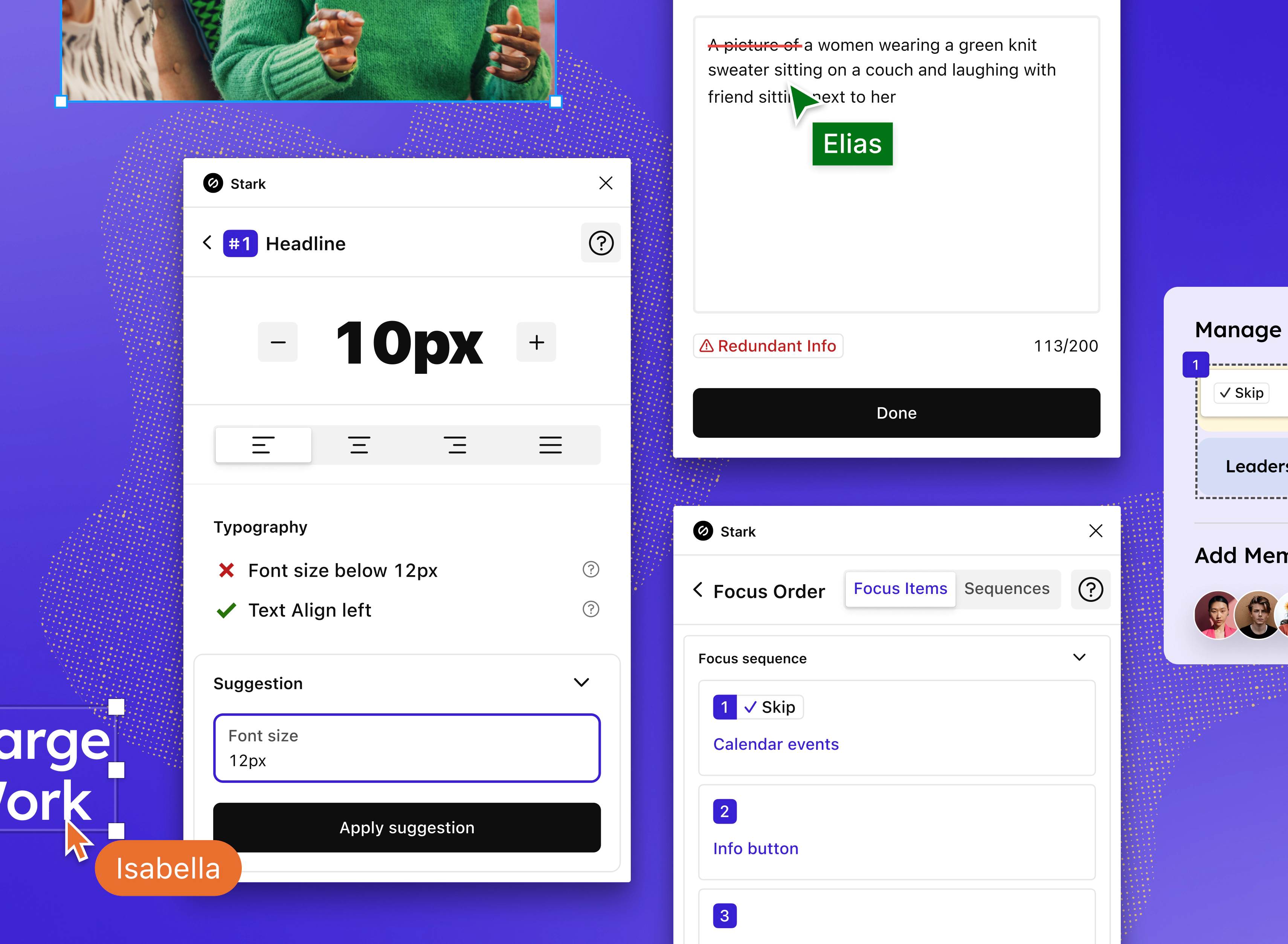
All-new Focus Order, Alt-Text, and Typography tools
Check out the big new updates we made to our Focus Order, Alt-Text, and Typography tools in Stark for Figma, Sketch, and Browser Extensions.

Team Stark
Apr 05, 2023

Get ready to check out the big new updates we made to our Focus Order, Alt-Text, and Typography tools in Stark for Figma, Sketch, Chrome, Brave, Arc, Firefox, and Safari. These new features were developed thanks to the thoughtful conversations in the Stark community and your open feedback. We’re so grateful for our community!

Alt-Text
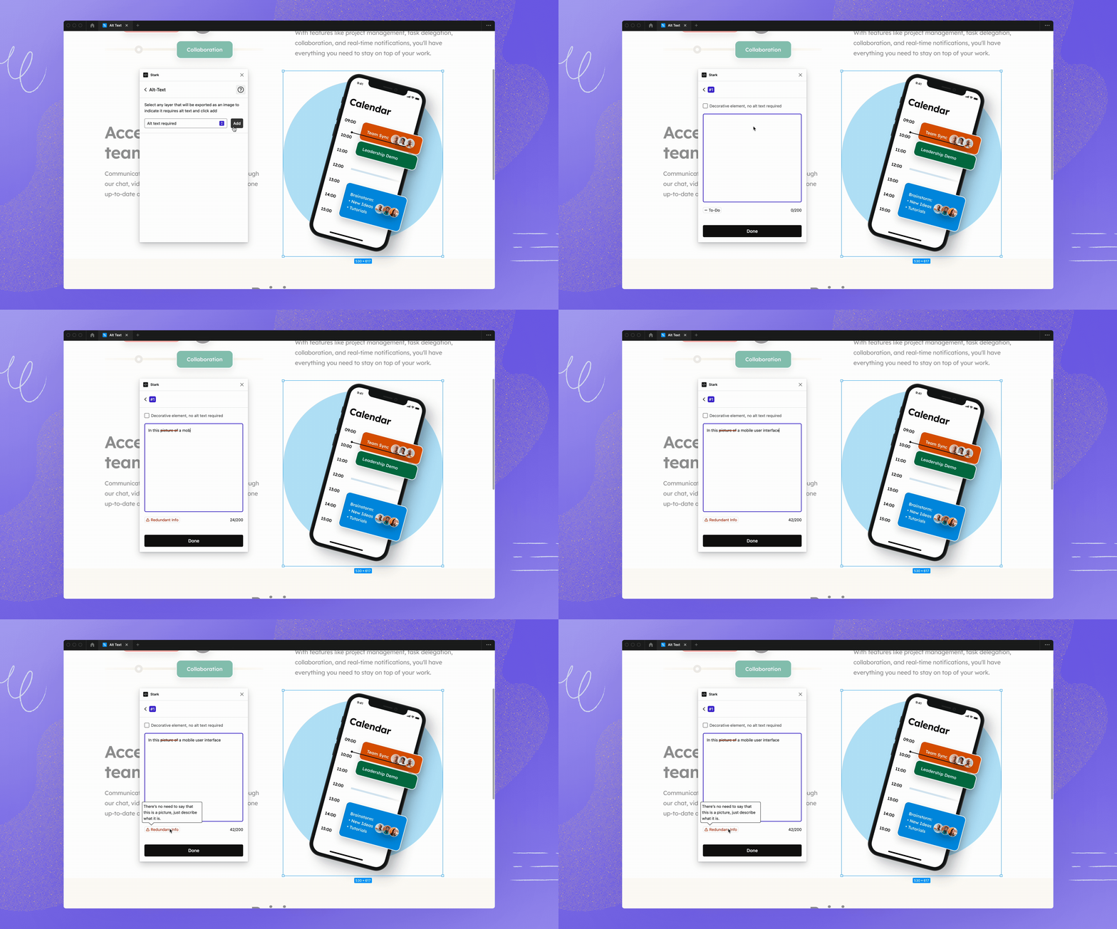
This update makes it easier to see and fix alt-text errors right in context by highlighting the errors directly in the text field. Writing good alt-text – using Stark’s continual alt-text scanning – is one of our most-loved Stark features.
This update is especially useful for designers in Figma who are collaborating with content designers or copywriters, since everyone can now use the same alt-text editing functionality right in the file. When it comes to QA and testing, our browser extensions highlight the errors in the code so you know exactly what needs to be changed.

Focus Order
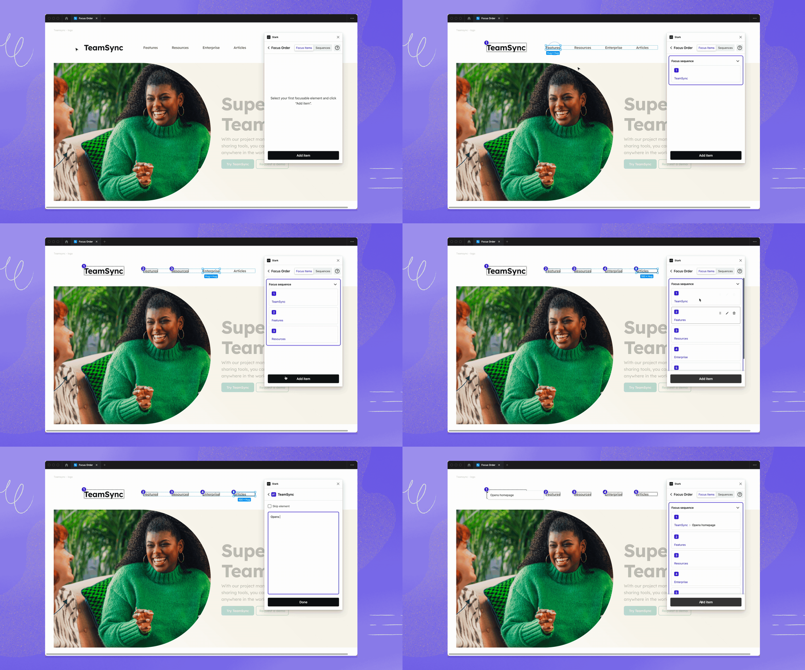
Intentional design of the focus order and flow of your software is essential to ensure a great experience for every user, no matter which device they’re using. This Focus Order update adds a few important features: a simplified flow to add focus items with a click, a free-form annotation field, and a checkbox to mark an element as skippable.
This Focus Order update allows you to start adding focus items with a click instead of first having to create a new sequence. That’s much easier and saves time.
The new free-form annotation field allows designers to include any labels or helpful handover notes for the developer team, which removes the guesswork around focus order and promotes a more cohesive workflow across teams. Annotations are a huge time-saver and we expect that team and enterprise-level customers will especially love this new feature because it both speeds up the designer-to-developer handoff, and makes the handoff more accurate.
When it comes to skip elements, several of our customers have told us about an increasing need to support all kinds of screens, like big screen TVs and connected exercise equipment, in addition to web pages and apps. So, we added a checkbox to mark an element as skippable, which helps for types of screens that have special navigation requirements, like the need to work with a remote control instead of a keyboard.

Typography
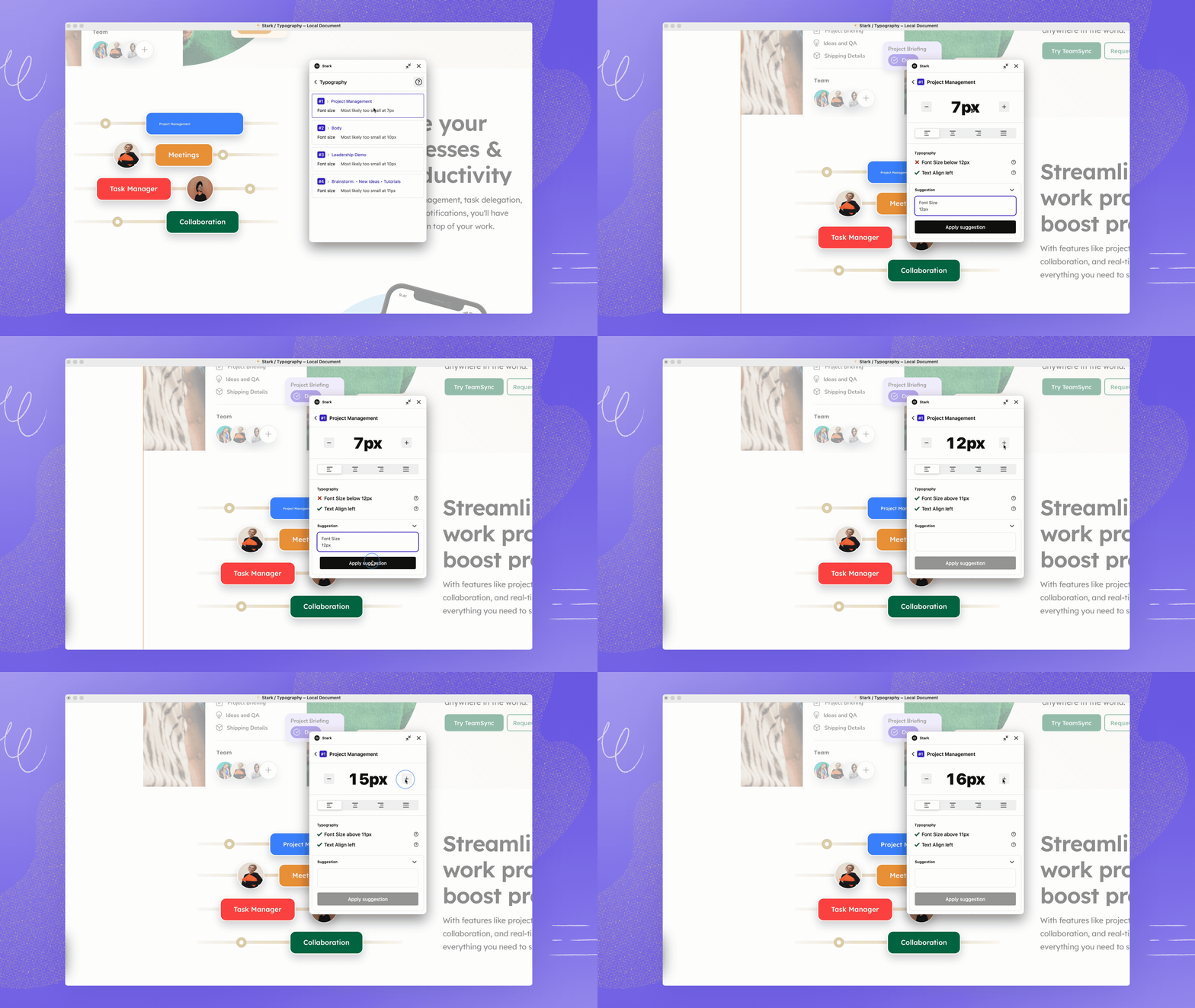
This Typography update incorporates new design and accessibility best practices to help you determine the right combinations and settings for font size and text alignment. If the text alignment is off or the font size is too small, this update includes Stark’s Live Preview to automatically reflect your changes as you make it accessible.
Just like in other Stark tools, we’ve now added Suggestions to Typography, which takes the guesswork and manual testing out of your workflow and makes it even easier to apply the accessibility corrections. While the WCAG guidelines set the standard for digital accessibility, there are a number of gaps in typography. With this update, our goal is to fill those gaps with best practices so that it’s easy for you to design accessible experiences across every element of your page.
Your feedback helps Stark evolve
We love hearing from you! Today’s updates are a direct result of the collaborative input and feature requests that we get from our users. As we continue to evolve Stark’s tools, please keep sending your feedback, ideas, and wishes our way.
We’d love to talk with you in our Stark community, where you can connect with other folks who are advocating for and learning about accessibility. You can also get in touch with us on Twitter, LinkedIn, and Instagram or send an email to support@getstark.co.