Customer Story: Harlow
How an indie-game studio created an award-winning, accessible video game with Stark

Team Stark
Jan 09, 2024

Arman Nobari found an unconventional path into the games industry. Rather than studying at university or working his way up in a large publisher, his drive to build holistically accessible video games started while receiving treatment for Stage 3 Lymphoma when he was 14 years old.
He taught himself game development as a means to get through chemotherapy treatments and created “mods” (in-game content made by players rather than developers) for popular games like World of Warcraft 3. He would share the mods with the other kids in the hospital, but was upset when he found that many of them couldn’t play the games due to cognitive stress or physical disabilities resulting from their illnesses.
“This bummed me out, but it also planted the idea that there must be a way to design a game that wouldn’t exclude my friends or anyone from playing,” Arman says.

After working a few years in tech, it wasn’t until he had a brain tumor removed in 2018, along with the passing of a family member 6 months later, that he decided to take building what he calls a holistically accessible video game seriously.
“Playing games is what got me through every terrible experience, so I had to jump in with both feet and do this with my life,” Arman says. “Forget the traditional career path; I have to build a company around accessible games because it’s what I keep going back to during these hard chapters of life.”
While accessibility in gaming has seen tremendous strides in the last few years, the concept of a holistically accessible video game is still new and accessibility as a whole in software wasn’t top of mind for many even five years ago. With that, Arman didn’t have a guidebook for achieving his goal, and ended up hitting roadblock after roadblock. And yet, he kept going.
“Stark is where I’ve learned the most about accessibility,” Arman says.
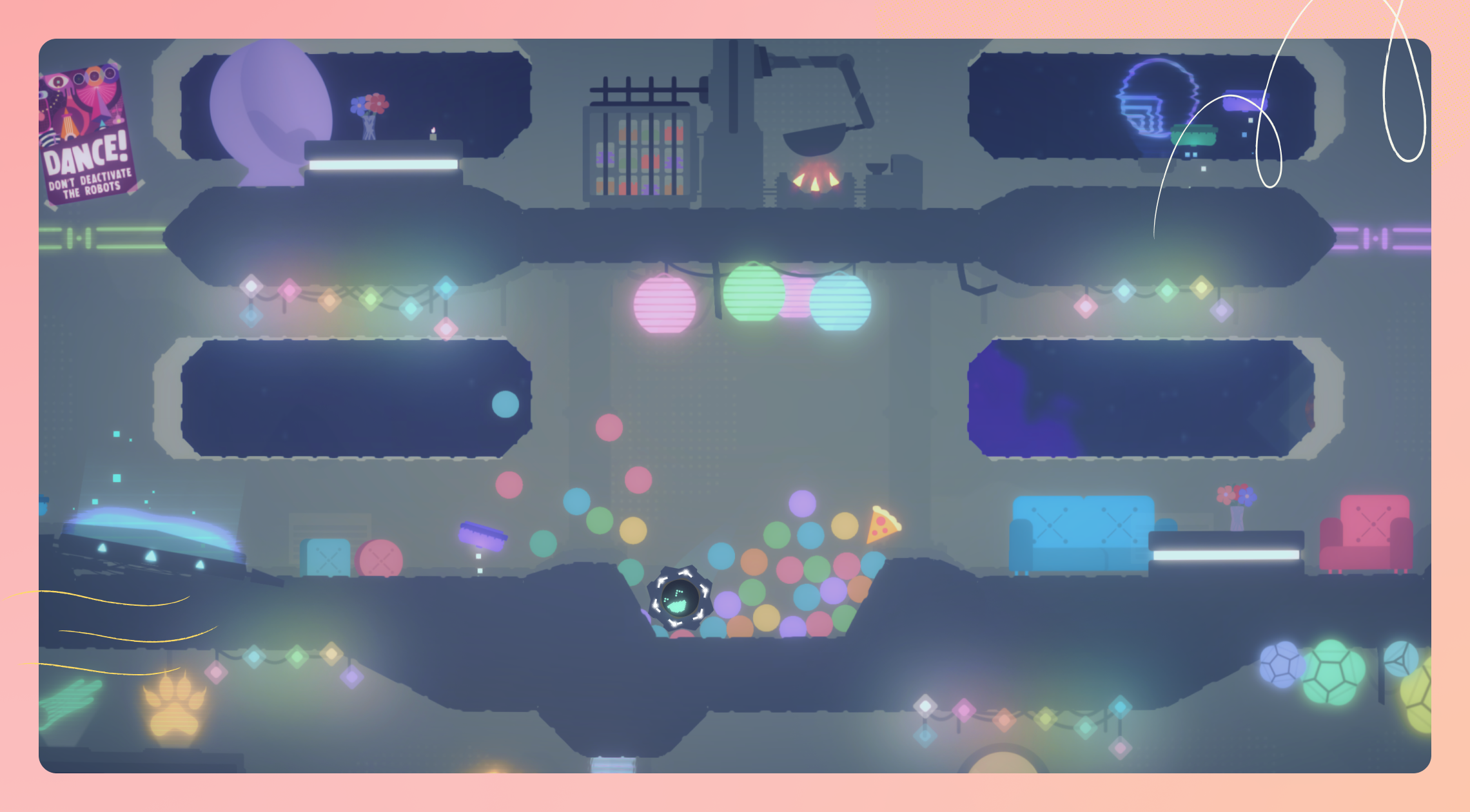
As a game developer, he loves the flexibility of Stark because every game is different. And the fact that he can use our tools right in Figma saved himself an entire calendar quarter worth of time in his workflow. And in 2021, he finished Harlow - a small solo-developed indie game about planning a space surprise party for stranded colonists as a clumsy robot. After he put it on Reddit, Arman found that a lot of people believed in and supported the success of his game.
While Arman set out to make his game Harlow accessible to as many folks as possible, he faced dozens of game-specific accessibility challenges that productivity software and websites don't face.
Throughout Arman’s ad hoc process, he learns new things on the fly. He turned to the Stark Library and Community to find fast answers to topics he wanted to dive deeper into, and also found a way to make Stark’s integrations and tooling, like Sidekick, work for his unique process. Arman tapped into Stark’s collection of accessible gaming resources. And he did, in fact, need to get creative. Despite that, he was determined to meet the high bar in an effort to make the game more inviting to more people.
“Stark is my accessibility resource,” Arman says. "I trust it, not just for things I know I need help with, but as my first resource when tackling something new."
What even is holistic accessibility?
Arman describes holistic accessibility as a bottom-up approach to building accessible software, where accessibility is seen as an essential and foundational element of a whole experience. This is in sharp contrast to viewing accessibility as “features"” that are applied on top of an experience that had not considered the needs of people with disabilities and various life circumstances from the start.
It’s how accessibility should be done.
Holistic accessibility takes into account the core interaction design of something, and anticipates the wide-ranging tapestry of lived experiences that may confront, use, or spend time with that thing. It also requires a willingness to not call something done until it’s done well enough.
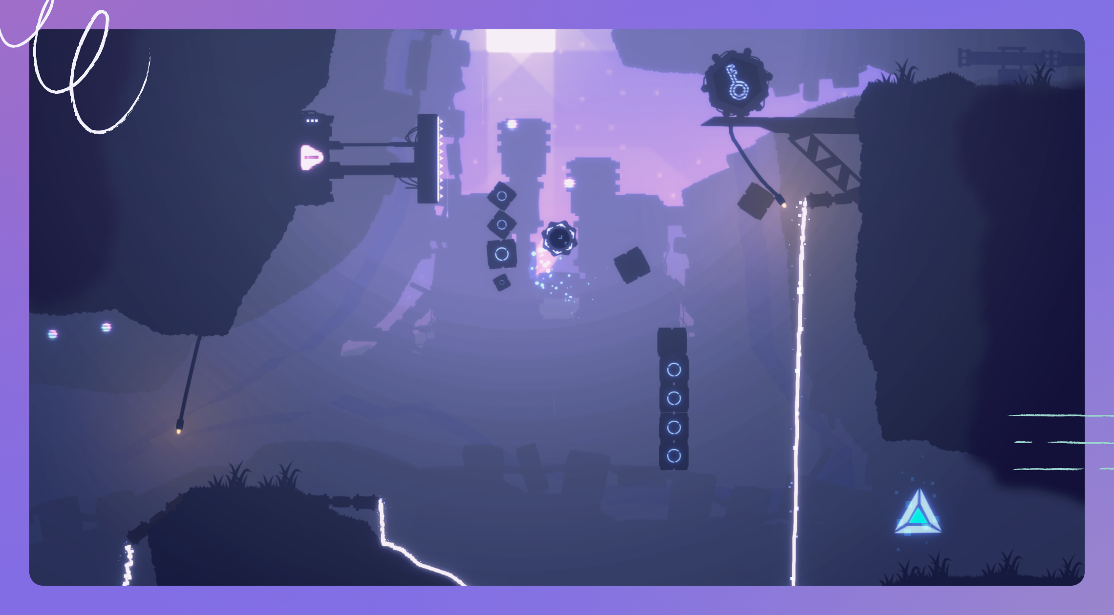
“It’s about creating for a spectrum of accessibility needs,” Arman says. Harlow isn’t just visually accessible with its perceptible shapes and muted colors. Arman focused on motility and thematic accessibility, too. The challenge is that developing a video game, unlike other software, is more like “sculpting.” So Arman needed accessibility tools and resources that would mold to his ad hoc process.
Stark’s flexibility in addition to the suite of products and educational resources were the perfect fit for his workflow—helping him design for a spectrum of disabilities and disorders.

Checking the expectation of “normal” in video games
Since he was creating Harlow during a dark period of his life, Arman didn’t want to glorify topics that would prevent someone from wanting to play. “It deals with catastrophe in a silly and uplifting way,” he says. That’s why the script includes lines like, “Every day I think about inventing pizza cake. The galaxy isn’t ready yet.”
In every story he creates, he tries to leave a fingerprint of what he’s been through, and he tends to anchor narratives in a sense of hope. Back when he went through chemotherapy, and it felt like the universe was collapsing around him, simply holding onto hope got him through that experience. So when creating stories and experiences in games, Arman always makes sure that catastrophe and challenges are framed through a lens of hope. A true craftsman ensuring they deliver nothing but quality experiences, Arman never wants to make bleak games; there’s too much nihilism on the internet already. In that way, his goal is that the stories and games he creates can be as much of an escape from the stresses of life as they can be an artistic vision fulfilled.
Since Arman was already using Figma to create graphics for the game, it made sense to integrate Stark’s Figma plugin into his workflow.
Stark’s flexibility allowed Arman to choose the right tools and “bend them to work for video game development.” — which means an usual workflow as a standard. He uses Figma Dev Mode to see some styling values—their game UI is based on flexbox, so it’s an efficient starting point.
Checking the contrast of the Harlow user interface
“The primary visual driver in Harlow is shape and contrast, not color,” Arman says. Which is such a drastically different stance compared to many — who turn to color primarily. And understandably so. Color plays a drastic role in the psychology and adaptability of software. Checking the contrast was a crucial part of the game’s development, and Arman emphasizes the necessity of having a tool to take the guesswork and manual labor out of the process. He also uses Figma Dev Mode to see some styling values—such as border thickness and relative sizes.
To make Harlow visually accessible, Arman used the Contrast Checker to ensure the color contrast between UI elements passes WCAG AA and AAA compliance requirements.
One of the biggest learnings you discover when making software for customers is that they will bend a product into all the various ways it fits their workflow. And Arman did that in a way we couldn’t imagine! During game development, Arman spent a lot of time taking screenshots and importing them into Figma. From there, he used tools like the Contrast Checker to sample and compare every element, including his clumsy, bouncy robot.
Harlow is the game’s main character, so it was vital for that little robot to be perceptible in every scene and surpass accessibility standard levels. For Arman, one of the challenges was that WCAG bases its requirements on large and small text—so it was hard to determine if Harlow the character was comfortably viewed given his size. Instead, Arman came up with a clever trick (true mark of a craftsman):
“In place of the game's character Harlow, I often used plain text letters to ensure scale never encroached on at-a-glance clarity” he says. "That way, if a letter seems even slightly hard to read, there's no way the character is clearly visible. This helped me ensure the game's camera never strayed too far away, even during larger environmental scenes.”

A fully accessible and award-winning video game
Published in early 2022, Harlow was named a Gold Winner at the 2022 NYX Game Awards. Arman considers the award a “data point.”
“Harlow didn’t win for an accessibility category, and at no point is the game shy about being accessible,” he says. “This award proves people are willing to evaluate and praise accessibility, even for a game that was, at the time, a small solo project.”
“Stark helps me get values into WCAG AAA territory really quickly. It also accelerates our build time by how fast it is to use. It’s a tool with an incredible effort-to-value ratio.”
“On a meta-note, it’s also a stark (hah!) reminder that accessibility is a practice as much as it is an end result. It’s a reminder that things can be improved incrementally, that a button or icon or dashboard can be 0.25% objectively better, and that 0.25% better is not only worth it, but is also easy to achieve.
Adjust the color, apply that change systematically, and boom, you’ve just helped hundreds of thousands of people get more value from the thing you’re making.
Imagine the entire population of Yonkers or St. Louis having an unexpectedly better day because a game (or website, or app) was way more usable than they expected. Maybe some folks who’ve never had their needs anticipated feel seen and valid for the first time. That’s aligned with my values both morally, ethically, and as a maker/founder.
That’s where theory and output converge for me. A product and the organization that built it can practice mindfulness just as we can, as individuals—and once you have mindful habits around accessibility built up, you get those efficiency gains, you ship faster, because you’ve put in the reps to have incredible efficiency in your actions. Using Stark feels like a daily affirmation in service of these values; that we're building an organization that operates with these principles.”
After Harlow's launch, Arman reflected on the lessons he had learned and the tools he had gained, and started work on laying the foundation for the studio he'd go on to create, Good Trouble. "Stark gives me a ton of confidence as a part of my team's toolkit. It's an integral part of our UI design workflows and more.”