Introducing the all-new Color Picker in Stark’s Contrast Checker
We’re rolling out a new, more advanced Contrast Checker to Stark for Figma and Sketch (for Pro, Team, and Enterprise users)—complete with advanced layer detection and the option to check all colors on a page and from your design system.

Team Stark
Nov 20, 2022

Many of you have told us that Contrast Checker and Color Suggestions in our plugins for Sketch and Figma are an important part of your workflow.
We’ve seen 1.2 million people use the Contrast Checker and close to 200,000 Color Suggestions applied. It’s safe to say it’s a popular tool.
We obsess over continuously making our products smarter and more powerful, and today we’re taking our most used Stark tool to the next level with a brand-new version of Contrast Checker in Sketch and Figma for Pro, Team, and Enterprise users.
Here’s what’s new.
Advanced Layer Detection
To make the contrast-checking process as simple as possible, we scan all layers and elements in your artboard to understand which colors you’re comparing within a selection. To increase precision, we ran experiments to determine which algorithm produces the best results. We’re now using text layers as the foreground (top) by default, drastically increasing accuracy.
Let us explain.
Suppose you have a frame with a background color, a call-to-action button (a rectangle or shape layer) in a different color, and text on top of that button. Since you wouldn’t want to test the contrast of a button on text, we’ve updated the Contrast Checker to prioritize text layers in the foreground, which also helps us better identify the colors you want to compare.
Pick colors from your design system (finally!)
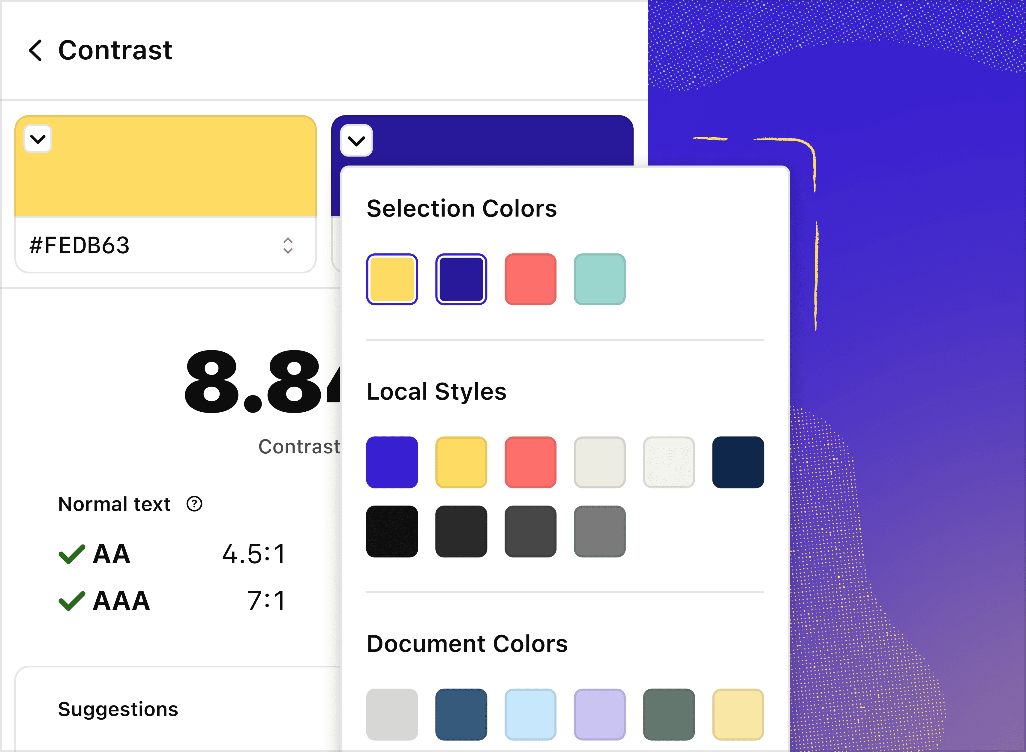
If we don’t get the colors exactly right, or you want to check the contrast of other color combinations in your file, you can use the new drop-down menu to switch out the colors you’re comparing.
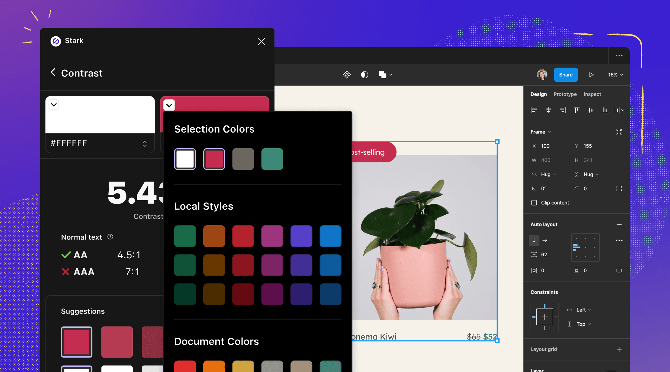
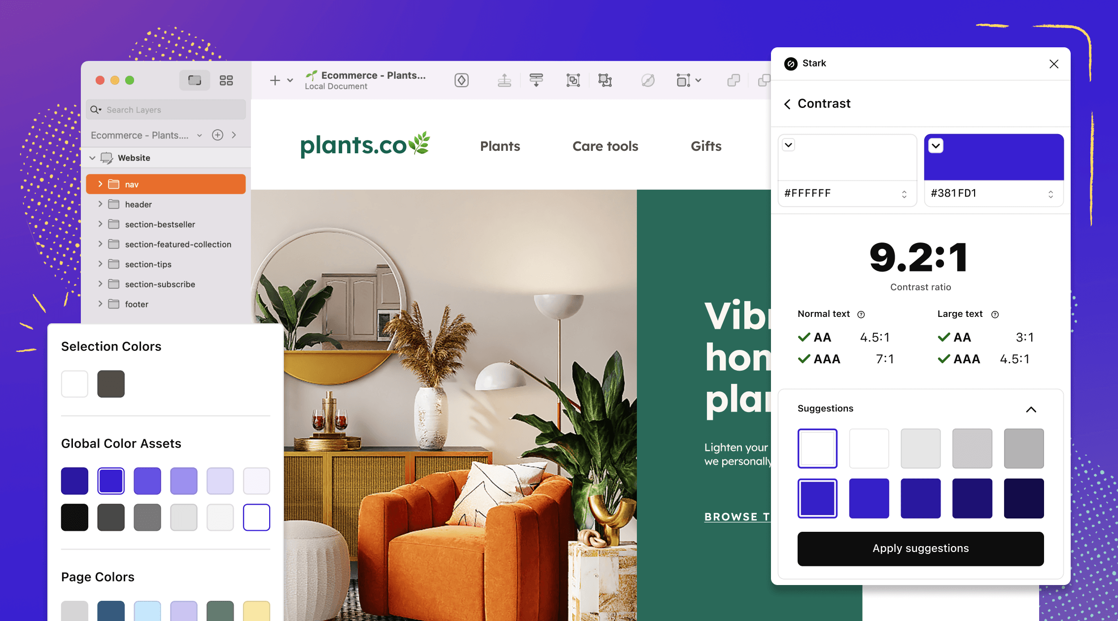
In the drop-down menu, you’ll see all solid colors in your selection and page so that you can compare them quickly and easily. Even if you’ve selected 20 layers with solid colors, you’ll find them in the menu and can pick them from here. And don’t worry—we remove duplicates, so you don’t see the same colors over and over.
We’ve also got some updates that are specific to Figma and Sketch.
Check local styles in Figma
If you use Stark’s Contrast Checker in Figma, we’ll pull in local styles that exist in your file. Figma lets you organize styles into groups using the / naming convention. We’ll keep that organization structure in the drop-down menu to ensure your color styles are just as easy to find in the Contrast Checker as in the Figma sidebar.

Check all colors and libraries in Sketch
In Stark for Sketch, you’ll find local colors from your document, default colors from Sketch, and global colors from any remote libraries you have set up neatly organized in the Color Picker drop-down menu.
To keep things simple, we’ll categorize the colors in the menu for you.

All of these updates to the Contrast Checker and Color Suggestions are available to our Pro, Team, and Enterprise customers in Stark for Figma and Sketch. Try them out today, and let us know what you think.
Don’t have a Pro or Team plan? No problem. Upgrade your account to start using these features today.
Want to be part of a community of accessibility superheroes? Join over 50,000 experts in our Slack community, and follow us on Twitter, LinkedIn, and Instagram.