How to use your design system colors to fix accessibility issues with Stark in Figma and the browser
Learn how Stark connects to your design system in design and code to help you find and fix contrast issues in record time both in Figma and your browser.

Team Stark
Aug 28, 2024

About 56% of accessibility issues originate in the design phase. In fact, color contrast is by far the most common type of issue found on around 81% of all tested websites in the latest WebAIM Million 2024 study. And the same applies to mobile app UI and all other types of visual content.
Designers have a lot of control over color and contrast, and in turn can ensure that every design file is checked before handed over to developers for implementation. This saves both time and money for the company, and ensures that the product experience is accessible for everyone.
Let’s take a look at how easy it is for product teams to find and fix contrast issues using the integration with your design system directly in Stark.

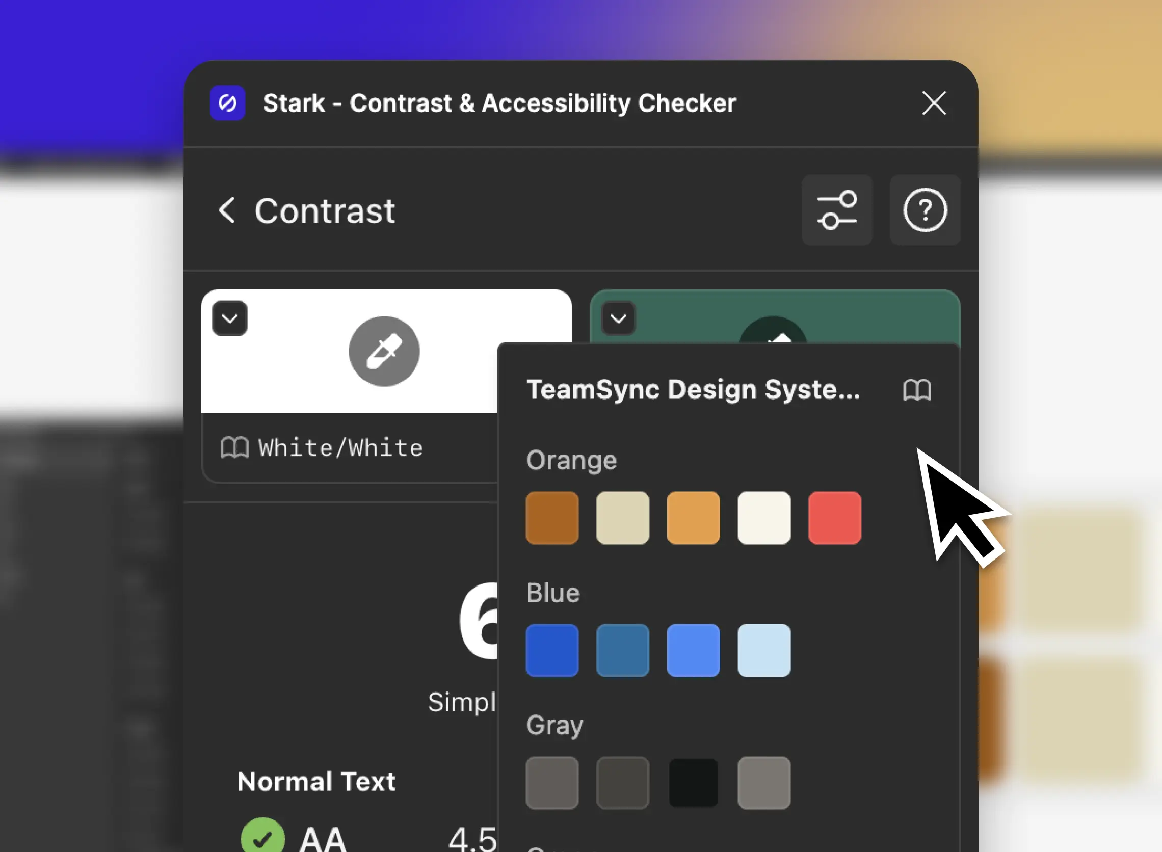
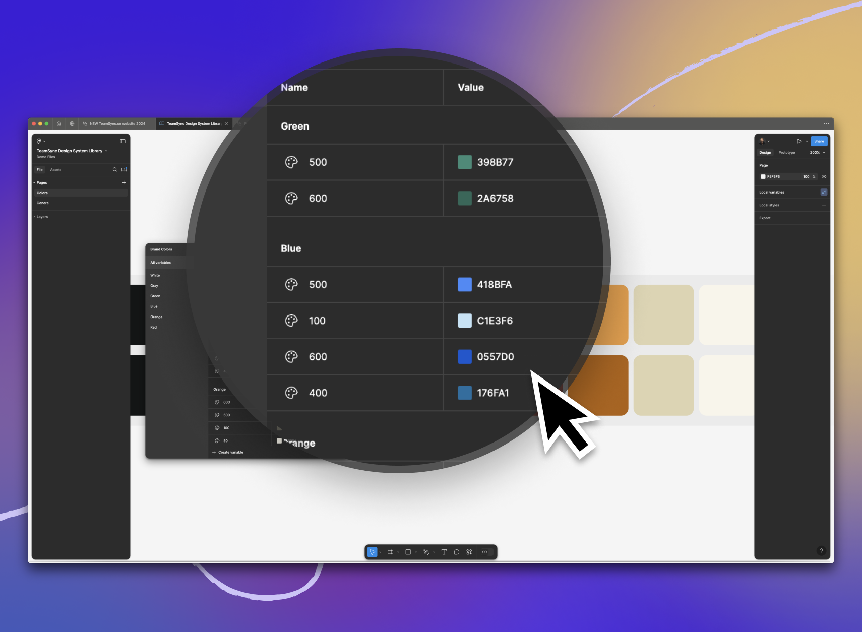
Set up your design system’s color library
Taking the time to set up your design system’s color library ensures your entire team has a solid foundation to build on. Stark supports local color variables as well as remote libraries. Whether setting up a new design system, or working with an already established one, make sure your colors are all properly named and easily distinguishable. You can also use Stark to ensure you pick colors that, when combined, will pass for the required contrast ratios by default.
Find and fix issues with a click
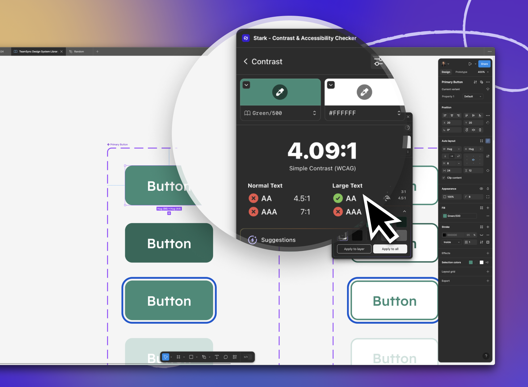
As you’re designing your product, make sure you run contrast checks early and often. Stark will automatically scan and highlight any element that violates contrast ratios. Once you select the issue[s] you want to fix, you’ll see a number of color suggestions from your design system library at the bottom of the contrast checker.
As you select one, Stark will give you real-time feedback if the selected color passes or fails for the desired contrast ratio. Once you’ve selected the color, you can either apply the change only to the selected element or to all elements with the exact same color combination which is a huge time saver.

Pro-Tip: Stark supercharges design system accessibility — if you allow it! Find a color contrast issue in one of your design systems components? Instead of fixing the instance, we recommend you go to the main component and fix the issue there so every file using the component automatically gets updated. Magic!
Check and audit the code
If you follow the above steps in the design phase, chances are high you’ll drastically reduce the number of contrast issues that make it into code. Especially if the color variables in your Figma library and in the code match.
However, there’s no such thing as a 100% forever accessible design system. Sometimes things slip through the cracks, or there’s simply some old code leftover. With Stark in the browser, designers, developers, and QA experts can visually inspect your website or web application for contrast issues.
Just like Stark in Figma, our browser extension gives developers and QA testers real-time feedback on the contrast violations of the selected elements. What’s more though, Stark also offers smart suggestions from your color variables in the code so that you can preview what the new color looks like in the rendered page. All that’s left to do is to replace the color variable from your design system in code and redeploy. It’s that easy!
So, whether you’re working on a staging environment or retrofitting existing code, Stark helps you find and fix color contrast issues based on your design system libraries with ease.
Celebrate the wins
Design systems are a powerful tool to build more accessible products. They’re a great way to connect design and code, and streamline the collaboration across the product team. As you’re fixing contrast issues across design files and code, make sure you celebrate both the fact that you’ve just saved your business money and, most importantly, that your product is now accessible to people with disabilities.