Do virtual whiteboard apps work for everyone?
Online collaboration tools present many new accessibility blockers that can shut out people with disabilities.

Claudio Luis Vera
Mar 24, 2022

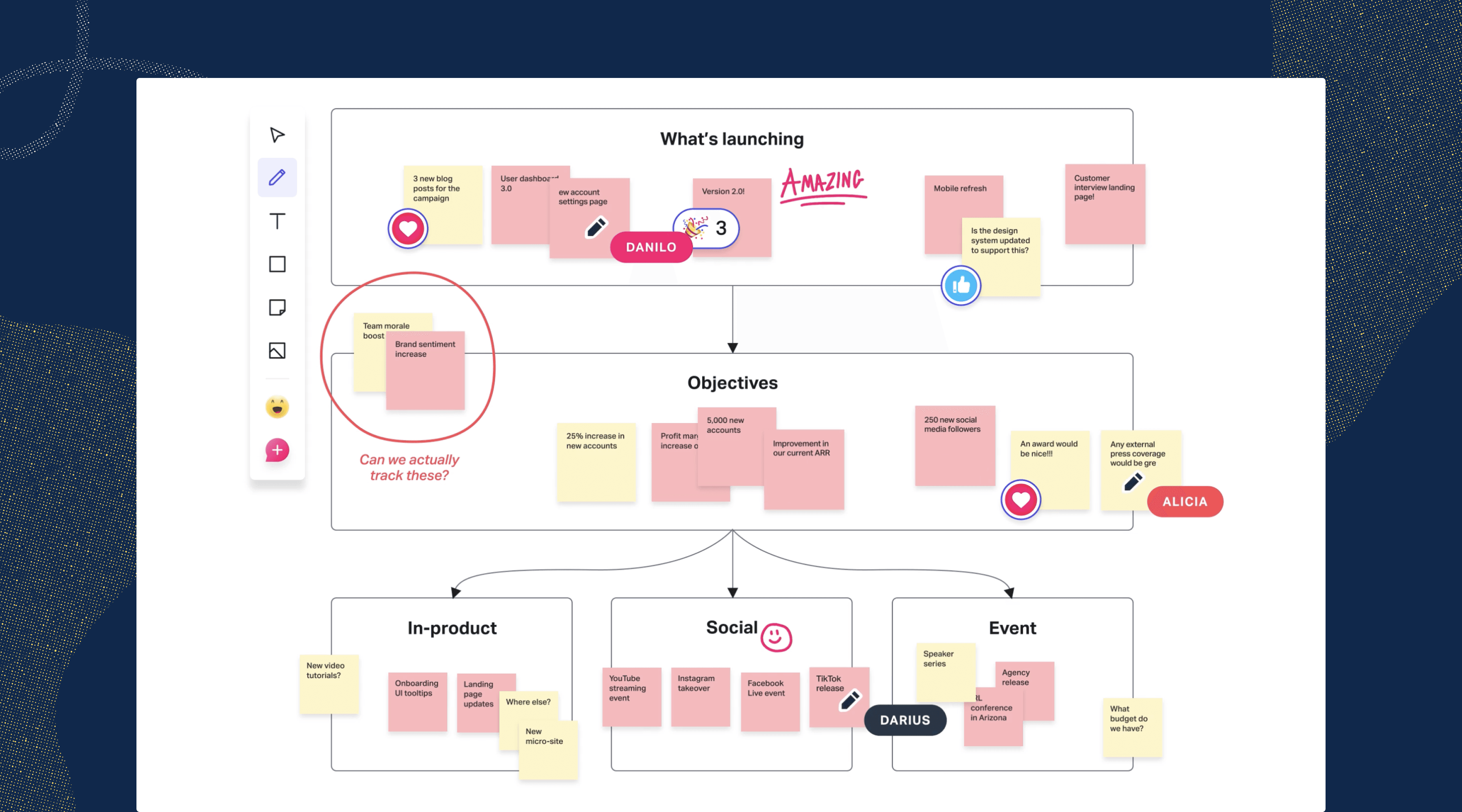
Now that in-person design thinking and collaboration are practically a thing of the past, there's a whole category of online whiteboard apps to replace the dusty dry-erase boards of the real world. You can collaborate with dozens of stakeholders, designers, and coworkers — well, at least with their cursors and avatars.
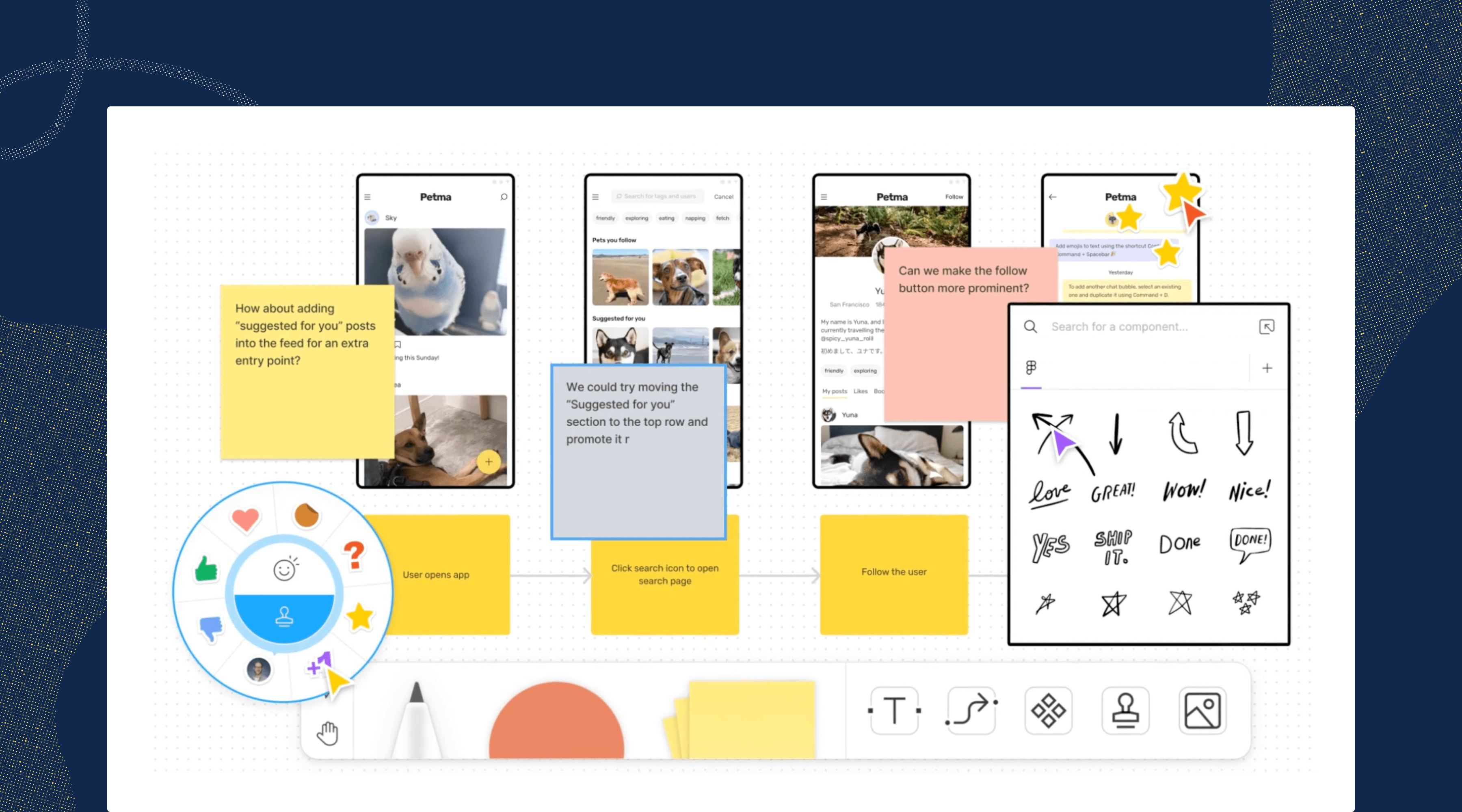
But with the convenience of this new tech, we also introduce new challenges—especially when it comes to accessibility. We're now facilitating sessions—in real-time—with virtual sticky notes, drag-and-drop, jumping around, and zooming all over the place. Here’s the problem: not everyone can take part in this way, especially when you take into account differences in people’s abilities to see, hear, and interact with said technology.
How do you ensure that everyone can participate equitably?
Participation isn't a single activity. Instead, let's break it down into four different types of activity that a whiteboard session would have to support. To participate fully, an attendee must be able to:
Perceive (see, hear) what's happening
Operate the app's controls
Understand what's going on
React and respond to the conversation
These types roughly correspond to the core principles of accessibility, which also share the acronym of POUR. These four activities aren't unique to people with disabilities—they're usability principles that should apply to all users.
So, what does it mean to perceive information?

For blind and low-vision folks
If you have reasonably good eyesight, you can probably scan a screen full of content and understand what's going on within a second or two. It's an ability that most of us take for granted...but what if that weren't the case?
If you have low vision or if you're blind, perceiving means knowing what's on the screen without actually seeing it. You'd need someone or something—a moderator or a screen reader—to narrate the contents of the screen to you. Many whiteboard sessions have a lot going on visually, so you'd also need to be able to navigate the flood of text and voices efficiently. That narration would have to be timely as well, so you're not left behind if the conversation moves on.
What would it take then for a blind or low-vision person to perceive content in a whiteboard session? Here are some guidelines:
- You'd have to be able to access every bit of visual content and each tooltip with your screen reader. If it can't be read, then it may as well not exist.
- You’d need the app to provide you with alerts for changes of state or system messages. You'd want a lot of choices for which alerts you'd want to hear—so a robust set of notification preferences is a must.
- You'd want to make sure that all non-text visual elements (icons, images, etc.) could also be described by the screen reader when you select them.
- In a real-time session, the session's moderator would describe new visual elements as they appear on screen. Sighted users will appreciate this too, especially if they ever get distracted and look away from the screen.
For d/Deaf and hard-of-hearing users
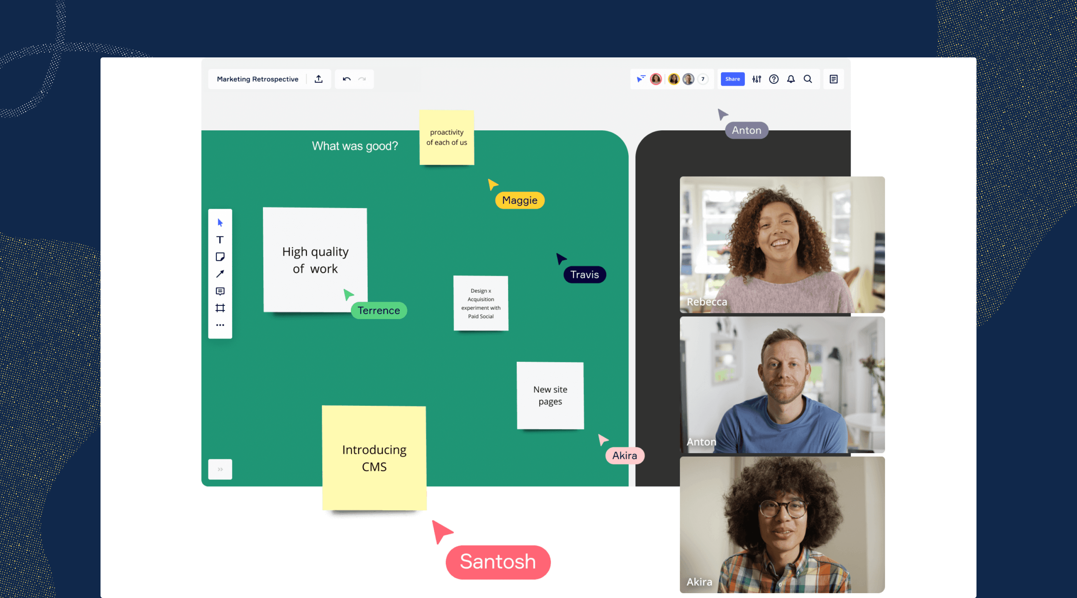
Perceiving content means being able to read what's being said — or having a sign language interpreter translate it into ASL for you. At the very least, a whiteboard app must provide support for closed captions, and preferably the kind that can be repositioned. You wouldn't want the captions covering up something important, right?
In a pinch, a session participant can turn on Live Caption in Google Chrome. Even though it can be helpful when there are no other options, it's not a real solution. Plus, to use Live Captions, those of us who are d/Deaf or hard-of-hearing would have to collaborate using the whiteboard’s watered-down browser version, instead of a more robust desktop app—which is really unfair.
A native whiteboard app should instead have a built-in solution for closed captions, or have an API that allows it to link with third-party solutions for captioning and transcription. To support those of us that are Deaf the app will need to provide a picture-in-picture video inset for a sign language interpreter (WCAG 1.2.6).
Transcripts are super helpful, too, if the organizers are using a high-end captioning service (WCAG 1.2.1) Watching a recorded session can be tedious, especially when compared to the energy of live collaboration. Transcripts spare us that tedium by letting us jump to the interesting parts—without watching the entire recording.
What does it take to be operable?

Most of us are able to work our computers comfortably using a pointing device, like a mouse or a trackpad. But many of us can't work a pointing device — it may take more manual dexterity than we may have, or we may not have the eyesight to see the cursor.
To be truly accessible, a disabled user must be able to do anything with a keyboard that an abled user could do with a pointing device, such as:
- access every user interface (UI) element
- perform every function of that UI element
- navigate to every part and mode of the UI
- access every piece of content
Apps must have keyboard shortcuts for all actions, not just a handful of the most popular commands. You’ll need good documentation that explains all these key commands. Also, the keyboard shortcuts would have to be checked to make sure they don't conflict with existing key commands for assistive technology.
Drag-and-drop activities present special accessibility challenges. They involve selecting an element, moving it to another location, and deselecting it. An accessible solution would have to provide all of this functionality through a keyboard—or there would have to be an alternate means built into the whiteboard app.
It's important to ensure that those of us with disabilities aren't just offered the role of participant. If you're blind, hard-of-hearing, or have any other difficulty, it's not fair to be kept out of a host or presenter role—simply because the app has only been built for abled users. Even if a whiteboard session is covering highly visual material, a blind person shouldn't be kept from hosting or presenting.
Make sure that everyone can react and respond
A common problem for disabled folks is the delay that comes with assistive technology in live sessions. Sign language interpreters, live transcription (CART), and some types of captions can lag as much as 6-10 seconds behind the conversation. That can make it hard to jump in or contribute to the conversation, especially if it moves along quickly.
Fortunately, there's a low-tech solution to this issue: moderators should pause and ask if everyone's good before they move on. This will also give participants a chance to ask questions if the captions aren't accurate. Also, it’ll give other folks in the session a chance to jump in and provide help, if necessary.
Meeting organizers can also provide links to the materials before the live session. This gives people extra time to become familiar with the materials—a huge help if you're blind and use a screen reader.
On the app side, there are other technical fixes that give people more time to do what they have to. First, the apps should not use timers or they should provide a way for users to disable them. Next, users should be allowed to disable auto-save—if you have a tremor disorder and frequently mistype, auto-save will save your mistakes and make them more difficult to undo.
Mind your meeting manners

There are a number of ways in which good meeting etiquette can improve the experience for everyone, especially those of us with disabilities. It's hugely important to ensure that only one person speaks at a time and that there's no crosstalk. Most captioning systems simply won't transcribe anyone's speech if there are multiple speakers, leaving a big gap. Presenters should speak slowly and clearly enough that the captions (or the interpreters) can keep up and be accurate.
If you're facilitating, be sure to introduce every new speaker—it'll help everyone who can't see the speaker ID on the screen. The same is true for any important visuals: it helps when you describe what's being shown on screen.
It's difficult to keep track of where you are in a meeting if you have to zoom in and out frequently. It's especially difficult if all you see is a screen full of gray blocks of skeleton text you can't read. To solve this issue, make sure that there are large enough labels to orient your users even when they're zoomed way out. There should only be a maximum of two different scales for text, so you can cut down on the zooming in and out. Even better, the amount of content should be kept to a minimum to reduce screen clutter and information overload.
Most importantly, organizers shouldn't make any assumptions about the abilities of the attendees. Unless it's a session with a group of immediate coworkers, it's impossible to know if every attendee can see or hear well. Captions should be enabled by default.
But the best way to find out what accommodations people will need is just to ask first. Here's a simple question that should be asked before any session or workshop:
Is there any accommodation or support that we can provide to make your participation easier? Let us know.
Accessibility requirements apply to whiteboard apps too
The makers of whiteboard apps are subject to the same legal requirements and vulnerable to the same lawsuits as websites and other software. To recap: a whiteboard app needs to provide compatibility with screen readers, captions, and full keyboard accessibility. Additionally, the interface must meet the same standards for color contrast that impact websites—and those contrast standards also impact sticky notes and other interfaces.
If a session is being recorded, then it's subject to the same requirements for all recorded media. To comply, the recorded audio must have captions and a transcript. But a solution that identifies who's talking (speaker attribution) makes the transcripts an even better resource for everyone.
A parting thought
There’s no substitute for real-time collaboration, and that can be both a blessing and a curse.
If your meeting technology or whiteboard apps don’t allow disabled people to participate in real-time, then they don’t truly have a seat at the table. If you’re gathering feedback and input during the live collaboration session, any barrier — even a lag on captions — can effectively shut people out of the conversation.
Since no whiteboard app is truly accessible in today's time, it’s really up to meeting hosts to remove the apps’ barriers through better facilitation.
Want to join a community of other designers, developers, and product managers to share, learn, and talk shop around accessibility? Join our Slack community, and follow us on Twitter and Instagram.
To stay up to date with the latest features and news, sign up for our newsletter.