Building accessible digital products using focus and interaction states
Easily guide your users' eyes through visual interest! Learn the what, why and how of building accessible digital products using focus and interaction states.

Claudio Luis Vera
Oct 27, 2021

What is focus?
In digital design and programming, the term focus refers to the state when an interactive element is highlighted or waiting for our input. The element could be a form field on a website, or the thumbnail of a movie, for example. Focus can only be on one element at a time, so as one element gains focus, it causes the previous element to lose focus or blur. To place focus on an element, a user typically clicks on it with a pointing device or uses the tab key to move through an interface.
The element in focus should be the first thing that grabs a user’s attention.
In fact, one could argue that the element in focus should be the first thing that grabs a user’s attention, a property known as the primacy of focus. Many of us find ourselves using adaptive behaviors, like wiggling the mouse, to help us find our cursor or focus when it’s hidden in a sea of visual clutter.
In most digital experiences, a visible indication of focus works in tandem with the cursor, letting the user know which elements they’re interacting with. The most common cursor – a pointer – is controlled by a pointing device such as a mouse.
But what happens when a mouse isn’t an option?
There’s an abundance of situations where the user navigates without a mouse. Instead, they’ll use a keyboard or some assistive technology for their disability, such as a sip-and-puff or a switch. In these cases, a visual indication of focus functions as a critical safety net. Focus, therefore, needs to always be visible on the screen — it can’t go offscreen (as with a carousel) or be intentionally hidden with CSS. When programming, avoid using mouse-specific events like hover or mouseover. Use focus instead to guarantee universal usability. When testing an app, always make sure that there is 100% continuity of focus.
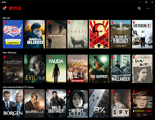
If you’ve ever used a remote to select movies from a streaming service on a smart TV, you’ve experienced how important it is to have a strong visual indicator of focus. One service may use a bold gold ring around a movie’s thumbnail to indicate focus, while another may magnify the thumbnail and throw a drop shadow behind it. In either case, the streaming app would be rendered unusable if the focus indicator were taken away.

By default and as an accessibility requirement, websites must allow users to navigate from one interactive element to the next using the tab key. Apps, even mobile ones, must provide tab navigation on a keyboard as a fallback to touch gestures. Focus, therefore, needs to follow a logical tab order— this means ideally following the order of objects in the source code or DOM.
How do you represent focus?

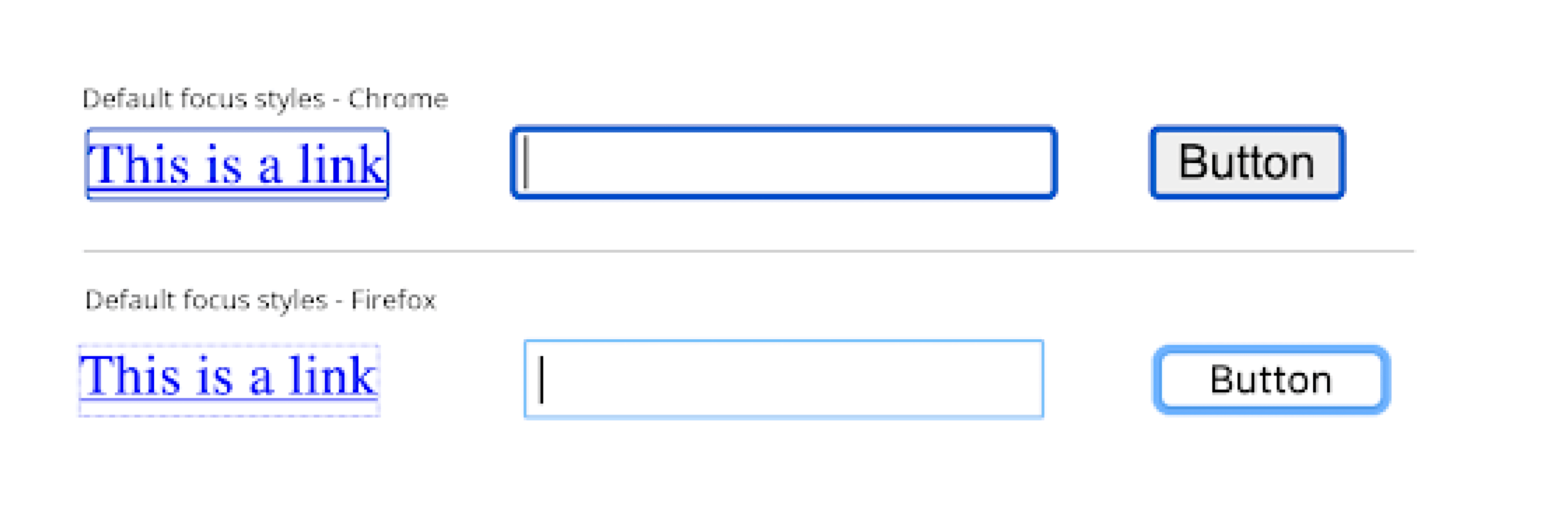
Historically, browser and operating systems have been very conservative in their visual representations of focus. Chrome uses an unattractive blue rectangle; Firefox only recently abandoned its 1-pixel dotted outline. Designers and developers often (rightly) feel disdain for the unattractive browser defaults. Many respond by suppressing focus styles completely.
FYI Note: Don’t EVER do this, because it makes your work unusable for non-mouse users!
Instead, treat the default styles for focus states in the same manner as the browsers’ text default of 16px Times New Roman. They’re an empty canvas waiting for your creativity.
Indeed, the focus state can be modified by virtually every property in CSS, which gives designers enormous freedom when specifying its visual appearance. In fact, CSS transitions allow designers to choose not only from a broad range of static design techniques but from the realm of motion and animation as well.
By default, focus indicators affect the outline property in CSS, which – to put it kindly – hasn’t been fully developed by the browser manufacturers. It doesn’t work with the border-radius of rounded elements, and it’s been designed to blend in. Designers should look at other properties of the box-model for focus states, such as border-width, border-color, box-shadow, and background-color.
But why stop at static design techniques? Our primal brains are wired to divert their attention at anything that moves, so small and discreet micro-animations can be well-suited for achieving primacy of focus — as long as they guide the eye to the element in focus and don’t present a distraction.

The most challenging aspect of designing for focus states is choosing a color. Most brand palettes are designed to have a series of complementary colors that work in harmony. However, to achieve primacy of focus a color needs to be selected exclusively to signify focus, and that color should stand out above all others – including calls to action.
In a design system, the focus color should be established early on and set up with at least two variations: a focus color for a light background, another for a dark theme, and an optional third for when it is adjacent to a similar color.
Focus and design systems
When deciding on the colors that make up the palette in a design system, one of the first steps should be to set aside a unique color to signify focus. While it shouldn’t be the same as the call to action, the focus color should be at least as prominent.
The focus color, therefore, should be one of the most saturated in your brand palette. You may consider a color that differs in hue by 180° (complementary) or 120° (triadic) from your color for calls to action.

Outline isn’t the only CSS property that the focus color can be applied to. It can also be applied to the element’s background color, to its border, to a solid box-shadow, or even text, just to name a few examples.
Focus color is a perfect application for using tokens in a design system. Ideally, your focus color will be unique and never overlap a similar background color. If that’s not the case, then you should consider assigning a second color or token for when these overlaps do occur.
There’s no reason why designers should view focus as an ugly afterthought. Instead, focus should be the designer’s friend in guiding the user’s eye through visual interest.
Want to join a community of other designers, developers, and product managers to share, learn, and talk shop around all things accessibility? Join our Slack community, and follow us on Twitter and Instagram.