Introducing Focus Order
Making it possible for you to create Focus Order sequences and increase a smooth handoff to developers, while ensuring individuals not using mouse gestures or swiping—be it from preference or disability—can easily ‘tab’ through your product.

Team Stark
Mar 04, 2021

We talk a lot about how our job as designers and engineers is to make sure our users have a great experience, can understand what we’re asking of them, and can easily navigate the product to achieve their goal. To do that, users need to find their way around your product in a sequential and meaningful order. But not everyone can do so with a click of a mouse, a swipe on a screen, using a trackpad, or other frequently thought of methods to navigate. Be it from preference or impairment, many users will 'tab' through your product’s screens. So user interfaces should be designed (and implemented) in a way that ensures they can be used without a mouse.
In many cases, users with impairments employ the use of a screen reader, keyboard, or emulated keyboard. Some of you may be wondering: Well how can the user actually navigate around the screen? How does the screen know what to show them?
That’s where Stark’s 'Focus order' comes in! Though sometimes referred to as Tab Order, Focus Order (this is the W3C recommended term) is the sequence in which a user accesses elements on your product. The individuals that can’t (or choose not to) use a mouse 'tab' through your product instead. In doing so, they have to access elements in an order that makes sense — otherwise there is essentially no navigation or wonderful journey through the product. They’re quite literally lost on the page with nothing to interact with, which adds a ton of cognitive overhead and confusion—resulting in not just a confused customer but probably a customer you just lost.
With today’s Focus Order launch, Stark gives you the ability to create that meaningful experience for the users right when you’re designing, and with that further bridges the handoff and educational process from designers to engineers. With just a few clicks, creating a sequence order and adding focus items on your screens make it ridiculously easy for you as a designer to further communicate the intent of your design for all users, and enable your engineer colleagues to truly understand how they should build that out.
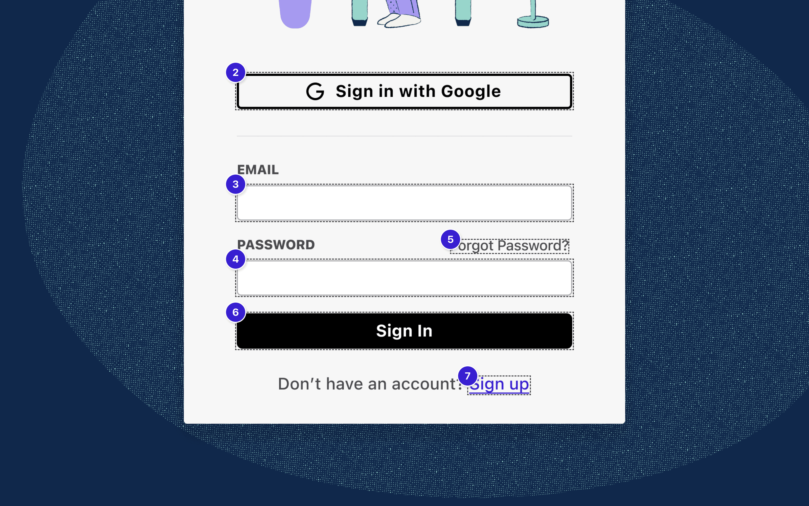
This order you set is as simple as a bit of logic, such as going from your menu to your page body content and buttons. You set this logic up in a way which you expect your users to navigate with their keyboard or input device—which again, we press, needs to be intuitive.

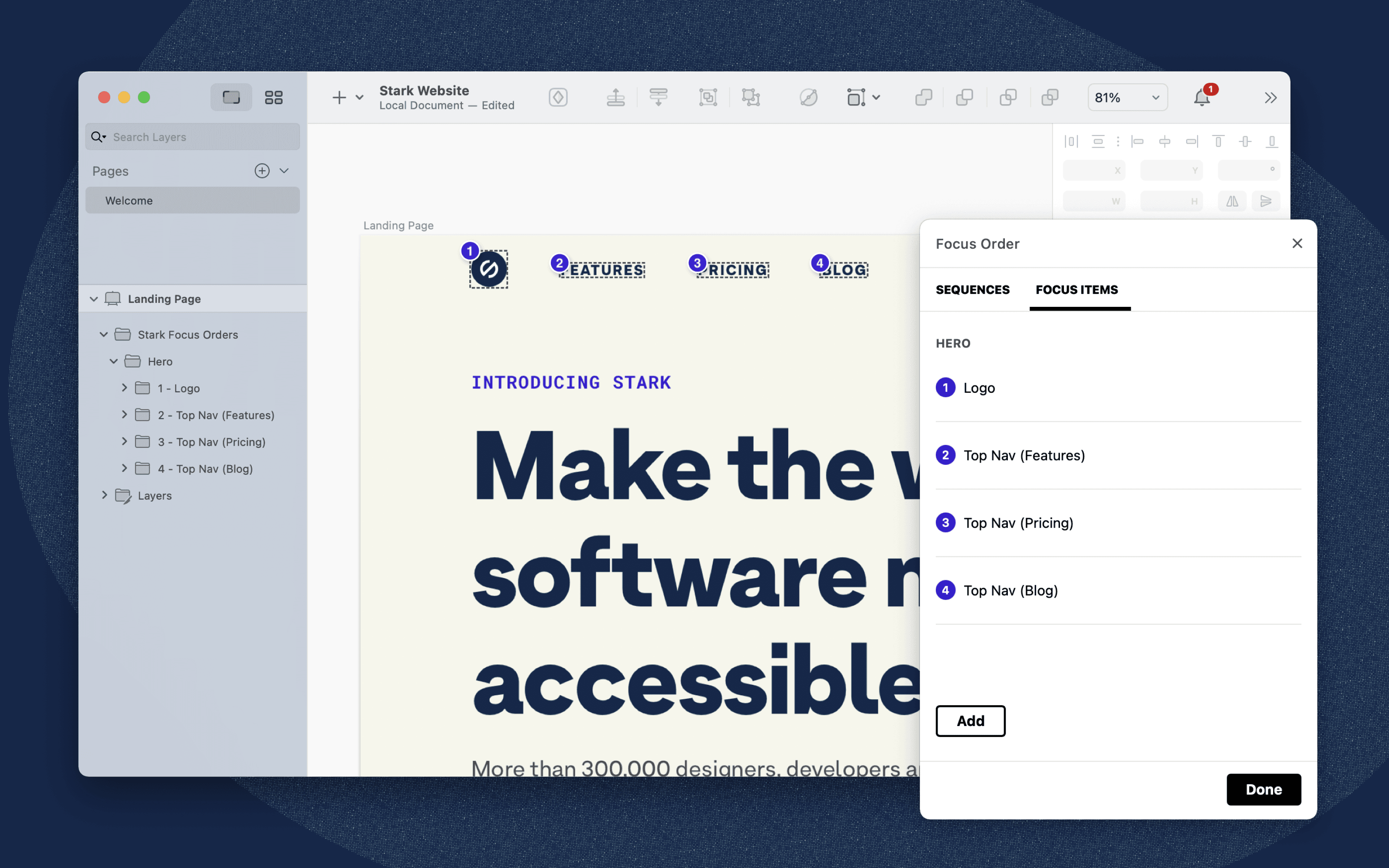
Right within Stark, the first thing you’ll do in Focus Order is create a sequence, click on a layer, and add the focus items to that sequence. It'll automatically attach the sequence to the artboard the layer is in.
Sequences are groups of order items usually designated toward specific sections of your product (think: Hero, Testimonials, etc.). Within Sequences are Order Items, which are the actual annotations on a page you set to interactive elements to determine the order in which a user will navigate through your product. So while Headline and body copy wouldn't be focusable elements—interactive elements are meant to be focusable like your buttons, fields, links, etc.
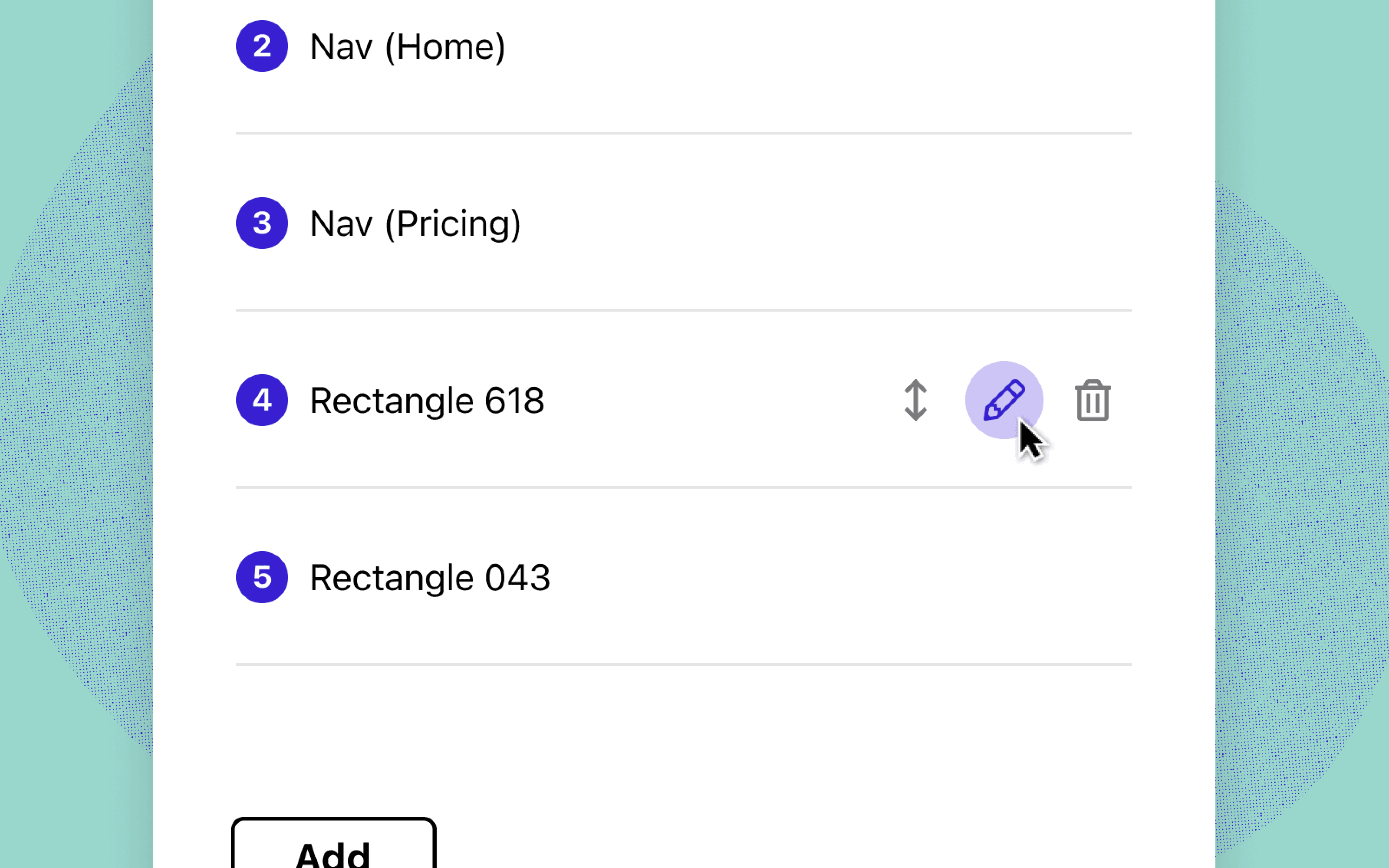
Sequences can have as many Focus Items as are required. And after clicking on your interactive element layers and adding your Order Items, you can edit their name, re-order them, or delete them.

Each of the order items first inherit the layer name. Feel free to edit those names to something more descriptive for engineers during handoff though. They’re tied to a unique ID as opposed to the layer name itself—so you’ll never lose them unless you make the decision to delete them. It also means that changing the focus item name will sync to your layers panel. Your layers panel remains untouched.
A big bonus to the feature is that the Focus Items you set in your Sequences get added as their own [locked] folder in your layers panel. Which means you have the option to export your artboard with the Focus Order sequences—making communication easier for handoff to engineers and in meetings with stakeholders.
The w3c details the techniques, failures, and overall information about Focus Order to get you started. Over the course of the next few weeks, we’ll be pushing out a number of educational content—from guides to blog posts—on what Focus Order looks like for designers and developers. And if you haven’t yet, be sure to sign up for our webinar where we cover what Focus Order is, how to design and build with it in mind, how to use the Focus Order feature in Stark, and the handoff process.
Focus Order is available to both free and paid users, with paid users gaining access to create more sequences. This instantly becomes beneficial when your product (app, website, etc.) has more than one screen (think: Company website with multiple pages, an iOS or Android app, etc).
To stay up to date with the latest features and news, sign up for our newsletter. And as you’re diving in to the new feature, let us know what you think!
Want to join a community of other designers, developers, and product managers to share, learn, and talk shop around all things accessibility? Join our Slack community, and follow us on Twitter and Instagram.