Introducing all-new Language Analysis and auto-fill for Accessibility Notes
These brand-new language tools empower designers and writers to create more inclusive content ensuring that text is easy to read and accessible to anyone.

Team Stark
Oct 01, 2024

Text and in turn language makes up a big part of the content we consume daily and large parts of the user interfaces we interact with constantly. This applies to all users whether we navigate digital products with our eyes, hands, fingers, screen readers, or any other type of alternative controls. Yet there’s a big gap in quality when it comes to consuming textual content for different types of users.
Designers and writers are in a prime position to make a positive difference here – not just for people with disabilities, but for anyone by ensuring text is contextually as easy to understand and navigate as possible.
Today we’re adding a whole new set of tools to the Stark platform (starting with Stark for Figma): Language analysis focusing on undescriptive phrasing, reading level, as well as sensory text information. In addition, we’re making it even easier (and faster!) to annotate your designs for screen reader experiences so your documentation during handover to developers is as clear and efficient as it can be.
Language Analysis (beta)
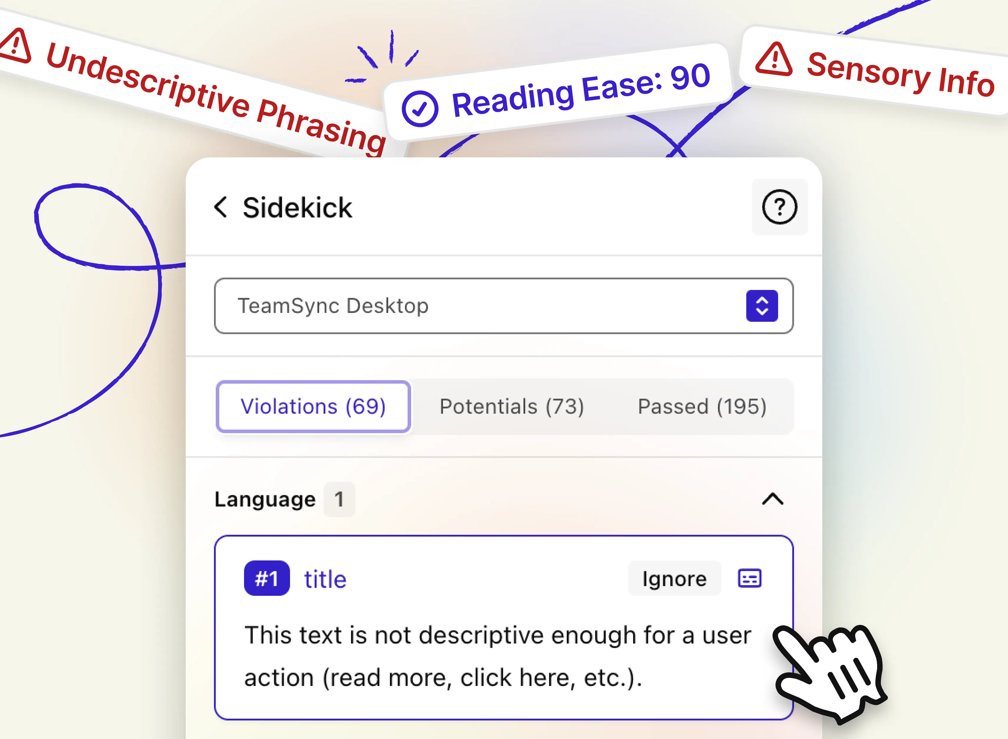
These new, powerful language tools are available directly inside Sidekick. So, as soon as you run a scan using the “Auto Scan & Fix” button, Stark will scan the selected frame or entire page and list the new language-specific issues alongside the other categories of issues you already know.
Let’s dive into the details!
Undescriptive phrasing
It’s still common to find buttons and links with labels such as “Read more” or “Download” which are in violation of WCAG criterion 2.4.4. This criterion ensures that links and buttons describe the purpose of the link / button, giving context to the user so that they can clearly understand what will happen when clicking the interactive element.
Stark will now flag the use of undescriptive phrasing providing in-context guidance for designers and copywriters to fix them before these issues make it into code or production.
Reading level
Ensuring any content is of appropriate reading level is essential to making it accessible to anyone. While there’s lots of nuance and a broad spectrum of factors to consider, one of the most established and proven principles to make content broadly accessible is to aim for grade 8 reading level as measured by the Flesch Reading Scale.
The Flesch Reading Ease gives a text a score between 1 and 100, with 100 being the easiest to read. Scoring between 70 to 80 is equivalent to school grade level 8. This means text should be fairly easy for the average adult to read.
Stark now automatically scans the textual content in your design and highlights any text that scores below 60 as a potential issue that requires a manual check. Click the “Ignore” button for any textual element that you don’t want to be scanned in the future and brought up in the future.
Sensory text
According to WCAG criterion 1.3.3 it’s important to ensure content isn’t solely identifiable by its shape, color, or location. For example, using language like “press the button to the right” or “click the blue button” isn’t accessible for certain users, and is considered a WCAG failure.
Auto-fill for accessibility notes
Creating beautiful, easy-to-use screen reader experiences starts with designers and copywriters making intentional choices for hierarchy, navigational order as well as wording in the design phase – and documenting those decisions for developers in the hand-over process.
Stark’s Accessibility Notes make this process super easy by providing specific annotations for every platform’s unique screen reader technology (think iOS, Android, React Native, Windows, etc) – and even a platform-agnostic annotation tool in case your engineering team is working across multiple platforms.
With Auto-Fill for Accessibility Notes we’re turbocharging your annotation workflow:
No more, manually filling out every section of the annotation (which can be quite a lot depending on the target platform), instead simply
-
select an element (e.g. a button) in your design
-
click “Add item” and
-
Stark will automatically fill in the annotation.
It’s that easy! And in a future update, Stark will also be able to pull in additional element parameters (such as “role”) from your design system.
Available today for all paid Stark plans
We’ve been hearing from a lot of our Stark customers and community members who’ve been asking for more language analysis tools ever since we’ve introduced scanning for the most common alt-text issues. And we couldn’t be more excited about the updates we’re announcing today.
Giving designers, writers, and product makers the tools to intentionally design (and check for) well-crafted language experiences is a huge step in closing the quality gap in content accessibility. And for companies prioritizing this work in the design phase it provides an additional benefit of avoiding costly retrofitting cycles in code or, worse, in production.
Language Analysis is rolling out in beta and supports the English language to start, with more languages to follow soon. For our Enterprise customers we’re also working on setting organization-wide benchmarks for reading level and other language-specific tests which will be available in a future update.
We love to hear your feedback
As you explore and use these new tools, we’re looking forward to hearing your thoughts and feedback at support@getstark.co, or join the conversations in our Stark Slack Community, on LinkedIn, and on Twitter. We can’t wait to see the inclusive experiences you will create.