Introducing Stark for Adobe XD
Right from Adobe Max, we’re so excited to announce Stark as a plugin for Adobe XD! From the simplicity of the UI, to the clear separation of functionality, XD makes it easy and beautiful to design with accessibility in mind.

Team Stark
Oct 15, 2018

A new look, features, and an expanded mission
Right from Adobe Max, we’re so excited to announce Stark as a plugin for Adobe XD! From the simplicity of the UI, to the clear separation of functionality, XD makes it easy and beautiful to design with accessibility in mind.
Why Adobe XD?
When we first kickstarted Stark, we knew that in order for it to be successful, it needed to live within a designer’s workflow. We had to figure out the best software with not only the most reach, but the most potential and where we thought we could provide the most benefit to its users. Adobe is a giant in the design world, and in our mind originally, not a milestone we’d hit immediately—until the XD team reached out to us to discuss bringing Stark to XD.
Working with the XD team has been exciting, fast paced (in such an organized way), an absolute pleasure, and their eagerness to bring Stark to the Adobe ecosystem has been humbling.
As we said upon announcing Stark coming to XD, and our being supported by the Adobe Fund for Design, the effort and assistance from them has not only been encouraging, but a reassurance that we as a community have the ability to innovate and move design as a whole forward.
Getting Started

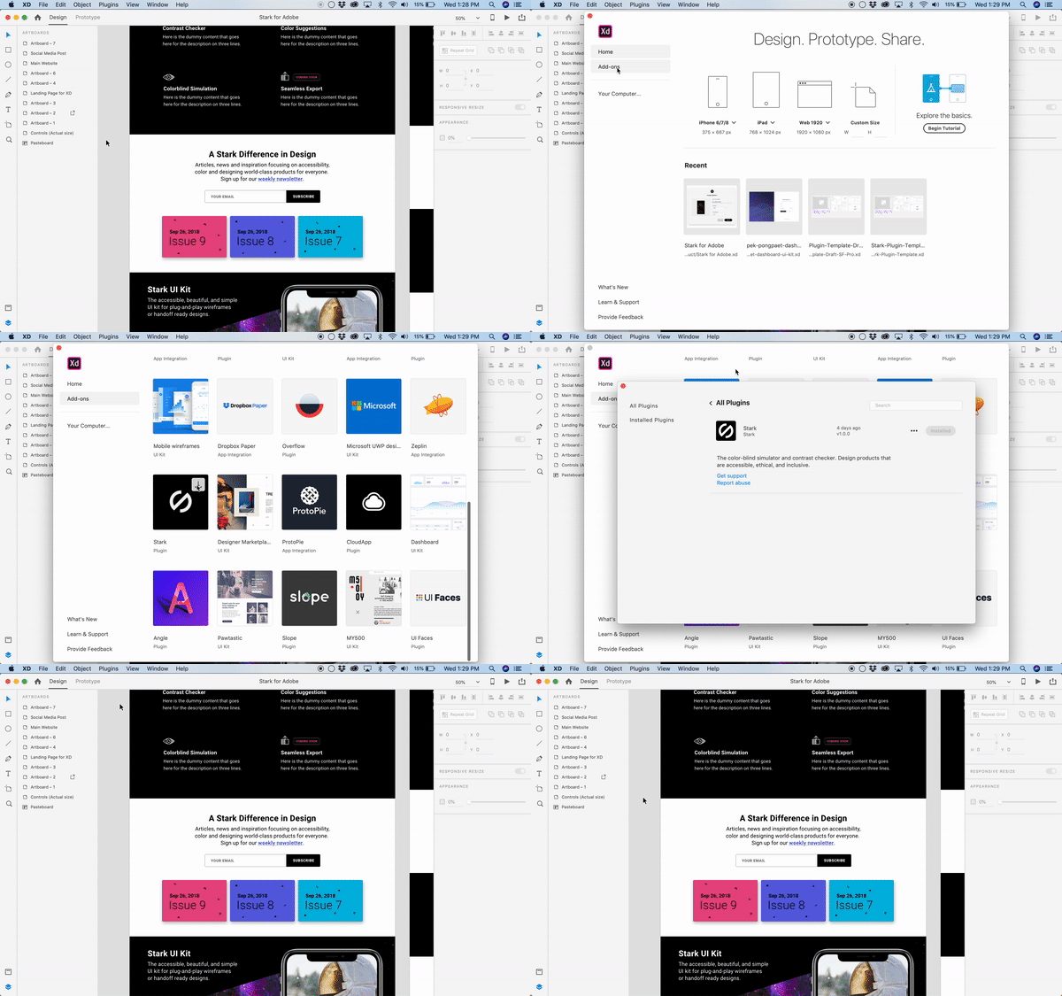
Installing plugins in XD is a breeze. To do so:
- Click on the
Homeglyph in the upper left of XD to view yourWelcome Screen - Click
Add-Ons - Scroll down to Stark and click on the arrow to download
Using Stark
Upon installation, Stark will be available by clicking the Plugins option in your toolbar up top where the Colorblind Simulator and Contrast Checker are ready to be used. Use Stark to better choose colors that appeal visually no matter the color blind type, to checking that the contrast ratio of said choices is high enough.
After selecting an artboard, simulate what your design looks like for each 8 types of colorblindness. Page between artboards using the selector and zoom in wherever necessary to get a better look.
Select two layers and run the contrast checker. Not a passing color? Swap between the foreground and background to see if alternating the colors ensure it passes.
All based on WCAG 2.1 standards.
What’s Next
Without going into too much detail (to save you time and get you started designing with Stark!), next we’ll be tackling:
- Education: We know that a product as crucial to designs as Stark is pointless without material to educate you with data, a why and help on the most frequently asked questions. Baking that into Stark is key for us as a product, but more importantly for you and us as designers.
- Export: Easily export the different colorblind simulations and results of your designs for your teammates, stakeholders, and clients.
- Color Suggestions: Colors didn’t pass? Stark will suggest a number of color pairs that pass which can then be used instead.
And much more. But we’ll save that for later… ;)
We’re stoked about the position we’re in and the direction we’re headed. Adobe and specifically the XD team are listening to those using the product. They’re moving fast and if what we have here is the baseline, we’re excited for what’s to come—especially as a team working side by side with them. So here’s to designing beautiful experiences that are accessible, ethical and inclusive. We have the world at our finger tips, and nobody should be deprived of that privilege.
Once you check out Stark for XD, we’d love to hear from you and see what you’re working on. Share it using the hashtag #passwithstark.
Want to talk shop with folks discussing all things accessible, ethical and inclusive design? Join our Slack community. Want the latest on accessibility, inclusivity, and some Stark news in your inbox every week? Subscribe to our newsletter, and follow us to talk shop on Twitter.