Supercharge Accessibility with the all-new Stark Suite
Meet the new Stark Suite and get started with a Free, Pro, or Team account today.

Team Stark
Aug 10, 2022
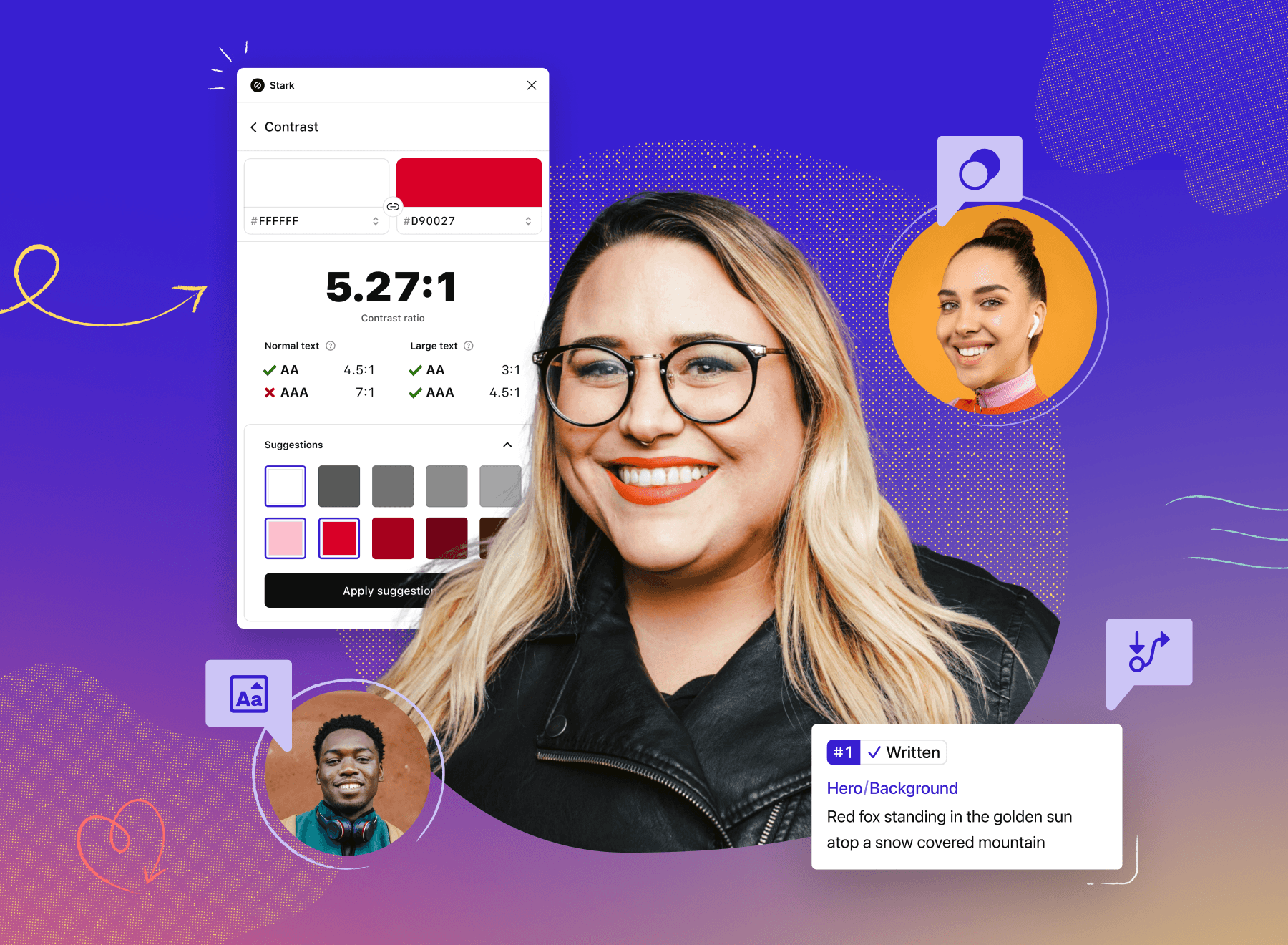
Today, we’re thrilled to unveil the all-new Stark Suite that includes plugins and extensions for the most popular design software, browsers, and brand-new tools to streamline your accessibility workflow.
In 2017, we embarked on a mission to make the world’s software accessible for everyone by empowering designers and developers to build accessible products from design to code more efficiently. Over the years, we’ve learned from you, our community, about the daily challenges you face ensuring that your apps, website, and SaaS products are inclusive, accessible, and compliant. You inspire us, and we want to thank you for helping us make Stark better every day.
Many of you have told us about the time and money you waste having to manually check design files and codebases, clean up messy handoffs and spreadsheets, or go back to the drawing board to fix an accessibility issue you could’ve caught earlier.
But it doesn’t have to be this way.
Accessibility, supercharged
At Stark, we imagine what the most efficient accessibility workflow looks like, from start to finish, for your entire product team. Deeply integrated with the tools you already use and brought together into a workflow you’ll actually love, the Stark Suite is every designer, developer, product manager, and QA expert’s accessibility toolbox.
We started with essential tools for designers to collaborate on and create accessible, beautiful products from the beginning. Now, with over 40,000 users and over 8,500 teams across startups and Fortune 500 companies, we’re introducing brand-new tools to empower anyone on your team to create, develop, and test with accessibility in mind.
Plus, we’re bringing Stark to even more platforms by adding extensions for browsers Microsoft Edge and Brave to help with rapid accessibility checks and design and code fixes. By expanding our suite, we’re not only covering more of the end-to-end product development cycle but 90% of the design-tool and desktop-browser usage market.
Let’s meet the Suite
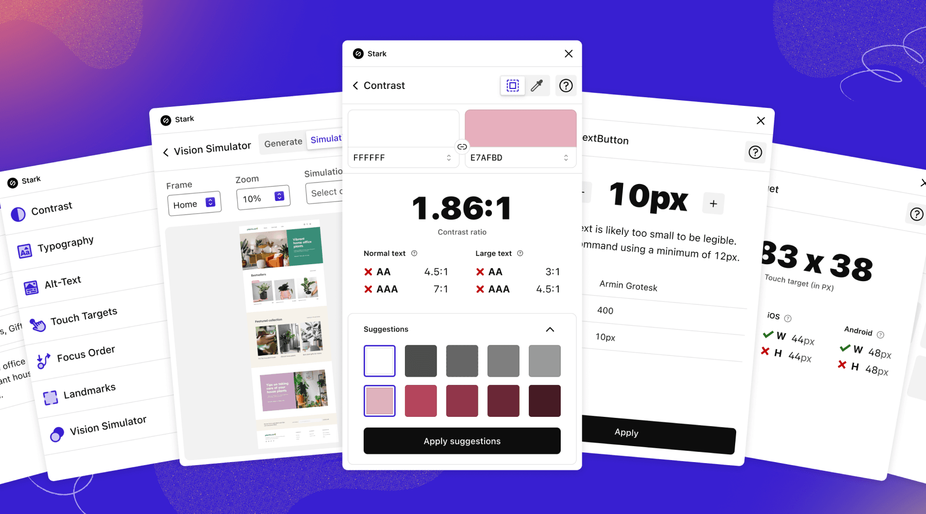
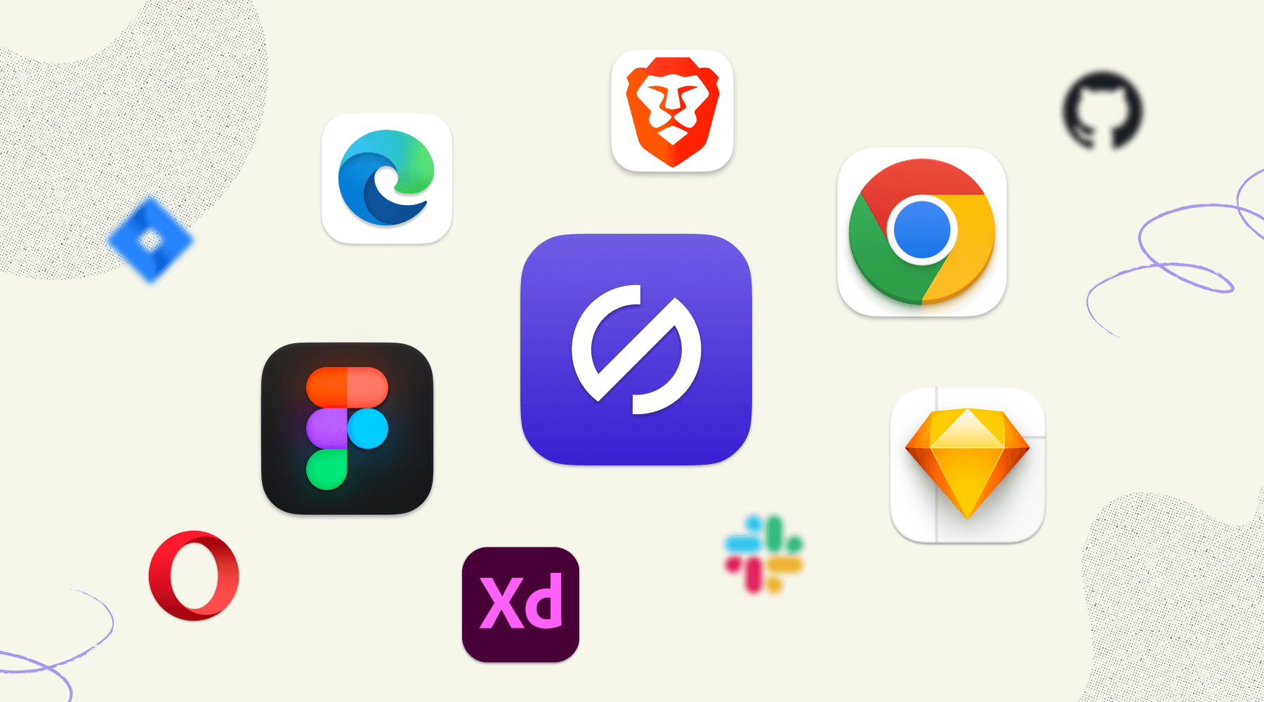
With plugins for Figma, Sketch, and Adobe XD, and extensions for Google Chrome, Microsoft Edge, and Brave, the Stark Suite has everything you need right when you need it. And we’ve added Alt-Text Annotations, Typography Analysis, and Touch Targets to your accessibility toolbox all wrapped in a new beautiful design. Combined with automation and in-app education, Stark makes it easy for teams to make any digital experience accessible.
Alt-Text Annotations
Any UX or web copywriter will tell you that knowing what to write for an alt-text description isn’t so easy. “Should I start the description with ‘image of’?” “Are emoji OK?” “Is this a good place for me to add keywords?”
Stark’s Alt-Text Annotations take the guesswork out of knowing which images need alt text and what to write. Whether you use the plugins for Figma and Sketch or one of our browser extensions, we’ll let you know if any images are missing descriptions.
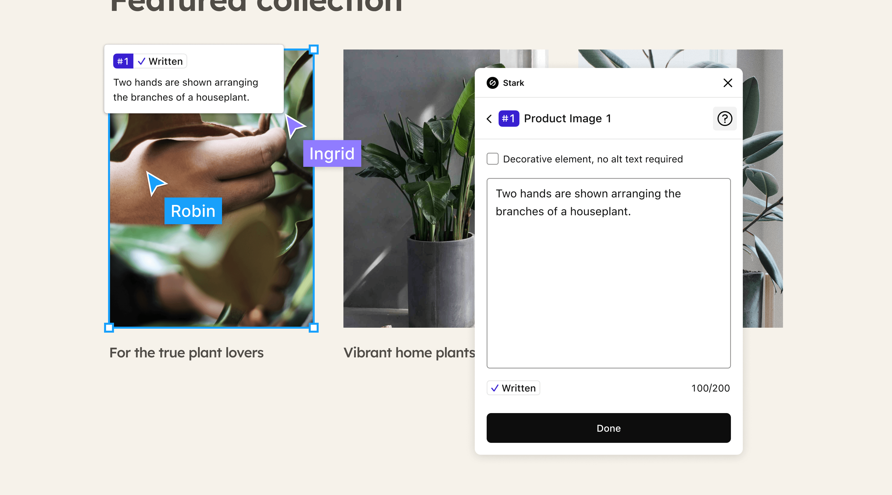
To use Alt-Text in the plugins, you can add descriptions directly to your artboard and learn best practices along the way. You can also mark images that don’t convey valuable information as decorative, so you can skip adding alt text.
With the browser extensions, we’ll automatically scan your live website or web app and list all the images we find so you can test and see whether or not they have alt text at a glance.
Typography Analysis
The typography you choose is foundational to providing a visually accessible experience. For your written content to be as accessible as possible, it needs to be legible and readable for people with all types of vision.
With Typography Analysis for Figma, Sketch, and our browser extensions, you scan the text in your design and get a detailed reading of your fonts. If any font size is too small, we’ll recommend the minimum size you should use.
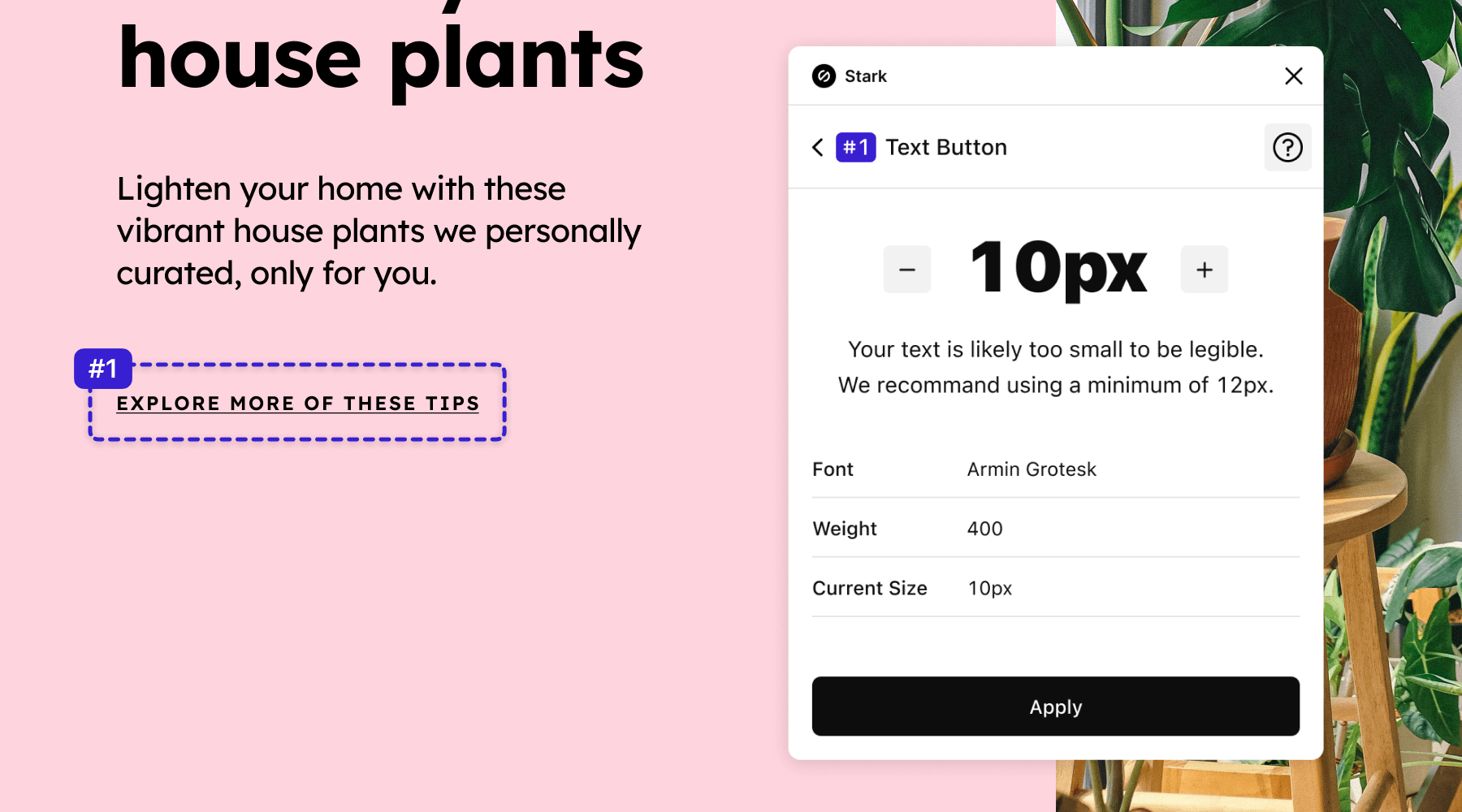
You can jump in and make the suggested changes to your artboard in the plugins. In the browser extensions, we’ll automatically scan and list the font sizes that are too small and enable you to test adjustments with Live Preview right in the browser. When you’re done just copy and paste the adjusted sizes from your developer console into your editor of choice.
Touch Targets
Small targets are great for a dart board but not for your mobile app. Primary actions in your interface should always be easy for anyone to complete, whether they have a disability or are accessing it from a jostling bus on a morning commute.
Our Touch Targets tool scans your design and highlights whether or not different elements meet the size requirements across web mobile, iOS, and Android guidelines.
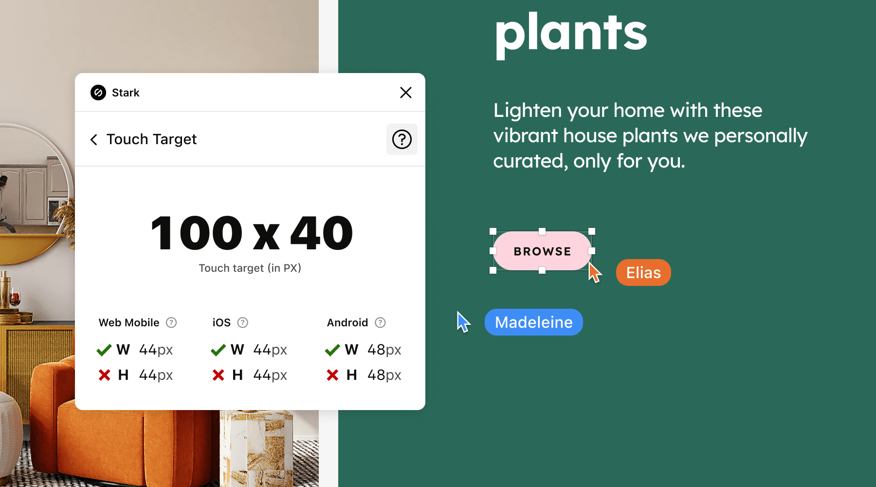
In both the plugins and browser extensions, you’ll get precise pixel measurements for your touch targets, so you know what needs to be changed.
Live Preview
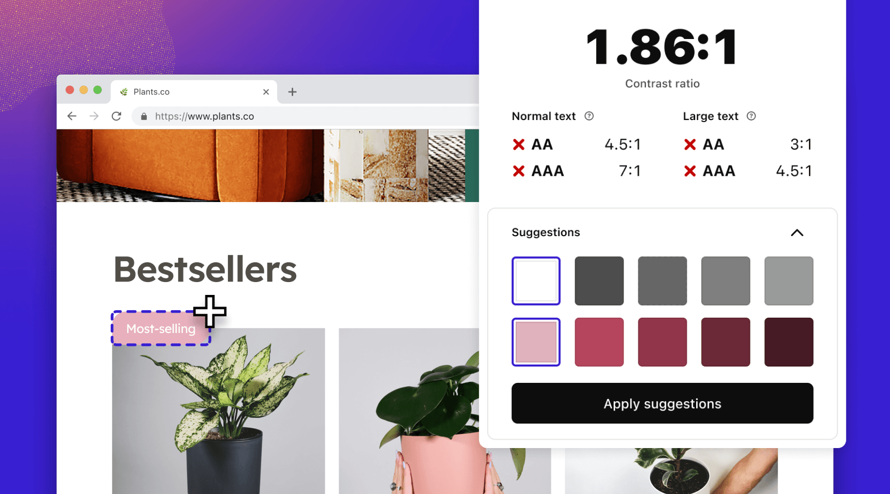
Accessibility checks aren’t just for your design files. With the browser extension, you can Live Preview any color and typography suggestions we make for your website or web app directly from your browser. Once you’re happy with the changes, bringing them to your codebase is as easy as copy and paste.
Focus Order in browser extensions
In addition to all these new tools, we’ve added Focus Order to our browser extensions for Chrome, Brave, and Edge. This is a frequently-requested update that we’re happy to deliver.
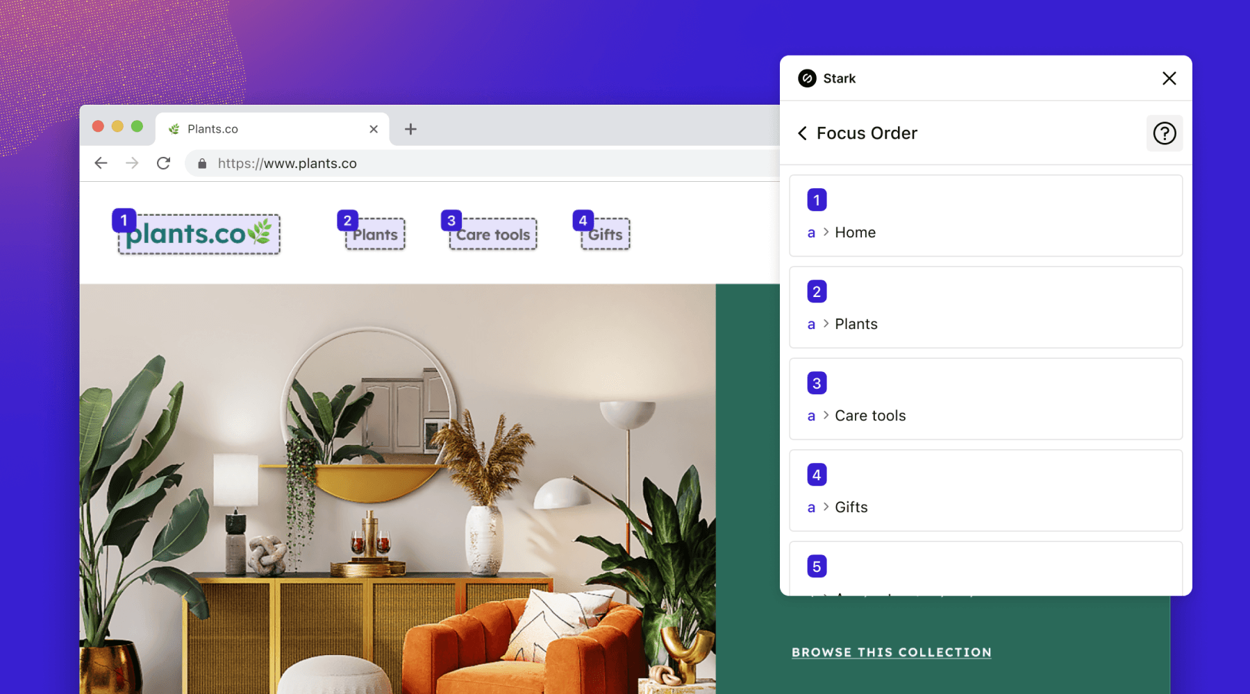
You can now test whether your Focus Order is implemented correctly within your website, online shop, blog, or web application code.
Get started for free, go Pro when you’re ready
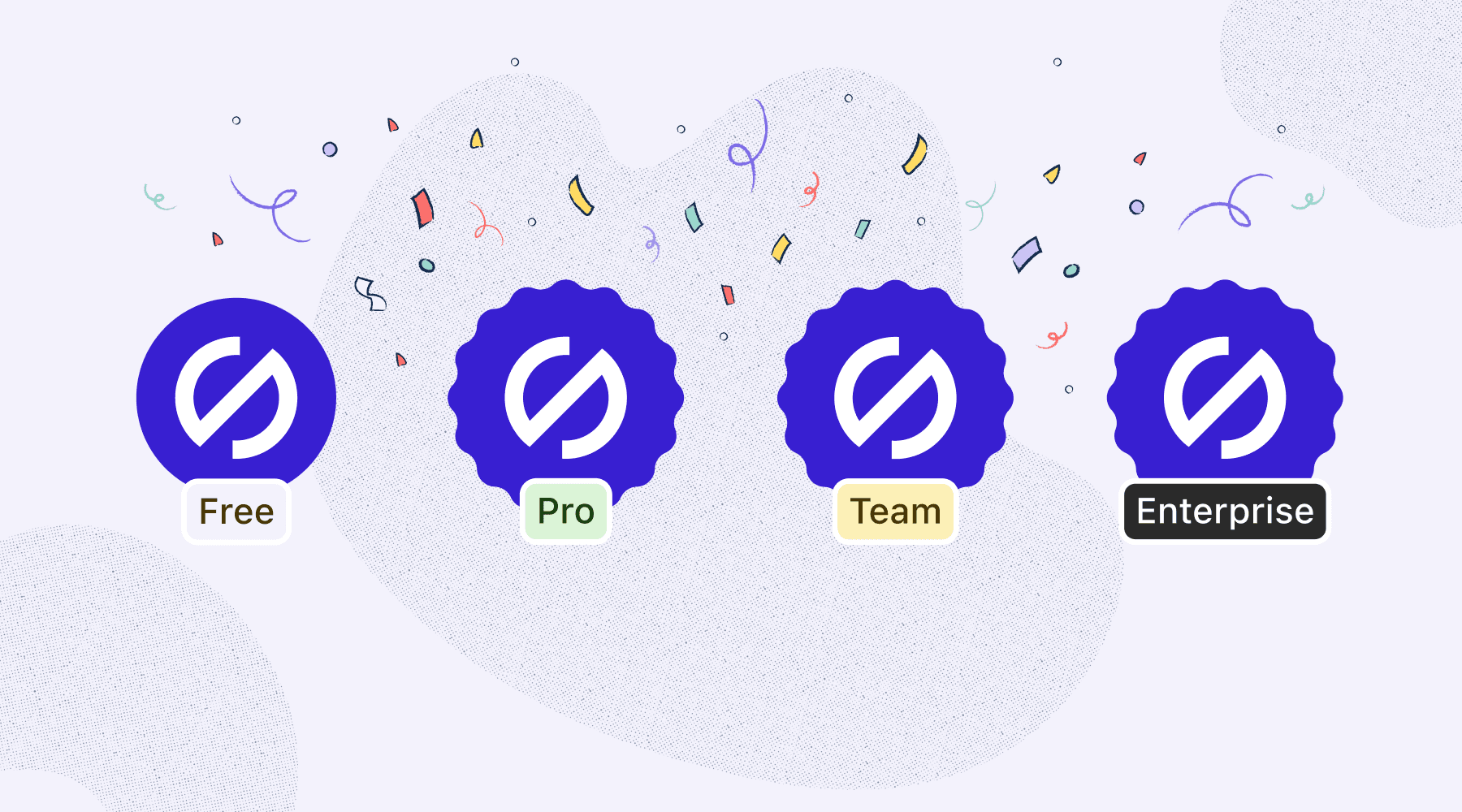
We’re introducing new pricing plans to give you more access to the tools you need, no matter what plan you’re on. If you’re just starting your accessibility journey, a free plan lets you explore Stark’s most-loved features like Contrast Checker and Vision Simulator. When you’re ready for more advanced features, you can upgrade to Pro for as little as $10 a month.
We’re also making it easier for large teams and companies to get started with our new Team and Enterprise plans. With security features like SSO and lots of flexible options, these plans are designed to meet your team’s unique needs.
Free
Create an account to get started with our Contrast Checker, Color Suggestions, and Vision Simulator. Now, all you need to do to use these features is log into your free Stark account.
Pro
If you’re actively managing an accessibility workflow from design to code, our Pro plan comes with powerful features to help you build and test accessible software in record time: Focus Order, Landmarks, Alt-Text Annotations, Typography Analysis, Touch Targets, Live Preview in browsers.
Team
For teams of 5 or more, this plan comes with all the features available in Pro, plus centralized administration, account management, and billing. You’ll also get brand-new security features like SSO, priority support, and access to Stark’s beta program.
Enterprise
For our growing segment of enterprise customers, we’re offering maximum flexibility with advanced account management, enterprise-grade security requirements, and workflow integrations.
Where we’re heading next
In the coming weeks, we're rolling out our new Stark for Mac app to everyone after a successful beta period. Stark for Mac brings the suite to a new level, giving you and your team the hub you need to automate accessibility checks, learn best practices as you go, and so much more.
To bring it back to the beginning, this all evolved from our mission of making the world’s software more accessible for people with disabilities. As our CEO and Co-founder, Cat Noone, says, “that starts and ends by giving teams the educational material and tools they need to do their best work and ensure their products are accessible from the design stage.” That’s what we’ve always offered and what our fellow product makers will continue to inspire us to deliver.
Want to be part of a community of accessibility superheroes? Join our Slack community, and follow us on Twitter and Instagram. You can also sign up for our newsletter to stay up to date on the latest features and news.