Your new Project Dashboard v2 in Stark is here
Now your team can get a rapid overview by monitoring trends, identifying critical issues, and understanding what's improving or needs attention—all in one dashboard.

Team Stark
Apr 03, 2025
Every software team needs a flight hub for the critical work done in all areas of the product development lifecycle; a central dashboard to track what's taking off, what's in the air, and what's coming in for landing — from general product work and security, to accessibility. Without this critical view, it's nearly impossible to understand how a lack of accessibility monitoring impacts development velocity, team efficiency, and most importantly, product quality for end users.
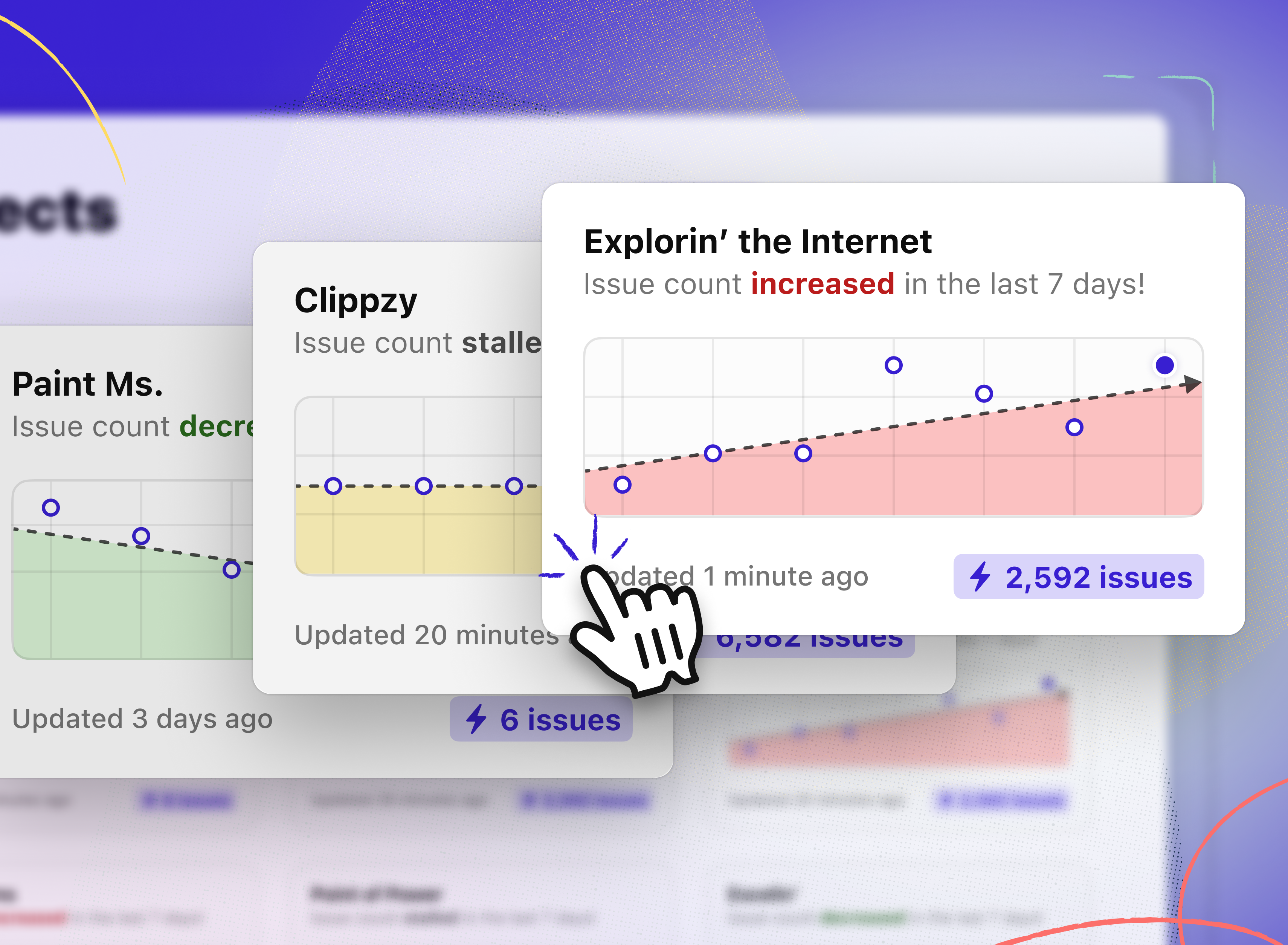
Today, we're excited to launch a completely redesigned Project Overview to give your team the window it needs into your projects, and enable you to better understand the progress or regression, and which issues need immediate attention—whether in active development or being retrofitted.
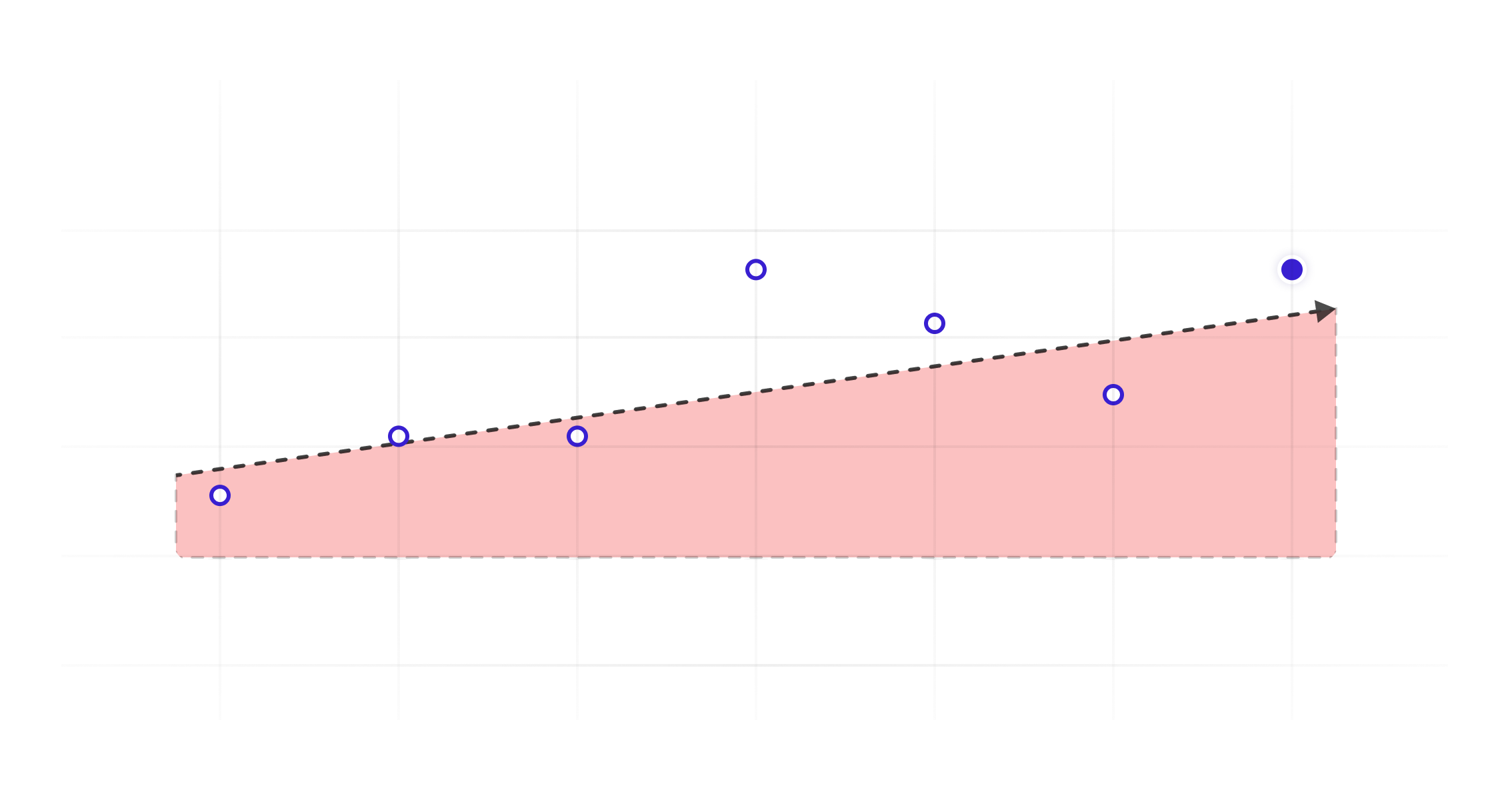
Now everyone, from stakeholders to project managers, can instantly get an overview of each project, including: general info, total issues, and graphs with trend lines for whether or not the project is stalling, getting worse, or improving over the course of the last 7 days — making it possible for you to prioritize what matters most and celebrate progress with your team.
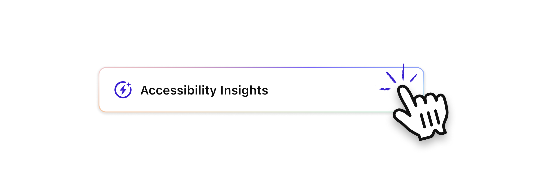
What we’re really pumped about is that this is just Project v2.1. Soon the dashboard itself and reporting will provide even richer insights with our Accessibility Insights — helping you identify patterns and, as always, providing targeted suggestions to fix them.
Best part? The new dashboard is available to everyone so go load up a bunch of projects, and check out all your nifty graphs!
We’d love to learn more about what you’d love to have in your ideal “flight control”, so please share your thoughts and feedback at support@getstark.co, or join the conversations in our Stark Slack Community, on LinkedIn, and on Twitter.