Work with Stark in your favorite design tool

Stark for FigJam

With Stark for FigJam, your team’s accessibility conversations start at the whiteboard. Keep track of everyone’s tasks, share and discuss feedback, and learn best practices for building the most accessible products as you go.

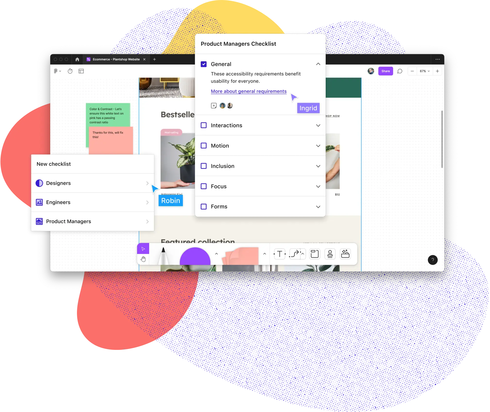
Stark for FigJam shown with the discipline UI showing Designers, Engineers, and Product Managers. To the right, a popup shows the Product Managers checklist with the General category selected and expanded. All of this sits on top of a FigJam file open to a plants website.

Speed up your accessibility
workflow from months to minutes

More than 40,000 designers, developers, product managers, and accessibility experts from over 28,000 companies use Stark’s suite of integrated accessibility tools in their daily product development cycle. Join them today!

Your accessibility to-do list

Role-specific checklists for better team collaboration

Accessibility Checklists in Figma and FigJam are tailored to a designer’s engineer’s, and product manager’s expertise, so you can ensure you’re solving for each task from different angles.

Get started for free
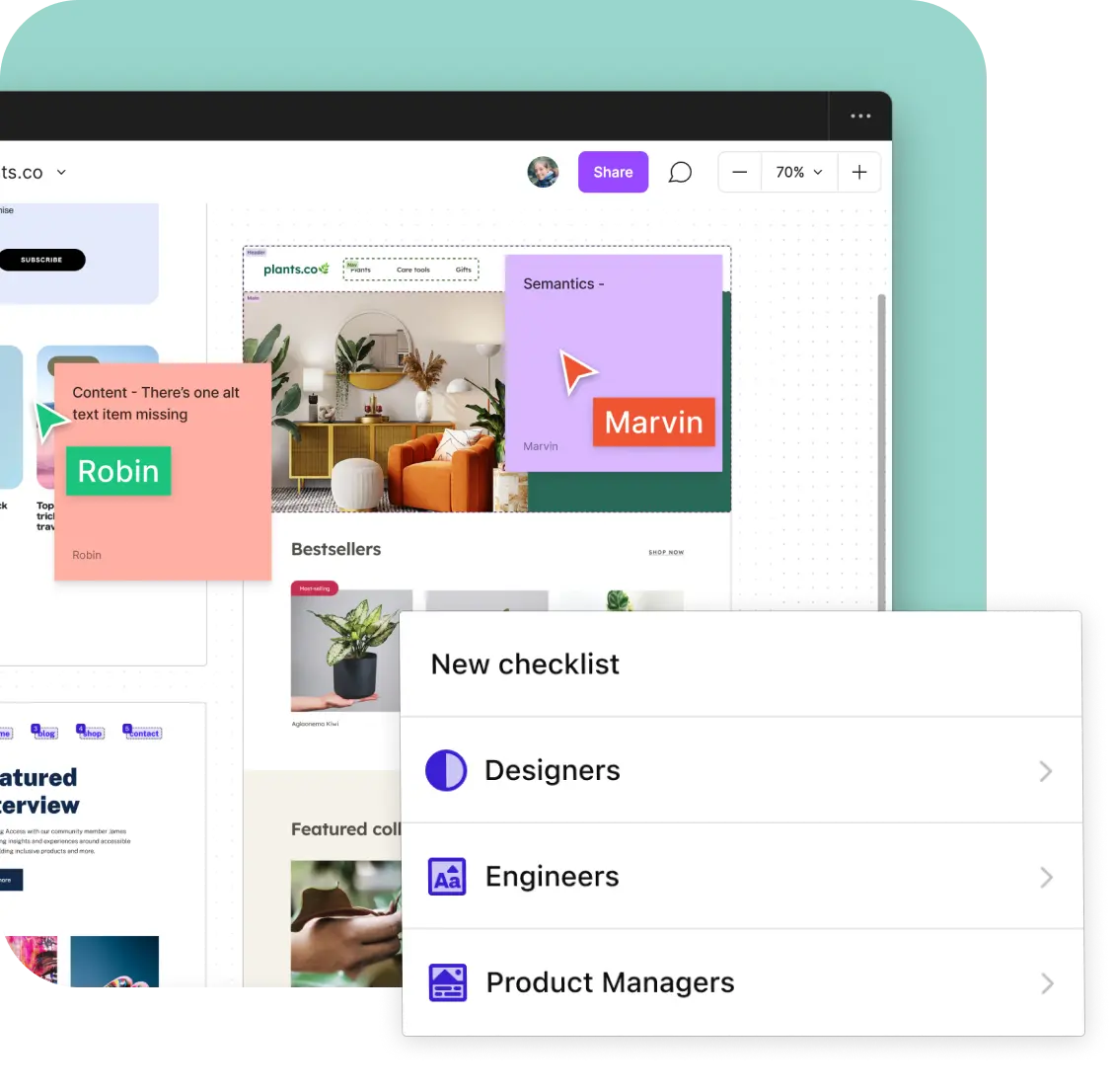
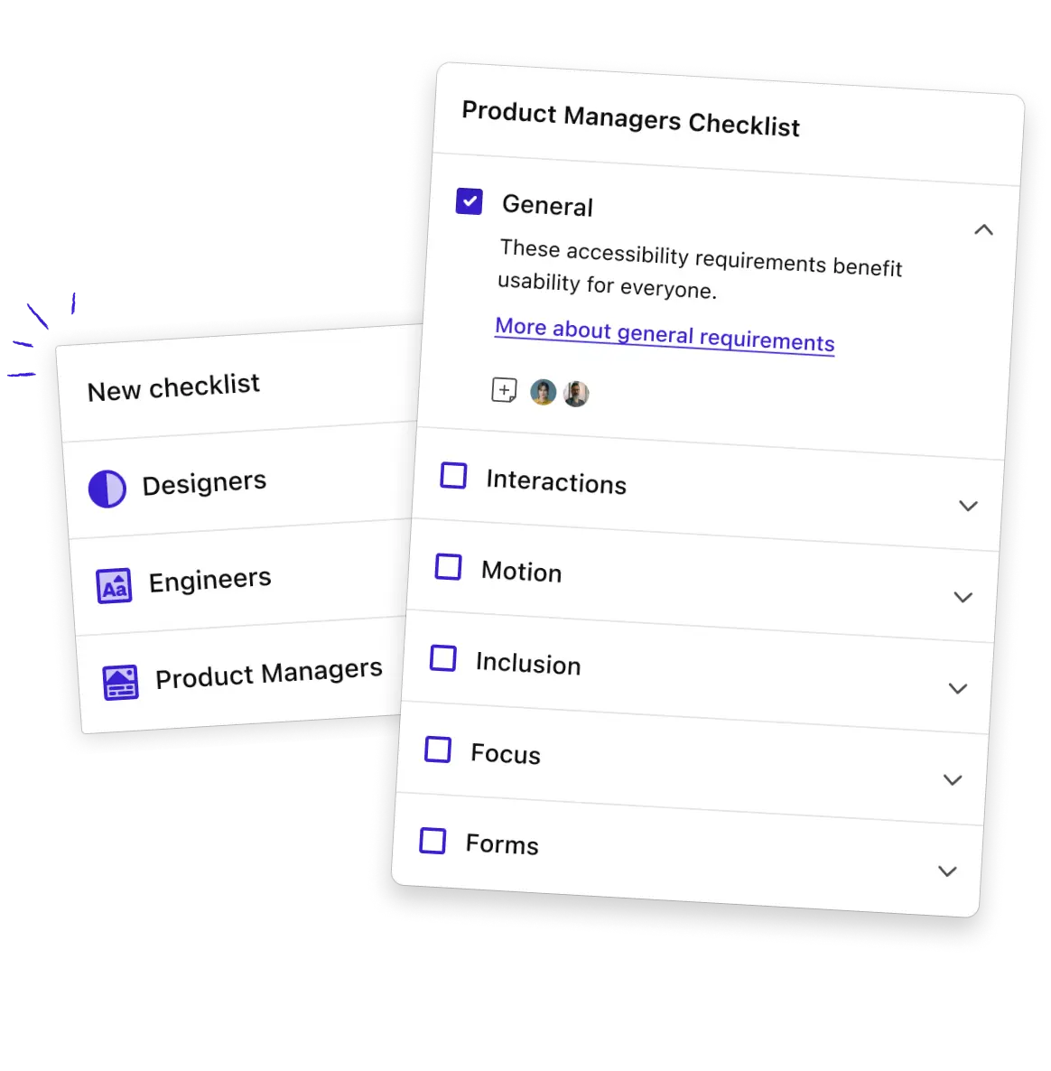
A FigJam screen shown with an overlay of Stark's checklists allowing the user to click Designers, Engineers and Product Managers.
The Stark Project Manager checklist showing the General category expanded. Two users have added comments and there is a link to learn more about General requirements for Project Managers.

Keep your team on track

Check off your tasks, track your team’s progress

Stark’s Accessibility Checklists tell you exactly what requirements you should meet before marking a task as complete.

Get started for free

Train on the job

Learn as you go

Stark is your accessibility sidekick. Learn best practices for meeting requirements to complete each task, making it easy to get started and get done.

Get started for free
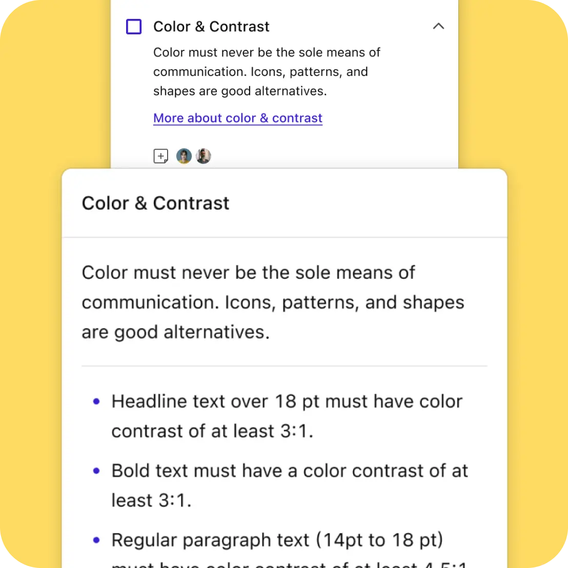
The Color & Contrast popup of the Stark Checklist shown with a bulleted list of things a designer can do to ensure they are adhering to good contrast standards.
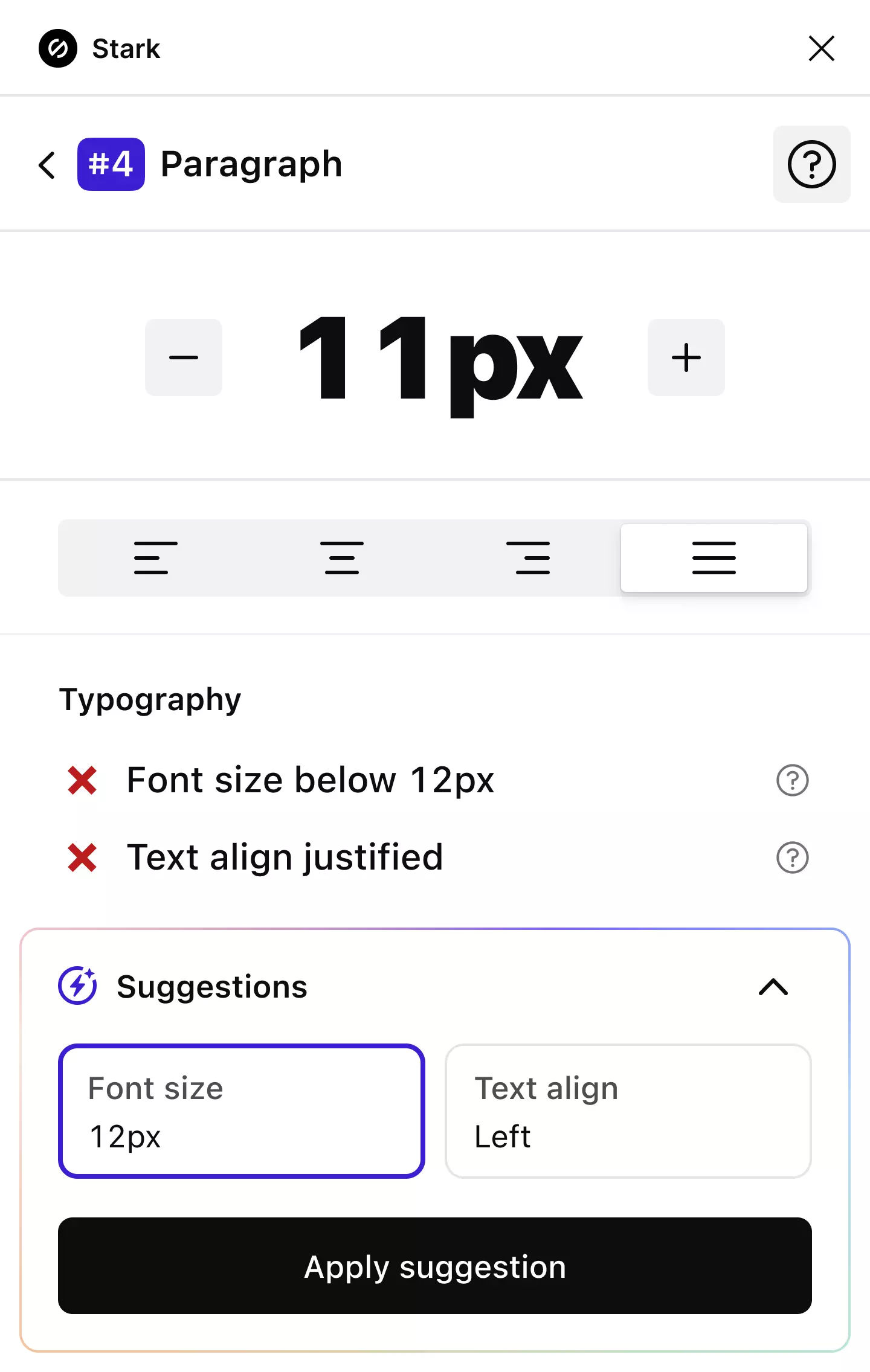
The Stark Typography analyzer showing font details for a design component with options to remedy it by increasing the size.

Brainstorm accessible solutions

Share feedback from start to finish

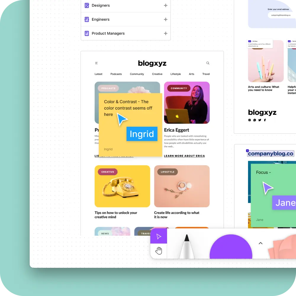
FigJam makes it easy for teams to leave comments during whiteboard sessions. With Accessibility Checklists, you can add sticky notes to tasks so everyone can see thoughts, questions, and comments left about the UI.

Get started for free

It takes a village

Join the Stark community

Connect with a global community of experts from all industries and stay up to date with the largest collection of accessibility resources on the internet.

Join our community
Group of Stark users clustered in a circle with teal, yellow, and coral colored circles surrounding them.

So, you’re ready to get started and supercharge accessiblity?

Step 1

Start with a free account

Wherever you are in your accessibility journey, we believe you should have access to the best tools.

Step 2

Download and install Stark

Download and install Stark for FigJam and begin your accessibility journey with a checklist for every discipline.

Step 3

Join a Team when you’re ready

From Reports & Insights to access to our Beta program, there’s much more you can do with a Team plan.

Come for the features,
stay for the magic

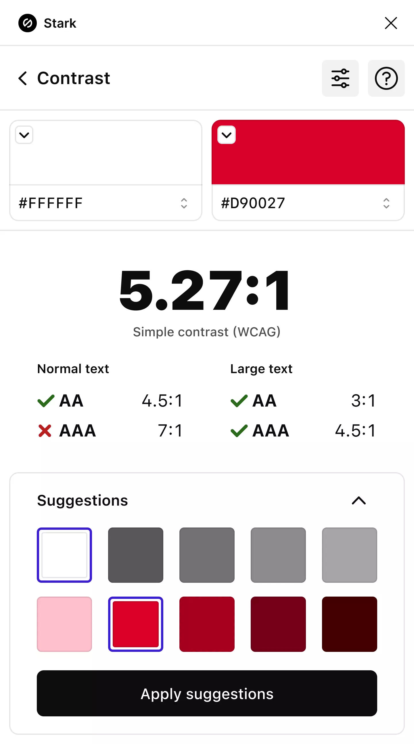
The Stark Contrast Checker showing white and red colors failing AAA WCAG standards and showing two rows of passing suggested colors at the bottom.

Contrast Checker + Color Suggestions
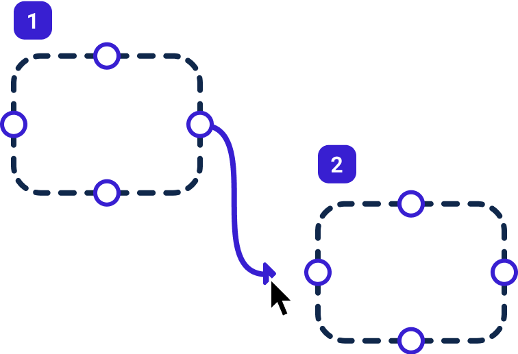
Two bounding boxes connected with a line and annotated with the numbers 1 and 2 showing the intended order of focus.

Focus Order

Landmarks

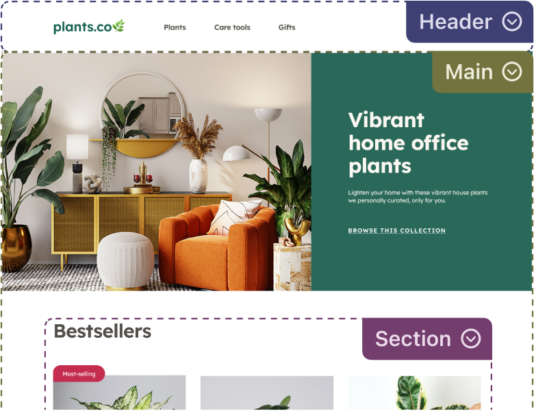
A website about plants annotated with the Stark Landmarks feature highlighting the header navigation, main content of the site, and a section of bestsellers.

Vision Simulator + Generator

The same photo of a living room covered in plants with a mirror on the wall and an orange chair to the right is shown in the various colorblind simulations that Stark offers including Protanopia, Tritanopia, Achromatopsia and more.
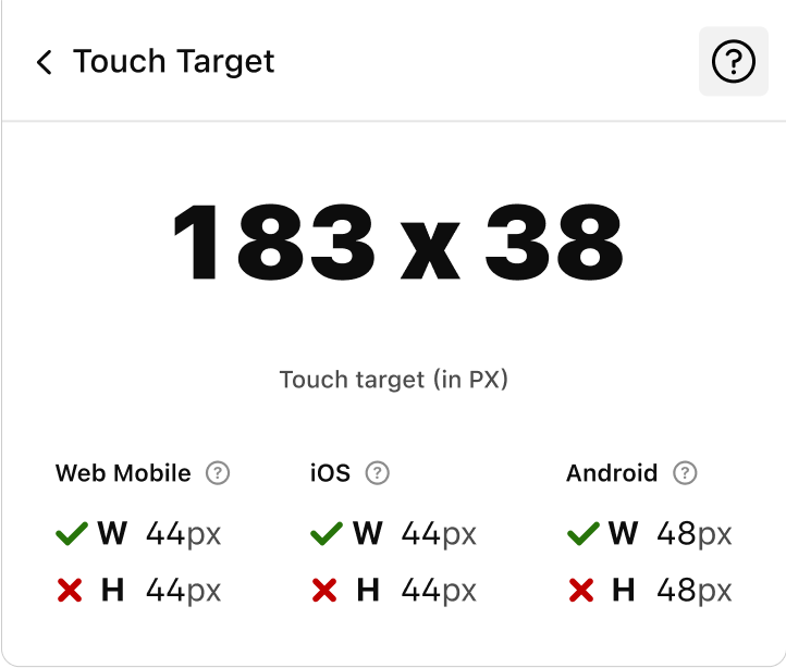
Stark's Touch Target tool showing a layer not meeting Web Mobile, iOS, or Android standards for touch target height.

Touch Targets

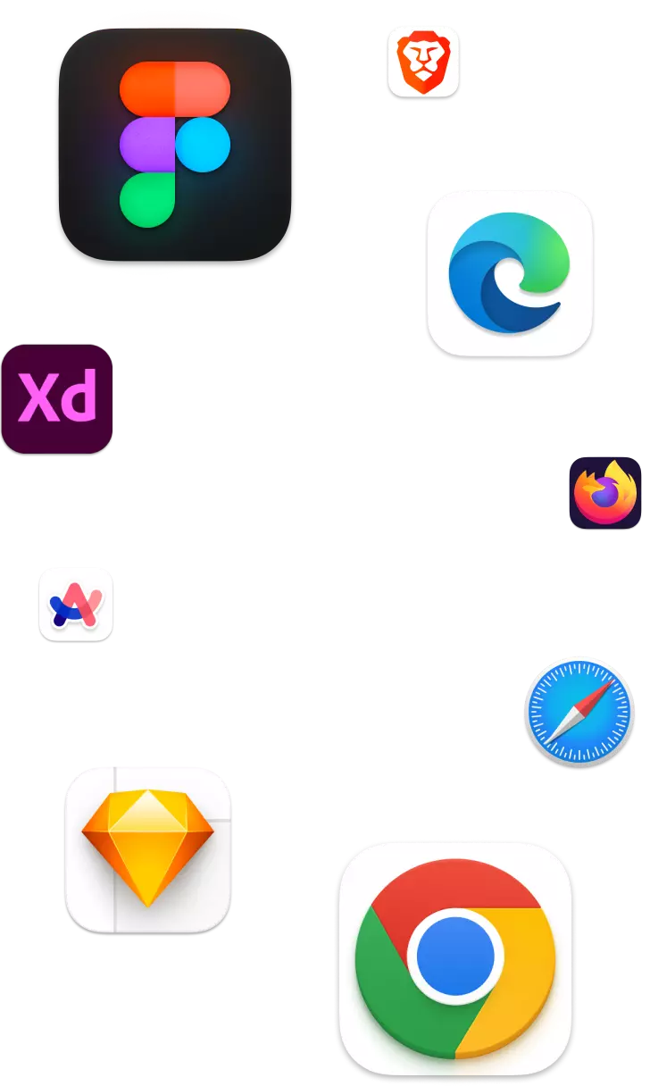
Stark's logo surrounded by design tools (Figma, Adobe XD, Sketch) and web browsers (Chrome, Edge, and Brave).
Stark logo

Works in your design Tool and browser

In-App Education
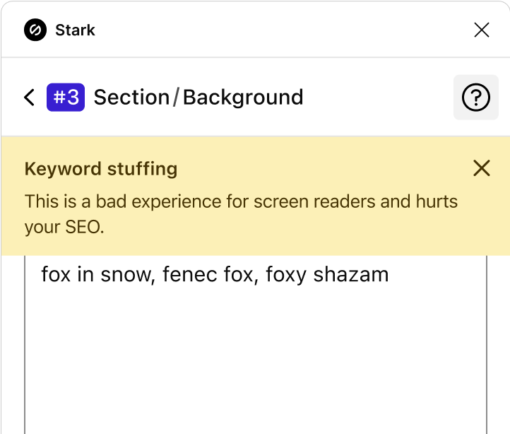
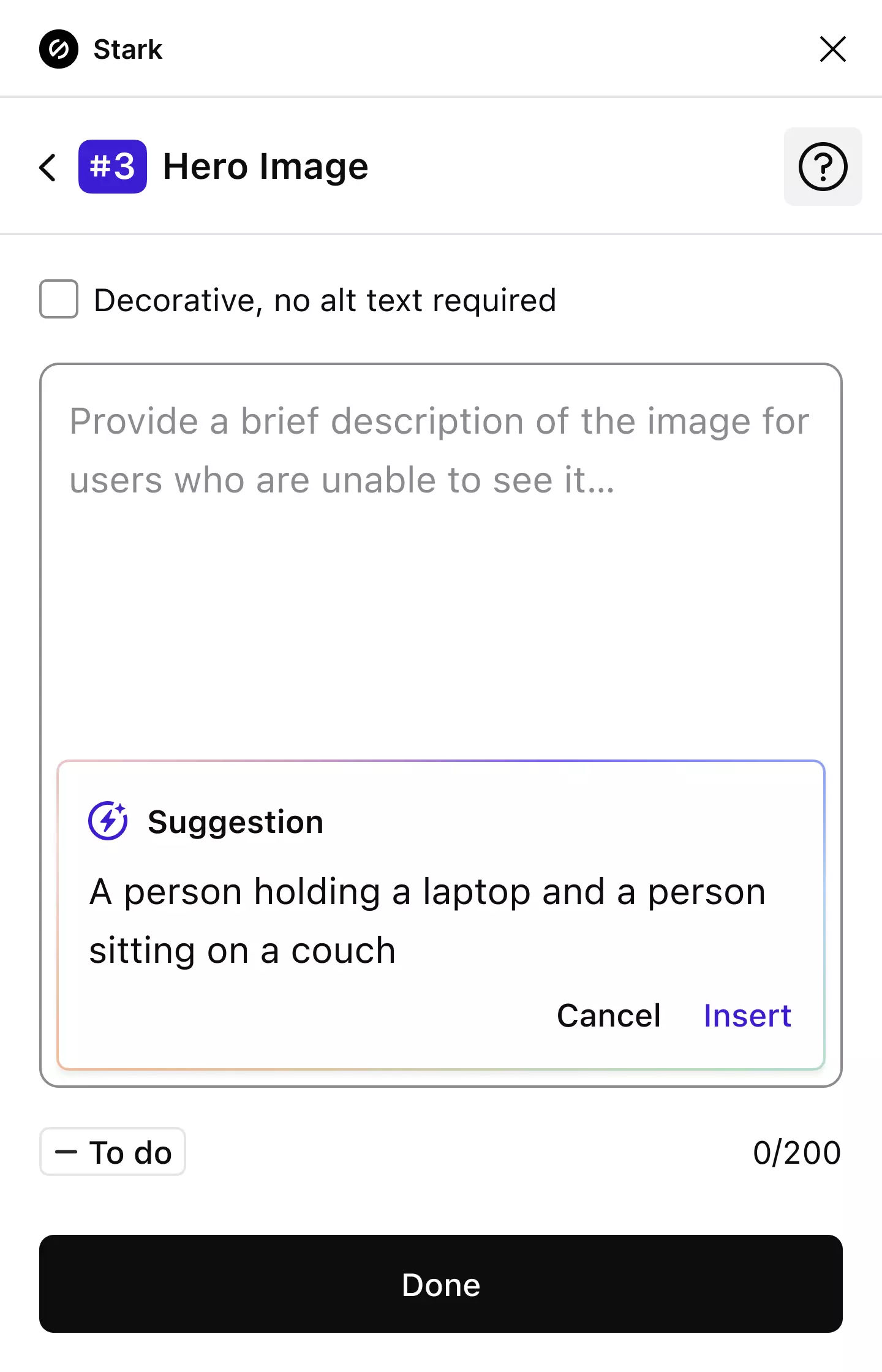
Stark's Alt-Text feature highlighting that the supplied alt text is an example of keyword stuffing which actually hurts your SEO and is a bad experience for screen readers.
Stark's Alt-Text feature with numerous layers annotated showing examples of written, decorative and incorrect alt text.

Alt-Text Annotations

Live preview in browser
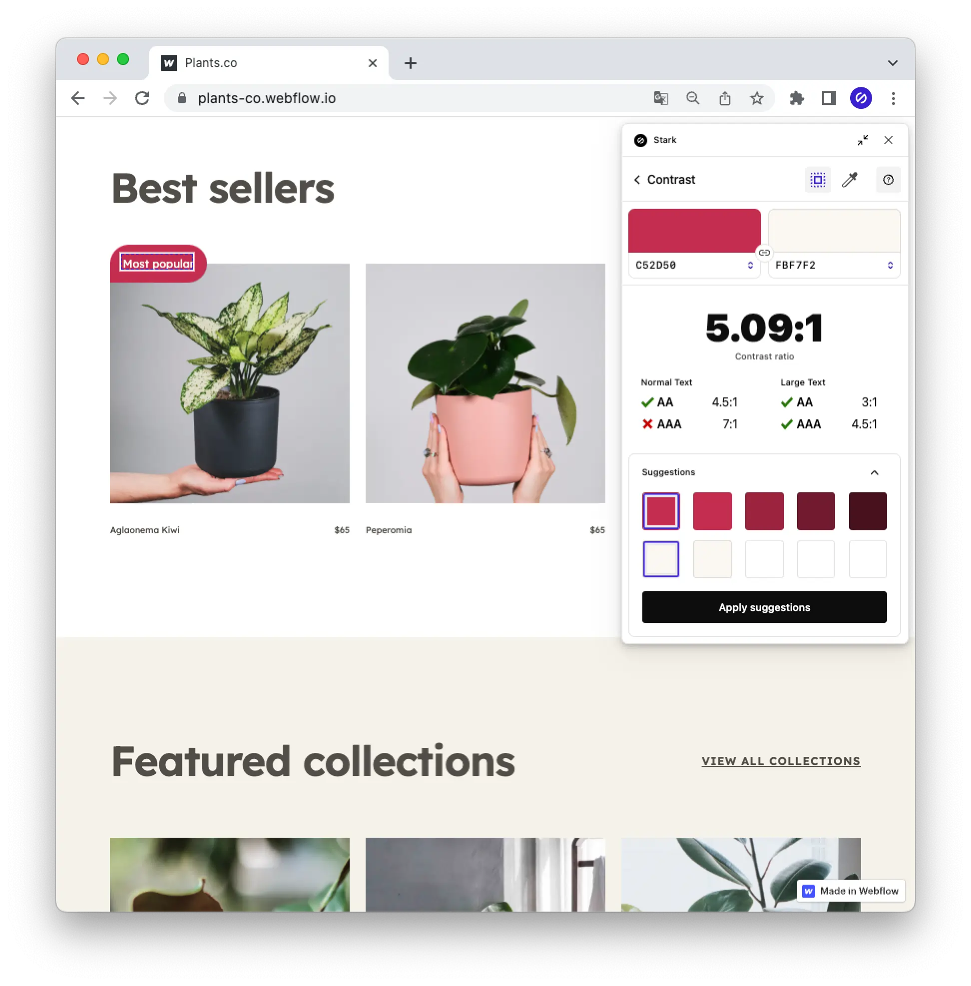
A plants website is shown with Stark's live preview feature allowing a user to directly change a color right in the browser.
Stark's Typography feature showing a layer with text size that is too small at 10px with the option to increase it.

Typography

Three illustrated faces (a bald man with a moustache, a person with blond hair, and a woman with curly hair) are shown connected with lines in front of a cloud with the word SSO above them.

SSO + Team Account Management

Beautifully simple, lightning fast
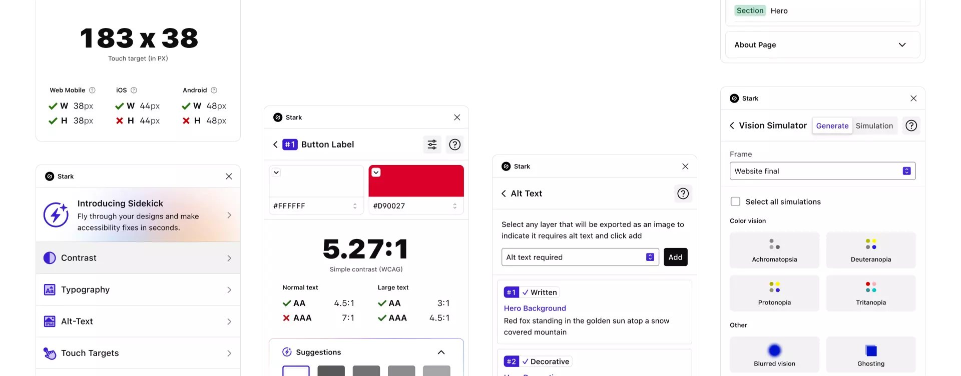
A grid of all the different features offered within Stark, including Contrast, Alt-Text, Vision Simulator, and more.