Using Typography Analysis
Check your designs to see if your text is too small to be legible
While the WCAG doesn’t give specific regulations for font sizes, it’s often the case that trying to read type that’s too small is a bad experience.
For the Stark Typography tool, we’ve implemented our guidelines based on research and best practices so that we can help you select fonts that are visually accessible.
Using Typography Analysis with Figma and Sketch plugins
Download: Stark for Figma, Stark for Sketch
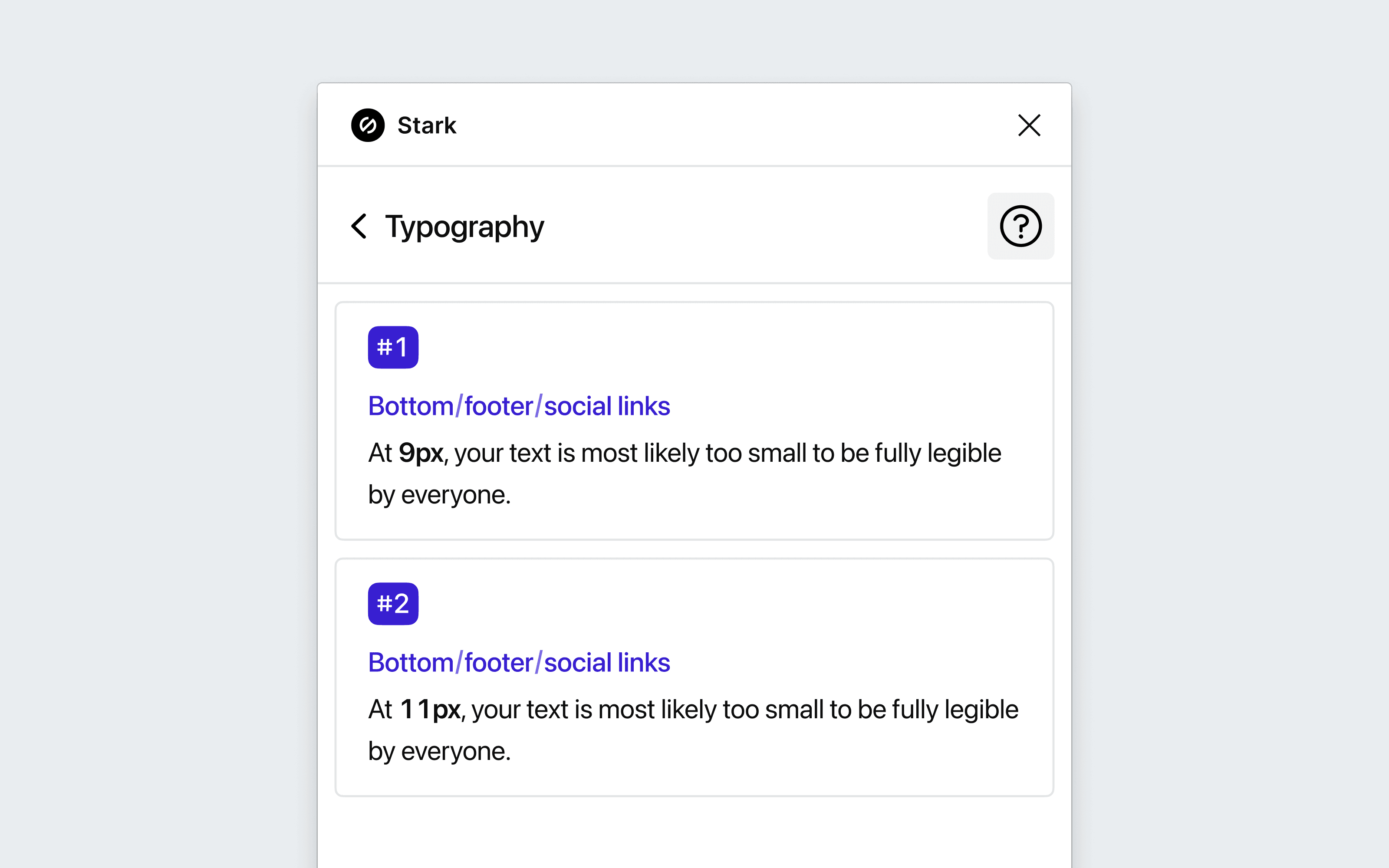
To use Typography Analysis in your design tool, go to Plugins and choose Stark > Typography. The plugin will scan all your artboards and flag any text smaller than 12px.
Surfacing and correcting typography issues
The Typography Analysis scans your file and will surface any instances where the text might be too small for all people to read.
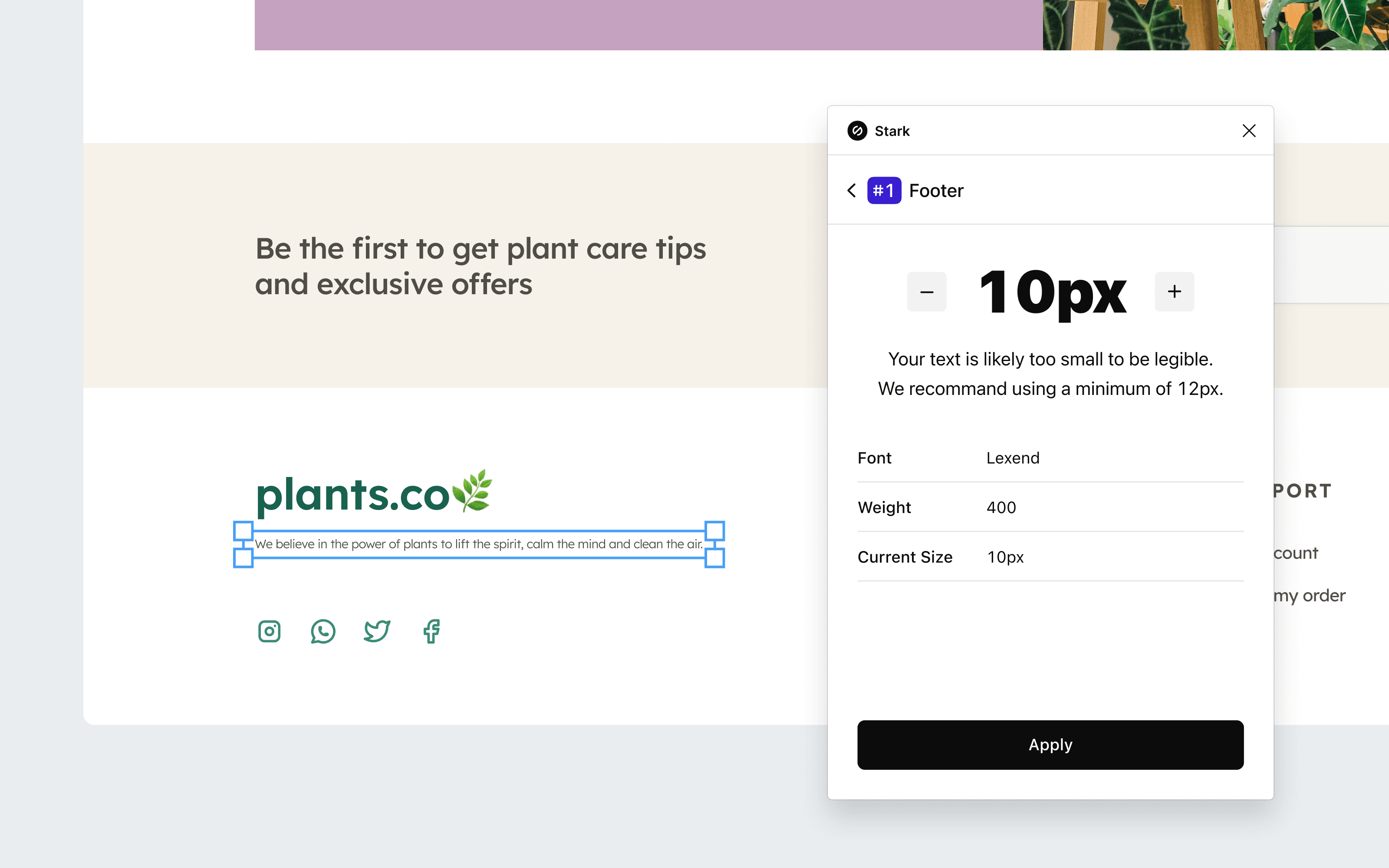
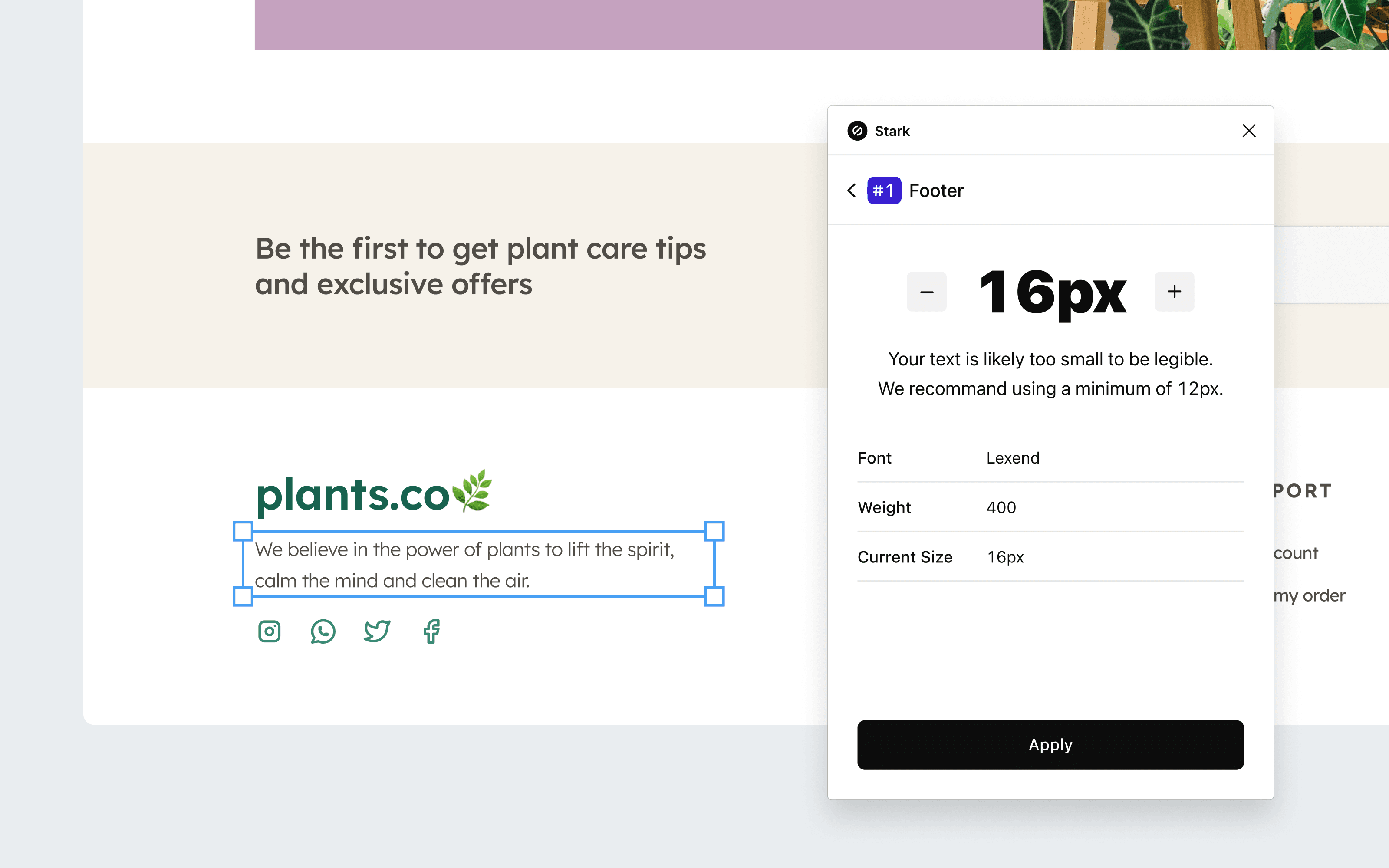
If any text is smaller than the recommended 12px font size, Stark will display issue cards that you can click in order to see more details about each instance. Adjust the text size within the card, then click Apply to save the change.
Using Typography Analysis in your browser
Download: Stark for Brave, Stark for Chrome, Stark for Edge
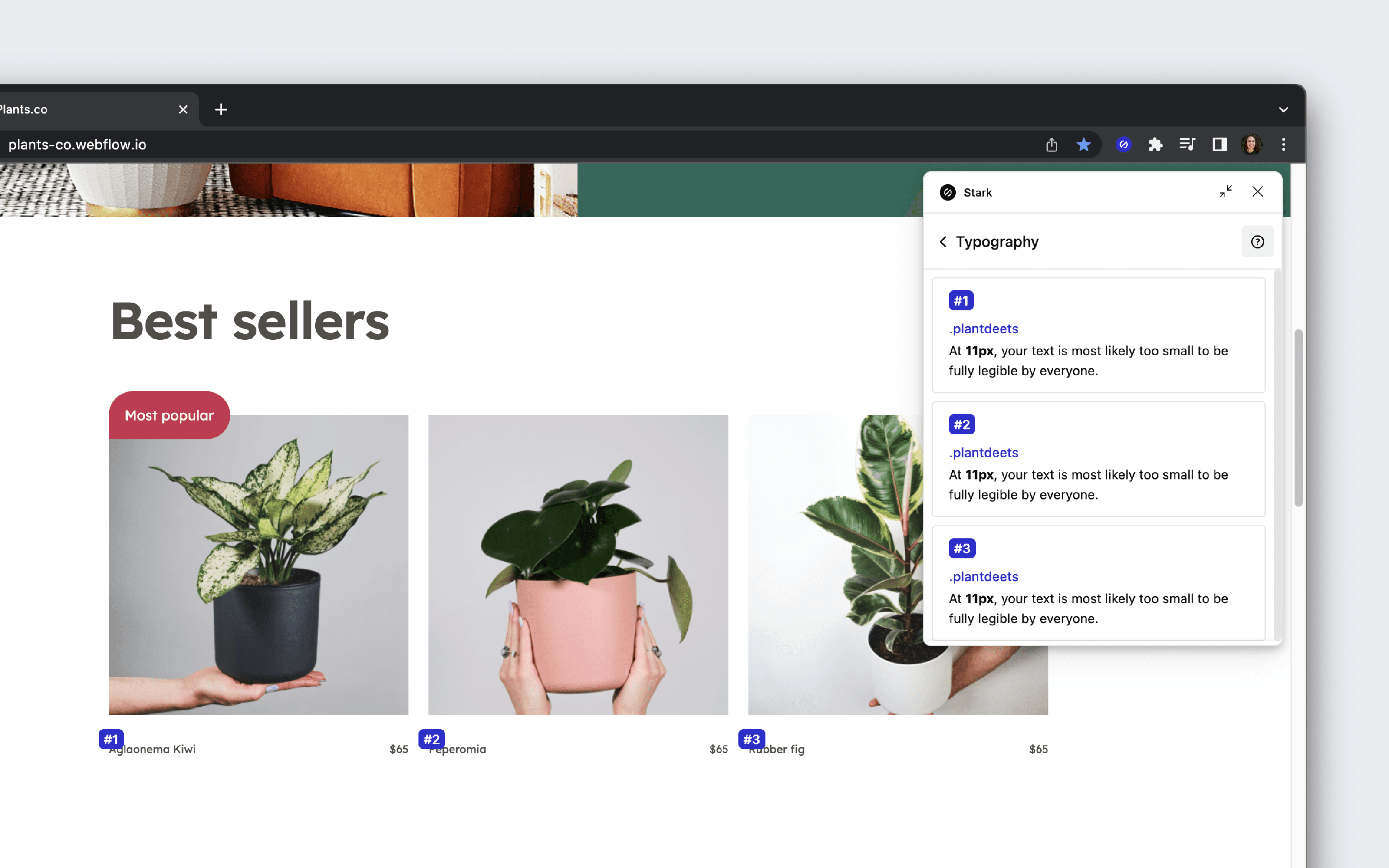
To get started using Typography Analysis, open Stark from your browser’s extension menu. After opening the typography tool, Stark will automatically scan the live web page and surface any text under 12px.
Applying changes with Live Preview
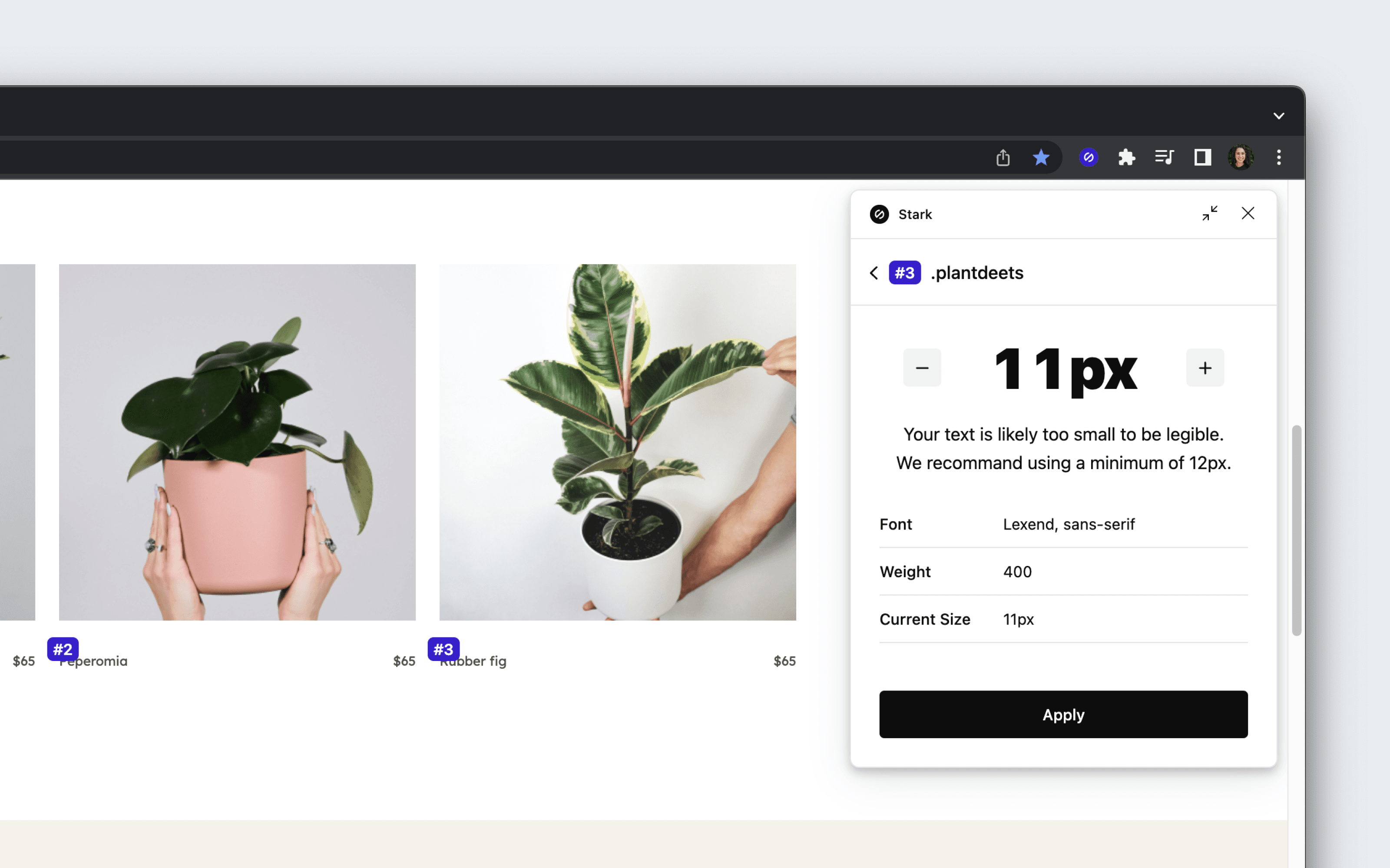
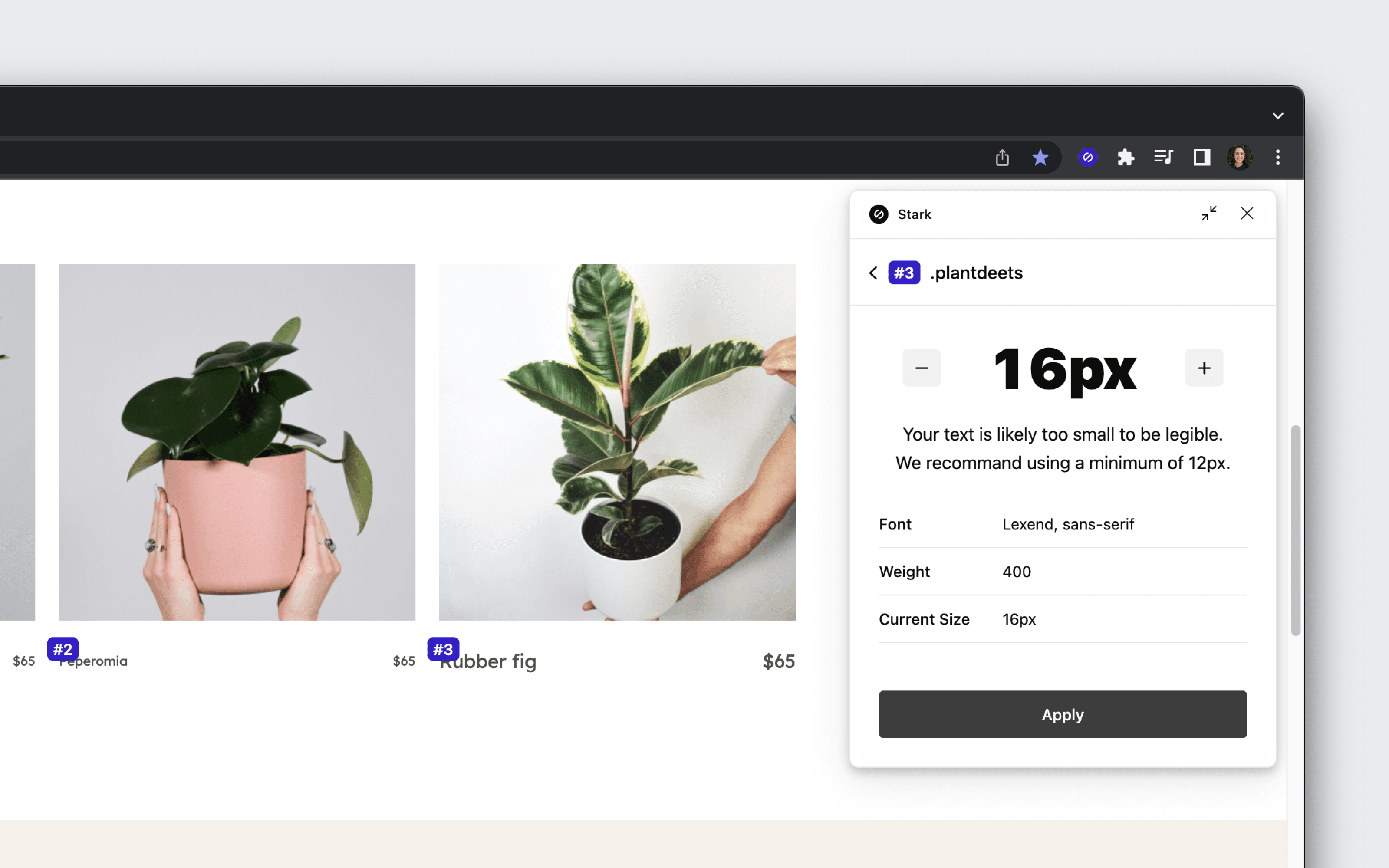
Choosing a text issue card will center the page directly on the issue, so that you don’t need to go searching. You can adjust the text size within the card, then click Apply to view the Live Preview of the change.
Have any questions about using Typography Analysis? Don’t hesitate to reach out to us at support@getstark.co.